Artist Spotlight: Heather Hobler

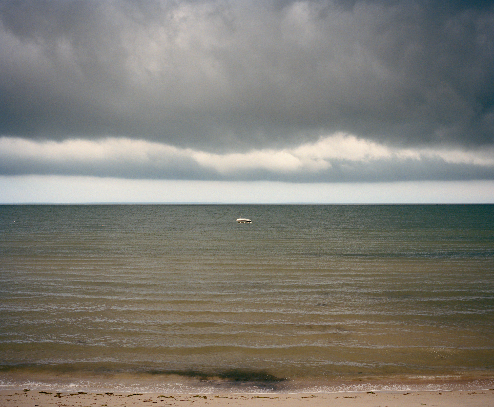
Heather Hobler came into the office a year ago when she started photographing her backyard seascapes. Keeping her tripod in the same location, she shoots color negative film during different times of the day. Each print holds luscious colors ranging from cool blues to warm sunsets. The meditative quality of her images invites the viewer to linger and explore every seashell and wave.

  • What is your earliest memory of art?

HH: A large dark abstract Grace Hartigan Wedding Dress painting. This painting hung innocently on
my great-aunt Francis’s dining room wall in an old whalers home in Mattapoisett. It was among
a Joseph Cornell Shadow Box, a Rembrandt etching, a Picasso scarf and many more hidden
treasures. These were true works of art living an ordinary life among the wallpaper and salt air.
Francis lived and worked in NYC in the world of art and museums. She took the train up for
holidays and weekends. Certainly quite exotic to my small town girlhood.

And along with these examples of high art I grew up in a house that my father and mother built
from the foundation up, sailed on boats that my father and brother built, wore handmade wool
garments from both grandmothers and mother, ate from the gardens of my grandfather, have a
handmade doll my sister made me.

In each object, aesthetics and use played equally important roles. What makes art “art” has
always intrigued me.

  • What is your background? Did you go to school for photography?

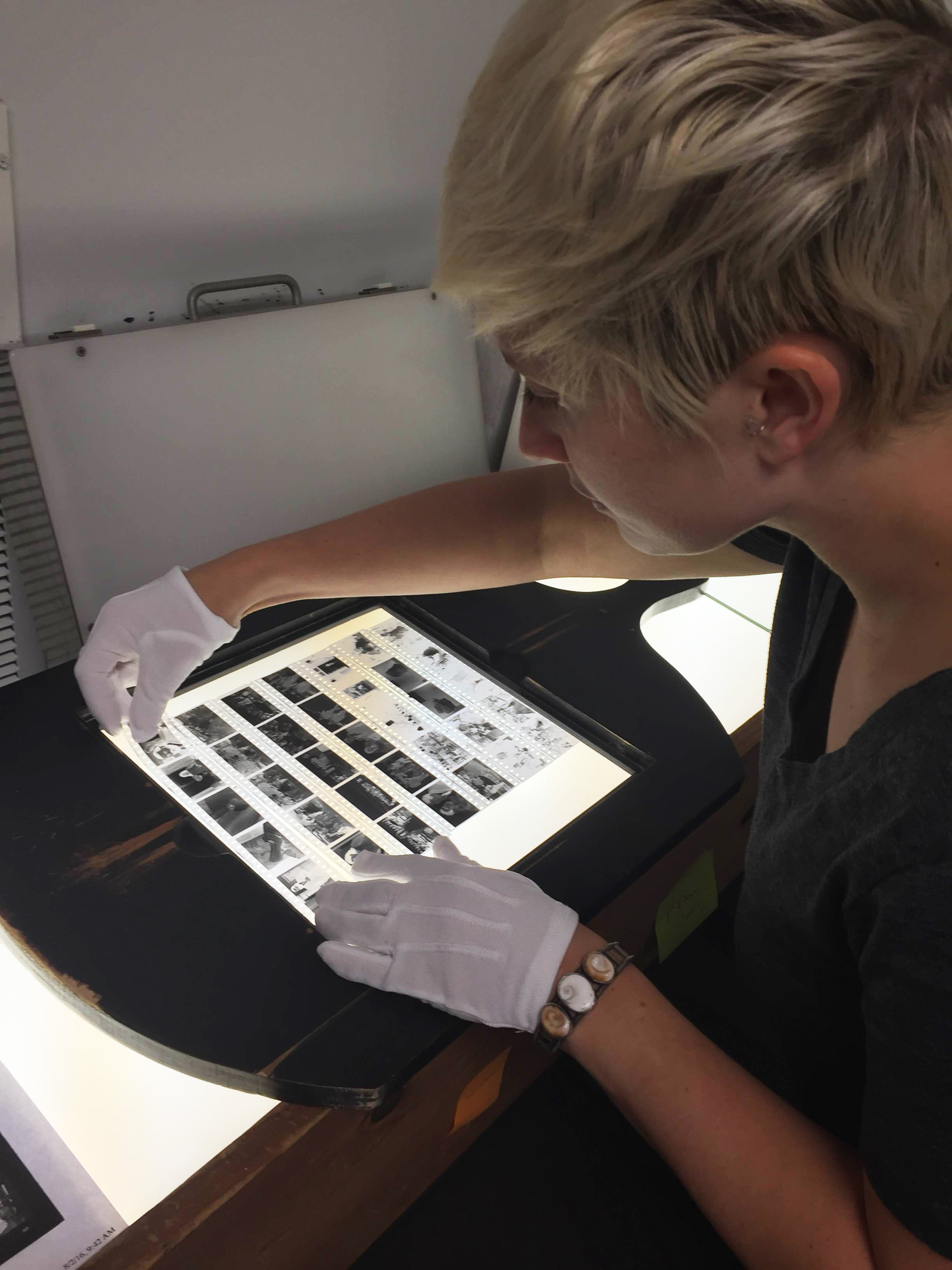
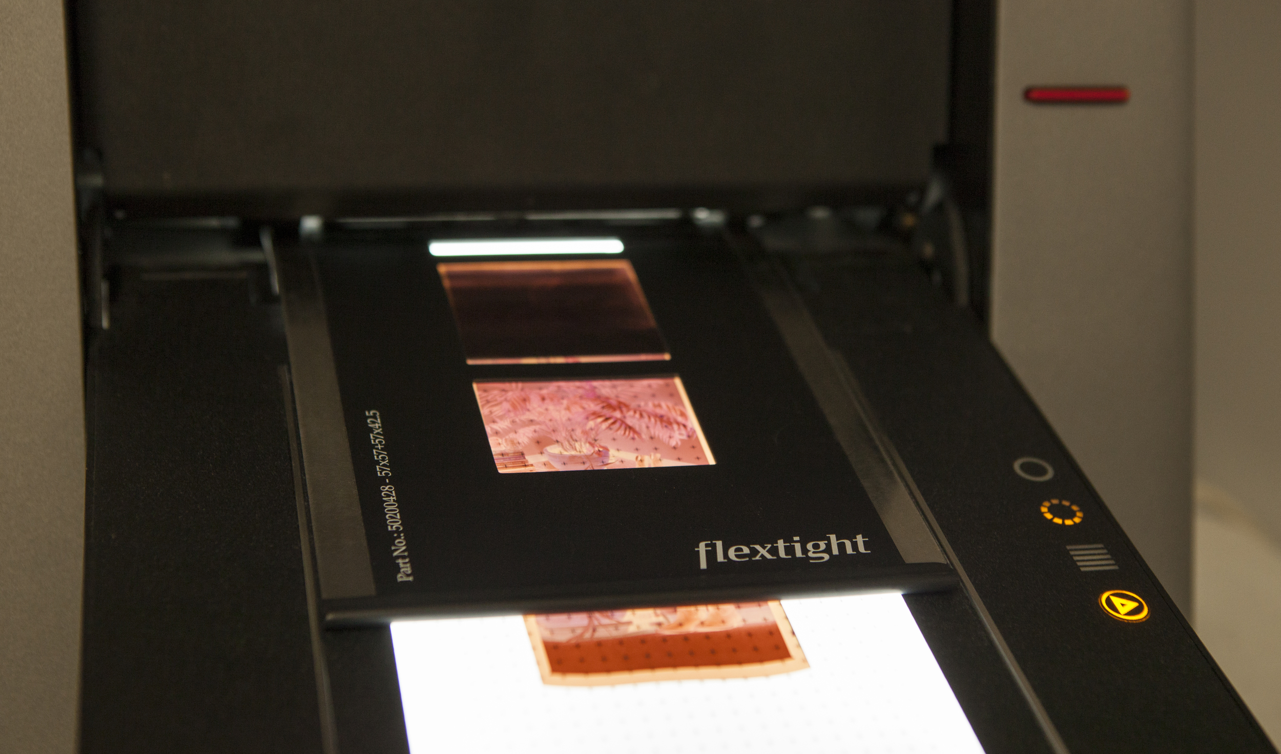
HH: I went to both SMFA Boston and Tufts University, finishing with a BFA from Tufts in my 20’s and
then back to get my certificate from SMFA in my 30’s. In my 20’s I studied film, video and
drawing and in my 30’s mostly painting and drawing. I have no formal training in photography.
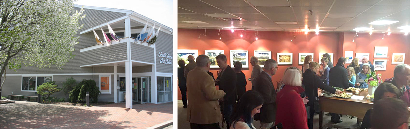
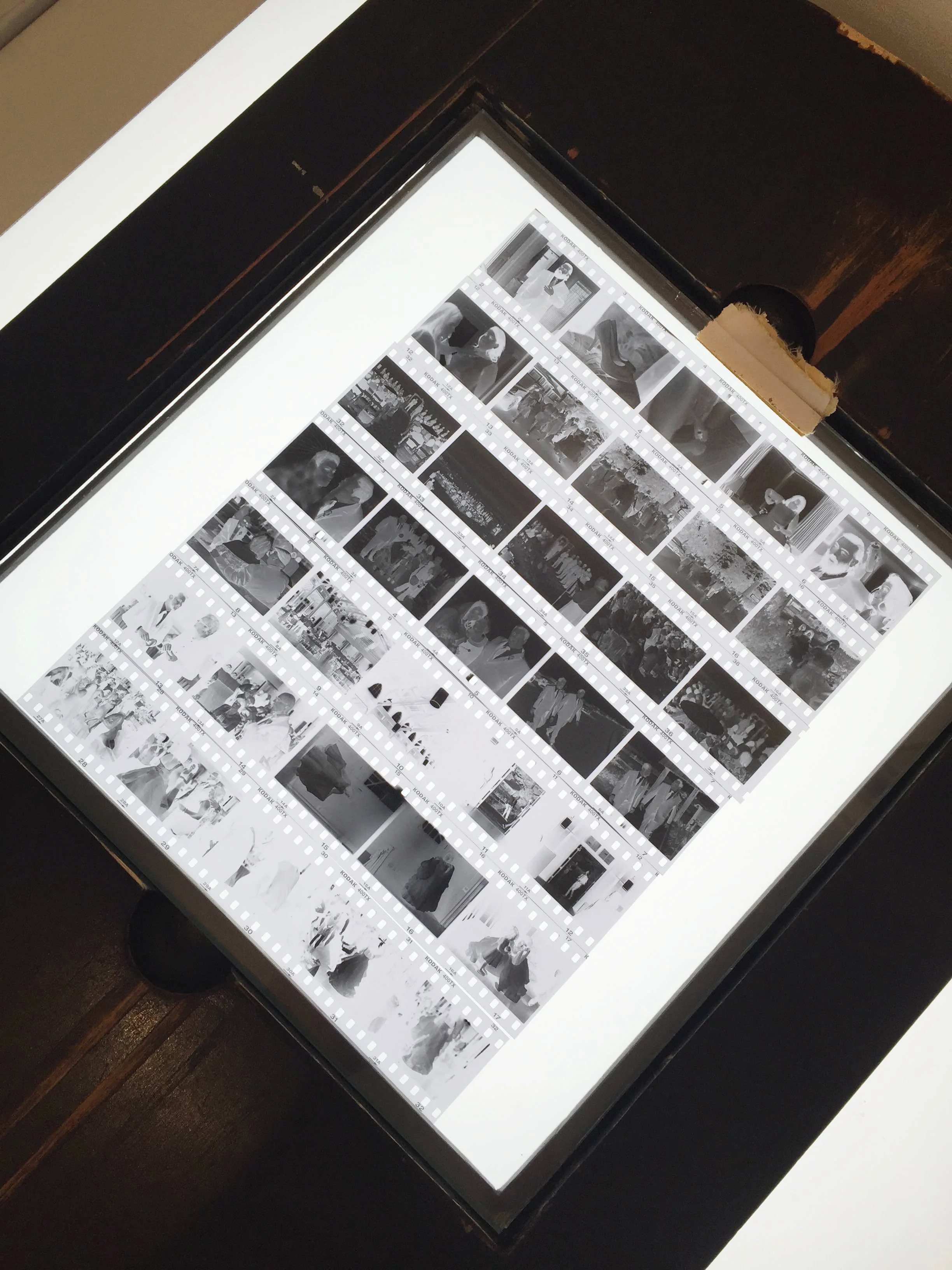
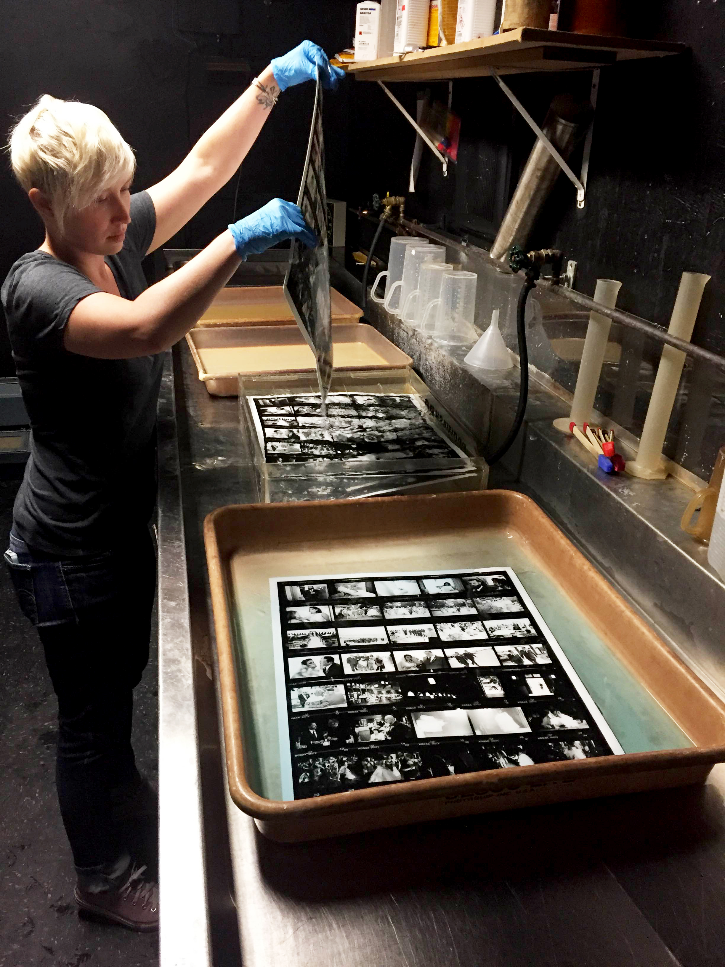
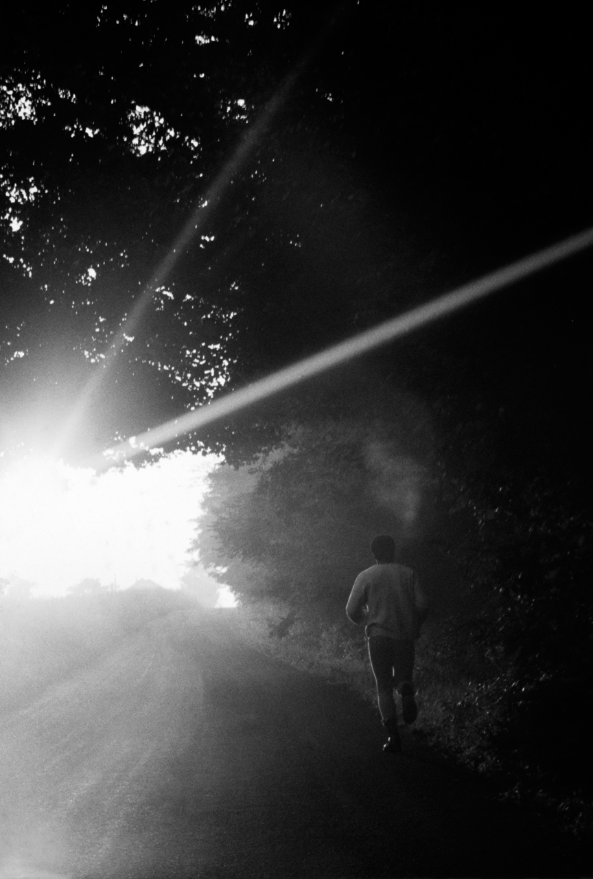
HH: This all started innocently as snapshots and quickly built into a reflective rhythmic journalistic
ritual. Taken from the same place daily and most often multiple times per day I stand facing
south over Buzzards Bay to document the pageant that is my front yard. As this work grows so
does my interest and dedication to what I feel is my most successful body of work.


“The adventure of the sun is the great natural drama by which we live” -Henry Benson, The
Outermost House


I had cancer 8 years ago, and it changed my life (of course and so what), and so too it changed
my belief in the validity of my art making. It was in the building of this collection it became
obvious this was a continuation and distillation of my art. Concepts of systems, comparisons,
suggestions of what came before, the play of edge-to-frame and the basic question of “what is
art?” have always been my concern.


Varying from colorfield paintings to romantic photorealism to pure abstraction, this work plays
with the formalism of the square and the minimalism of a controlled composition. This work is
both poignant and potent as they also engage in the contemporary issues of climate change,
the incessant barrage information and the dwindling amount of natural space. These, too, are a
nod to my 30 year devotion to yoga and meditation. and so the name where lines meet.

  • Throughout the exhibition you will be having interaction days of conversation & contemplation, yoga, and evening talks. How do you plan to work these events into the
    exhibition? What made you decide to do the interactions?

HH: These photographs together as a unit, a collection, a study, each and every time thrill and bore
me, equally. Kinda like, so what? so, so what? or who cares? so, who cares? So selfishly, I want
to discuss that play/work that we do to make sense of what makes us who we are. This is a
project because of just that: I do not have fully formed ideas around these photographs and
look to explore thru interactions. With where lines meet I will be in the space during all
opening hours inviting people in from all supports and interests of my life for contemplation,
conversation and community. Events range from Wednesday evening talks, Thursday and
Sunday yoga and Saturday suppers. I look to make this more than a purely aesthetic
experience.

  • What artists influence you and how do they influence your thinking, creating and career path?

HH: Colorfield painters, Morris Louis, Helen Frankenthaler, Abstract Expressionists Rothko,
Rauschenberg, to more contemporary and conceptual artists Gary Hume, Richard Prince, Hiroshi
Sugimoto
, Doug Aitken, Lisa Yuskavage. I believe all of the mentioned see the trueness of life
and portray it with such high esteem. Their integrity and complexity will forever be of
fascination to me along with their regard for beauty. Surely, by looking at how they are looking
influences and fine tunes my eye. As far as creating, I have forever been creating maybe just
not under the guise as an artist.

  • What is the best piece of advice you’ve been given?

HH: Listen.

  • When you are not taking beautiful photographs what are you spending your time doing?

HH: I prefer to be outside as much as possible for both work and leisure. I have been practicing
yoga for over 30 years and now teach. And I spend much time contemplating the horizon.

Making an Enlarged Contact Sheet

We recently printed an enlarged contact sheet of a wedding shot on 35mm film. Because we have a 8x10 Ilford enlarger we are able to lay the cut strips of film onto the glass and make what is essentially a big contact sheet. What a great way to remember a very special day for the bride and groom!


Somerville Toy Camera Festival

Francine Weiss

Francine Weiss

About the Festival:

Since 2013, the Somerville Toy Camera Festival has celebrated the quirky and creative results that can happen when photographers are forced to loosen their controls, submit to the light and embrace the accidental. Each year since, the Festival has brought a wide range of toy camera photography by US and international artists together in simultaneous shows at galleries throughout the city, and featured related programming including artist talks/panel discussions, workshops, social events, and a darkroom day.

This year the guest juror was Professor Christopher James who is the Director of the MFA photography program at Lesley College of Art and Design in Boston.


Liz Ellenwood with the Gold Holga Award!

Liz Ellenwood with the Gold Holga Award!

What is a toy camera?

Holga, Diana and LOMO just to name a few. They are simple and inexpensive film cameras where you have little to no control over shutter speed and apertures. Common qualities of images made with toy cameras are vignetting, soft focus, light leaks and other distortions. It is the true point-and-shoot camera!

Toy camera photography has been widely exhibited at many popular art shows, such as the annual "Krappy Kamera" show at the Soho Photo Gallery in the Tribeca neighborhood of New York City. Various publications such as Popular Photography magazine have reviewed the Diana camera in its own right as an "art" producing image maker. Several books have also featured the work of toy cameras, such as The Friends of Photography's "The Diana Show", "Iowa" by Nancy Rexroth, and "Angels at the Arno" by Eric Lindbloom.


When is the exhibition?

The 2016 Somerville Toy Camera Festival will take place in September-October, with exhibitions at three non-profit spaces in Somerville MA: Nave Gallery Annex, Washington Street Gallery, and Brickbottom Gallery. For a full list of opening dates check here.

In addition,  The Griffin Museum of Photography in Winchester, MA will have a walk-in camera obscura built by artist Marian Roth! The installation of the camera obscura in a small gallery at the Griffin will take place on September 8, and is open to the public. The camera obscura will be accessible to visitors during regular Griffin Museum hours through October 2, 2016.

Liz Wood

Liz Wood

How are we involved?

We have been proud sponsors of the Somerville Toy Camera Festival for the past few years. We offer a 15% discount for the exhibiting artists of the Festival for their scanning, printing & framing needs. Every year we look forward to seeing what each artist has created with their plastic cameras!

Tech Blog: Colorspace, File Formats and Untagged Files

Have questions about digital printing? How to get images to us? What type of file to send? We have tried to start simply and move onto the more complex questions. If you have questions regarding any of this or just want to review the process with us, please call or email us! First things first… You can upload us files here and you will see this screen from Hightail. You can drag and drop your images for upload to us.

Do I send Jpg, tif or psd? Raw?

You can send us any of the above. We have provided some details below about the difference between each type of file.

Raw are the proprietary file from the camera manufacture. Some examples are: Canon (.crw, cr2), Nikon (.nef, .nrw), Sony (.arw, .srf, .sr2), Pentax (.pef, .ptx).  Raw files hold the most data from your digital camera and are the easiest file to adjust exposure, contrast, white balance and other fine tuning. We can edit your Raw files however this requires an editing charge.

JPG is best for web use, but still can be printed from if it has high enough resolution and was saved at a high enough quality. (80+ in Lightroom, 10+ in Photoshop).

PSD is an Adobe Photoshop proprietary format. It can handle all of Photoshop’s features, but has some compatibility issues with non-Adobe products and Lightroom. PSD has a 2gb files size limitation.  Due to the compatibility and size issues, PSD has been (or should be) replaced by TIF by most photographers.  We prefer TIF.

TIF is one of the most universally accepted formats. It can be opened by most image editing and page layout software. TIF supports all the same things as PSD and has a larger file size limitation (4gb).

Ultimately, just send us what you have and we’ll figure it out. Got layers, send us those too. We can always provide assistance with your files or if you want to sit with one of our Digital Technicians and review files in person.

OK, so a tif  file, 16bit or 8bit?

Either one is fine. Whatever works for you.

What color space should I sent it in? AdobeRGB98, sRGB, ProPhotoRGB

You can send us files in any of these color spaces. You should be working in either AdobeRGB98 or ProPhotoRGB to begin with. sRGB is meant as a web colorspace, anything you upload to your website or facebook should be in sRGB.

As far as AdobeRGB98 or ProPhotoRGB goes, it could go either way. ProPhotoRGB is much bigger than AdobeRGB98 and can produce more colors. However, you must work in 16bit with ProPhotoRGB otherwise you can end up with posterization effects (banding). The other down side to ProPhoto is it includes imaginary colors. Yes, I said imaginary colors. They (Kodak) made the ProPhotoRGB color space so big that 13% of the colors included do not exist in the real world and are not visible colors. This can lead to color issues when printing. Some colors will become over-saturated or will be estimated to its nearest in gamut color and can cause banding. Even the best printers in the world can’t print imaginary colors.

AdobeRGB98 is larger than sRGB, is easily printable by commercially available printers and includes no imaginary numbers. Its not perfect, nothing is, but it is the standard most of the photographic world uses.

If you have a gray scale file, that is fine as well. Gray Gamma 2.2 will do just fine.

What about CMYK?

Leave that to the offset printers. If you send us a file with a CMYK colorspace we will convert it to AdobeRGB98.

What about an untagged file?

If you send us a file with an untagged colorspace you will get a call from an angry elf… just ask Ron Cowie. Again, you can just send us what you have and we’ll figure it out. Following our recommendations makes it easier, but we are happy to help in whatever stage you are in!

Steps of a Photo Restoration

We see a lot of vintage photos here at Panopticon Imaging. They range from wedding portraits to family photos throughout the years to military portraits, the list goes on!  Here are the steps we go through for a photo restoration: STEP 1: Bring in your old photograph to the office. We will review the image with you & give you an estimate of how much & how long it will be to digitally restore. We DO NOT restore the original photograph. We scan it and digitally correct the image through Photoshop.

STEP 2: We scan your image. Using our high resolution Epson scanner, we create a digital copy from the original photograph.

STEP 3: We make adjustments in Photoshop. Here we fix cracks & damage to the image. This takes time and each photograph is different, it can take as little as 5 minutes or as much as 3 hours. We also adjust the contrast of the image, making faces lighter or certain areas darker. We can adjust the tone and make it black & white, sepia, or brown tone. The sepia is our most popular option, it makes the image still feel like an old photograph.

STEP 4: Time to print! We use all archival inks and papers here. This means your new print will last as long as it is treated properly (keeping it away from moisture & direct sunlight). When we meet with you we will tell you the sizes we recommend printing. Most vintage photographs are small to start with so they look the best staying in the 5x7 to 8x10 size.

These were the adjustments made to this image:

Whatever happened to your photograph, we are happy to help bring it back to life! Stop by the office or give us a call at 781-740-1300.

Custom Wood Frames

We love these custom wood frames from a local wood worker. The details and precision are amazing! Each molding can be made with Ash, Cherry, Maple, and Walnut woods with the option of staining or painting.

Here is Tony King's photograph we framed with the clear lacquered ash & maple splines:

Assembling the matte, glass & frame

Finished framed photograph

Detail of the maple spline

One hanging option: french cleat

Second hanging option: wire with d-rings

Artist Spotlight: Fern Nesson

Fern Nesson is a fine art photographer living in Cambridge, MA. She practiced as a lawyer for twenty years and taught history at the Cambridge School of Weston and, for the past ten years, she was the College Advisor at the Commonwealth School. Fern is currently in her first year of the MFA program at Maine Media College. Her abstract work is rooted in the elegance of light and line and is currently on display in our gallery until May 14, 2016.

"Light Lines 1"

  • You have a background in law, how did you transition into the art world?

FN: I have taken a long journey through many, varied careers – lawyer, American historian, fiction and non-fiction writer, history, math and law teacher, college counselor -- but the spine of photography has run throughout my life. My father gave me my first camera when I was 8 and he taught me to develop my photos in the darkroom not long after. Since then, I have been engaged in looking at the world through a camera.

Until recently, photography was my hobby. I knew several great photographers (my father included) and followed their work with interest. About ten years ago, I interviewed my father and we published a book of his work. I have also collected photographs for many years. I am proud to own photographs by Michael Kenna, Ansel Adams and Bruce Cratsley, among others.

Several years ago, I decided to pursue my own photography more seriously. My initial goal was to learn to take better photos. I began by reviewing my past work and publishing several books of my photographs. Then I took a workshop in photography at the Penland School in North Carolina. Finally, last year, I quit my counseling job to do photography full-time.

It’s taken me a long time to accept the challenge of pursuing life as an artist but I am so thrilled to be doing it! Photography provides, as always, a wonderful way to experience the world and the improvement in the quality of my work as a result of studying and practicing it full-time is immensely rewarding.

"Morning Light 1"

  • You are currently attending the low residency masters program at Maine Media, tell us a little bit about the program. How has your work changed since starting your studies there?

FN: For my first semester, I am completing synergistic studio and academic projects, both entitled “An Exploration of Seeing.” Since November, I have taken over 20,000 (!) photographs, read a dozen of the great books about “seeing ” and written three lengthy papers describing the evolution of my own artistic vision. As an intellectual and artistic experience, a Maine Media education can’t be beat!

"Light Lines 3"

  • Your abstractions of light and shadow show a playful & insightful side to subjects we see everyday. How do you choose what you point your camera at?

FN: Light is the theme in all of my work. I don’t shoot objects for themselves; I shoot their interaction with light: are they illumined from within? Are they transparent? Are they reflective? Are they suffused with light? Do they glow? Are they in shadow? Do they sparkle? My subjects are quite varied but it’s all about the light.

"Morning Light 5"

  • What inspires you as an artist?

FN: I am drawn to elegance. In choosing a subject or a scene, I seek elegance in pattern, line, color and shape. I prefer the intricate, small detail, over the panorama. My photographs are abstract but not in the sense of removing detail; just the opposite. I focus on an element and I abstract it through the use of an unusual perspective or point of view.

"Light Lines 5"

  • Your current exhibition in our gallery space is a selection of images from various portfolios. How do you feel the individual pieces interact with one another as a whole?

FN: The photographs in my show, “The Light Dances,” are selected from three different series, which I shot in 2015-6. Although they are of radically different subjects – trees at night, a Calder stabile, and the curtains in my bedroom – they have certain underlying and essential characteristics in common.

First, they are each about light: light as it illumines and ennobles a dark object, light as it enhances a sculpture by throwing off shadows, light as it sparkles and brightens a cold winter landscape.

Second they are multiples. Varying the point of view on a single object takes advantage of all angles of the object and allows maximum concentration upon its interaction with light. The multiplicity of views points up what is so great about our existence: we all see things differently from each other and it is that very diversity that makes art and life so interesting.

Third, they use the power of black. Light as a subject shows up so beautifully when it is contrasted with black. Color can seem sometimes to be cheating; it can make even a dull picture interesting but black is a challenge. If you use it well, you get drama; if you use it badly, you get nothing.

"Stabile 1 - 4"