Color plays a pivotal role in a visual artist’s work. Having an understanding of the basics of color theory can help create a logical structure for color and help to understand how color is formed. There are three main categories in color theory: The color wheel, color harmony and the context of how colors are used. In this blog post, we will be focusing on color context.

Color context is how color behaves. Meaning, how it is represented in relation to other colors (and shapes). Looking at certain different colors can affect the way we perceive other colors. For example, the way you view the brightness of a mid gray (hue and tone) is altered when placed adjacent to other colors.
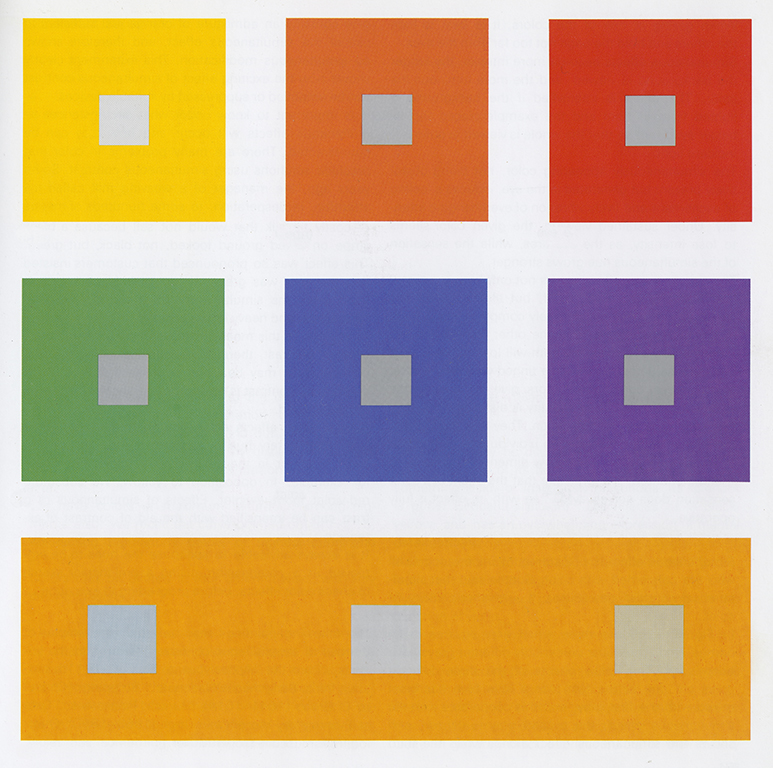

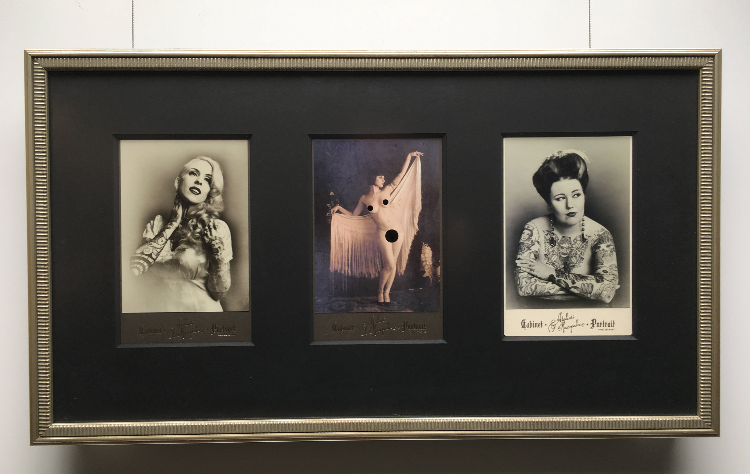
Observing the effects that colors have on each other is a starting point in better understanding the relativity of color. One of the ways understanding color can help you is when you are framing your work.


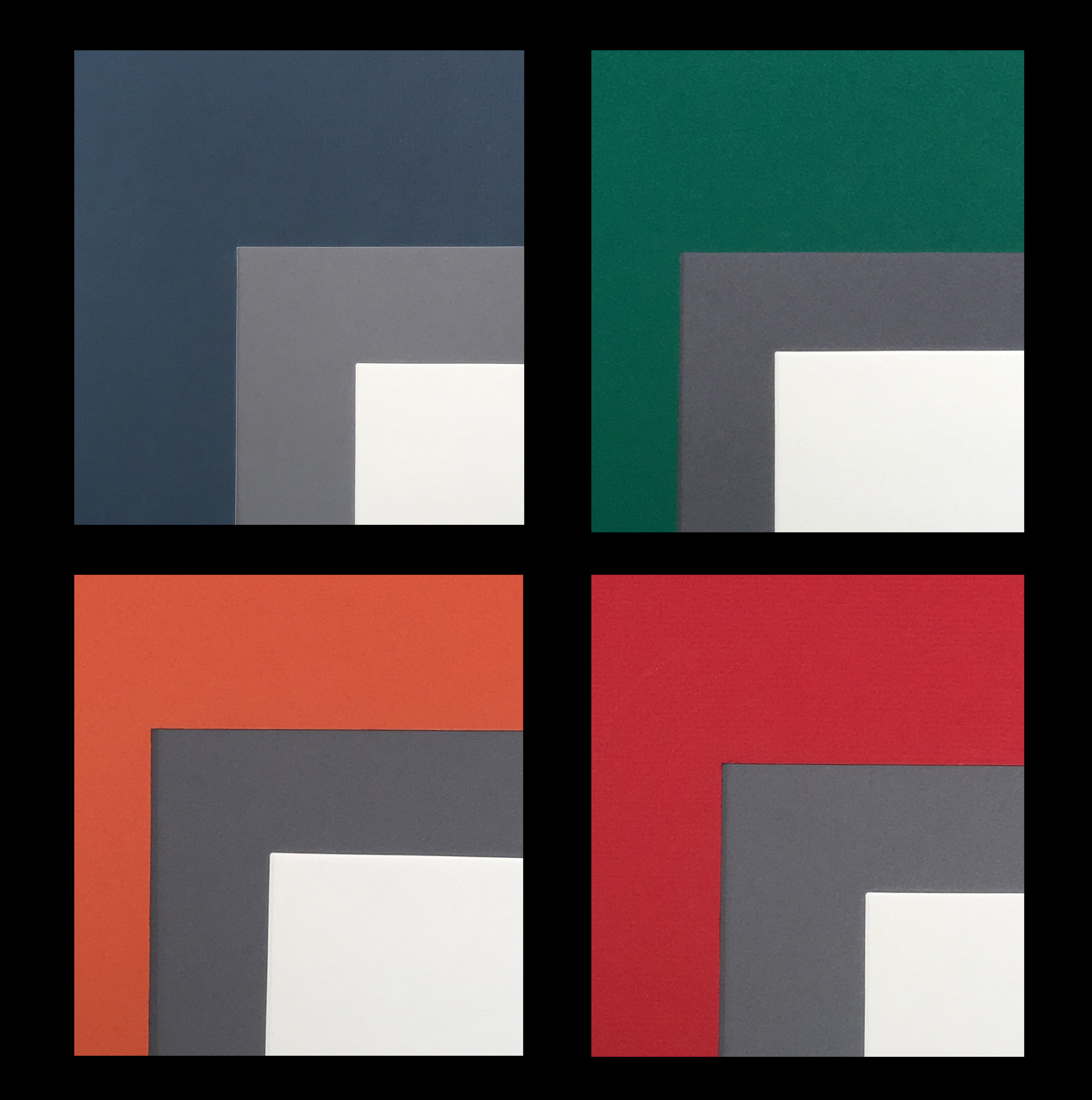
The mat you choose for your work can change the look of your image based on its relationship to the values, saturation and the warmth or coolness of different the hues. Lets look at a couple of examples of how you can use your understanding of color when framing your work.