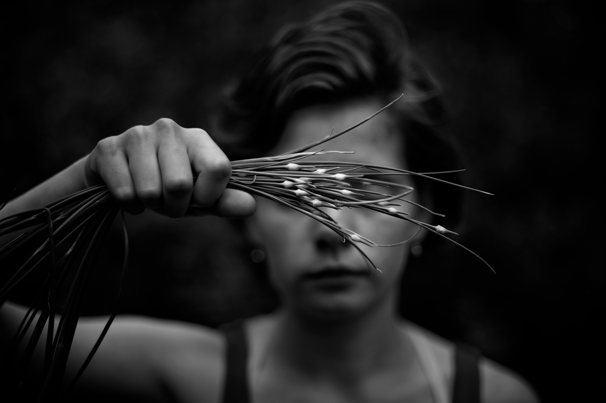
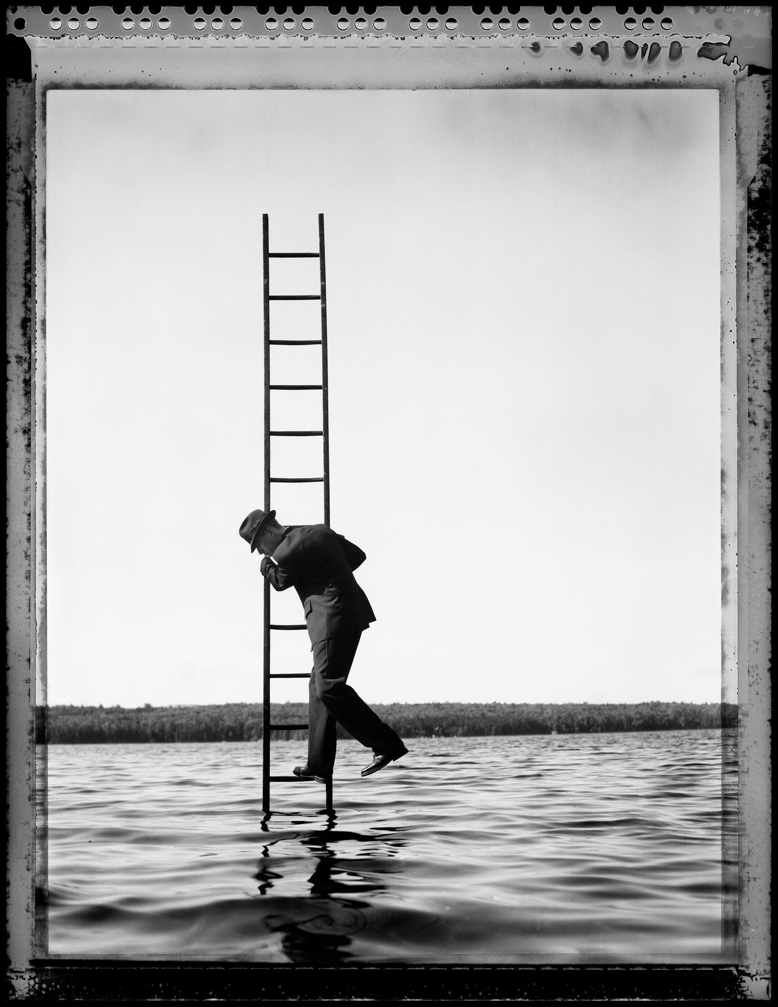
Its back to school time and we have decided to introduce a college series on the blog. In this series we will discuss issues related to students who are interested in photography and the arts. Welcome to the first of the series: What to Spend Your Money On!
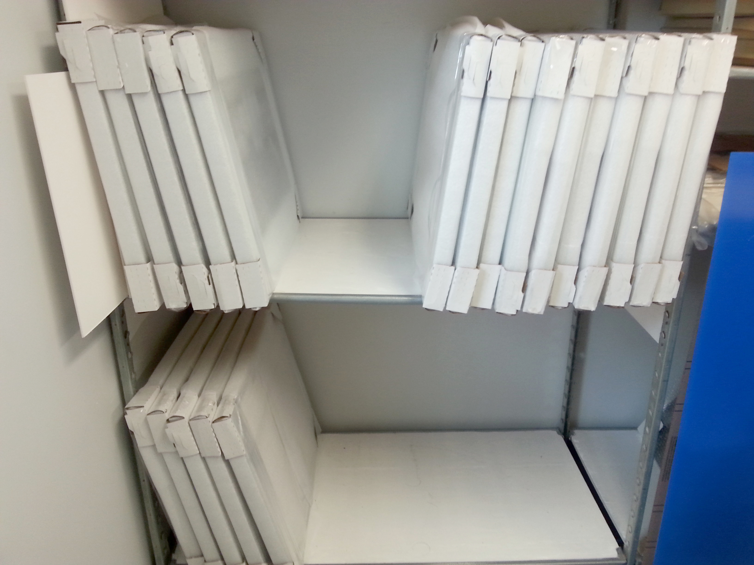
You are in college, You are strapped for cash, but you need some gear and some software in order to make work. Well first off, you are in luck. Most colleges with art/ photo programs, have a "cage" or "lockup". These are places that you can visit to "rent" or check out/ barrow equipment from. You usually need to be enrolled in a related class to have access so check with your school for their particular policy. That said, these places are great and usually filled with cameras, lenses, tripods and various other gear that you might want to try out. While you can, rent everything and save your money, don't buy anything you don't absolutely have to. If your college does not have a place to rent items, you can always try to borrow as much as you can from your friends or classmates. Remember you can do a lot with a little!
Freshman year, you shouldn't commit to a camera or equipment that you might grow out of or realize isn't for you. Your first year is a time of learning and exploration. During this time you will be figuring out what you like and what works for you. "Renting" and or borrowing equipment is the best way to try out different things without losing your money. In most programs there is usually a computer lab staffed by upperclassmen / work study students who are there to help with any questions you might have. These computers labs are usually restricted access like the "lock ups" and are a great resource. They should have all the software you need so there is no need to pay for a license either. The message here is just don't spend your money.
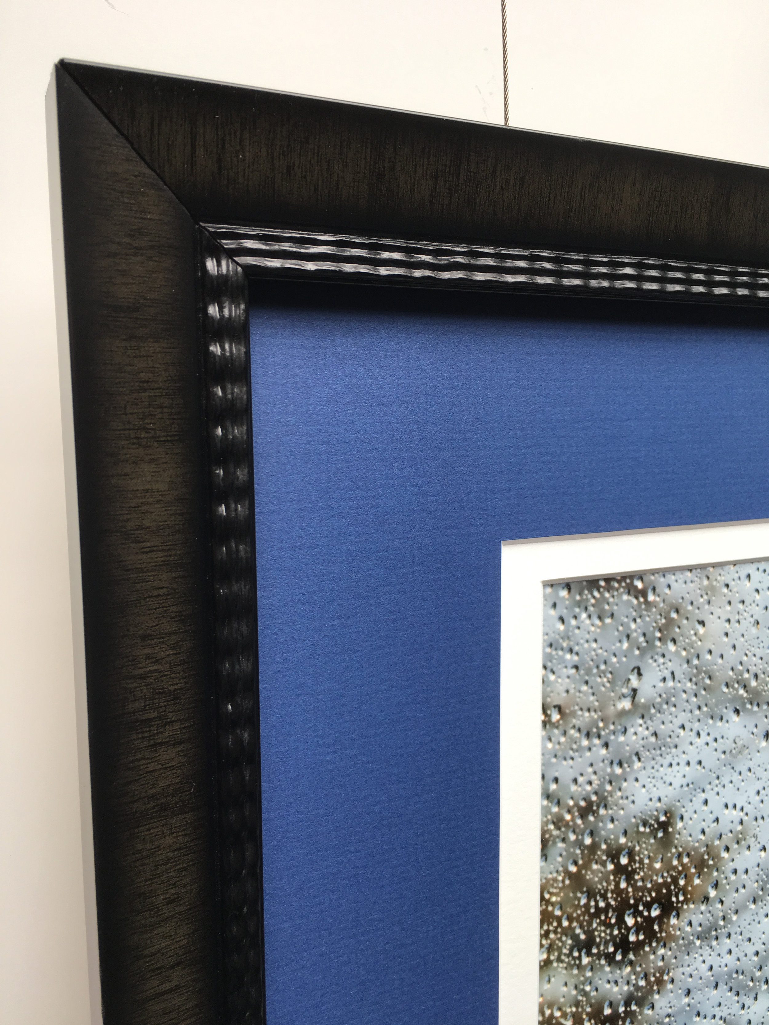
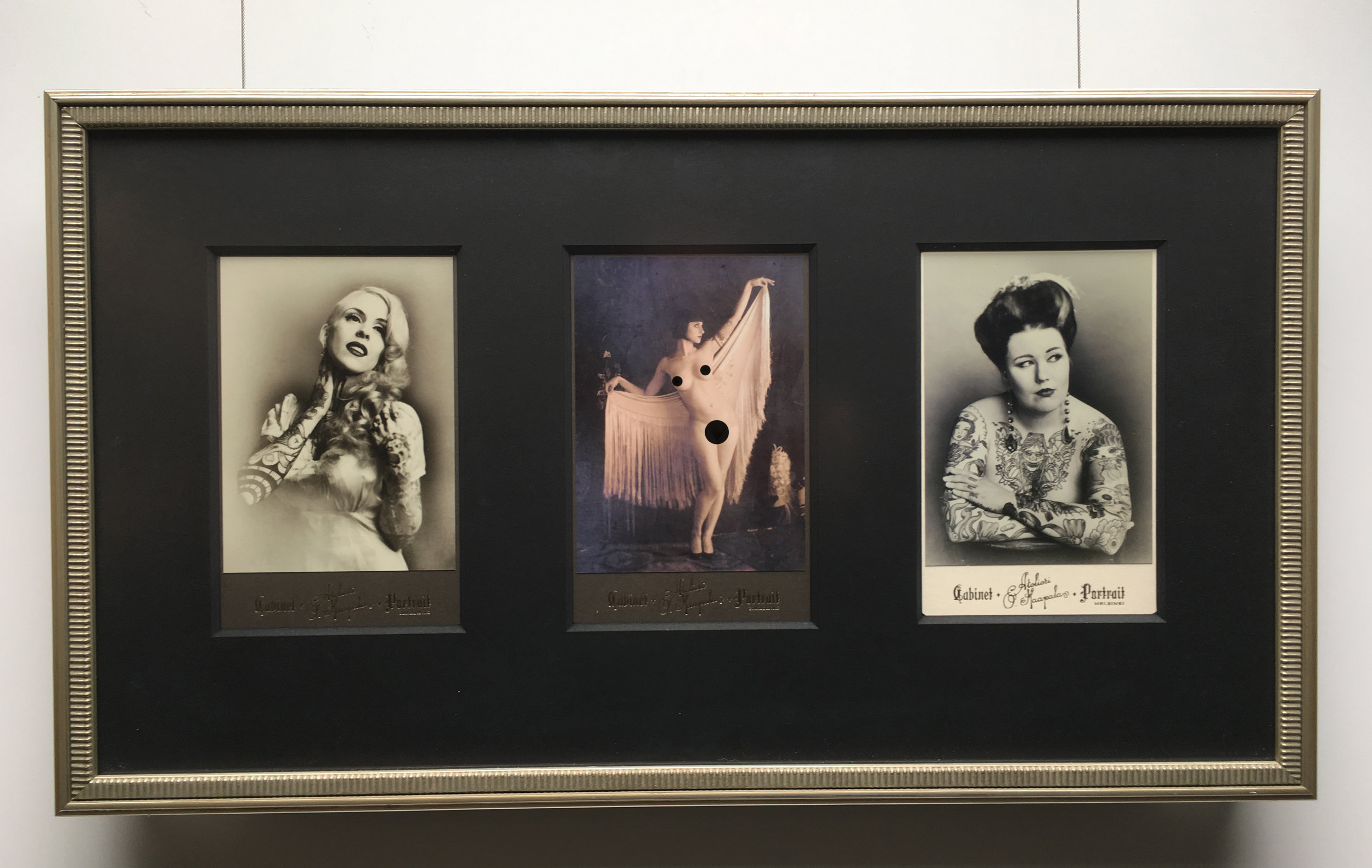
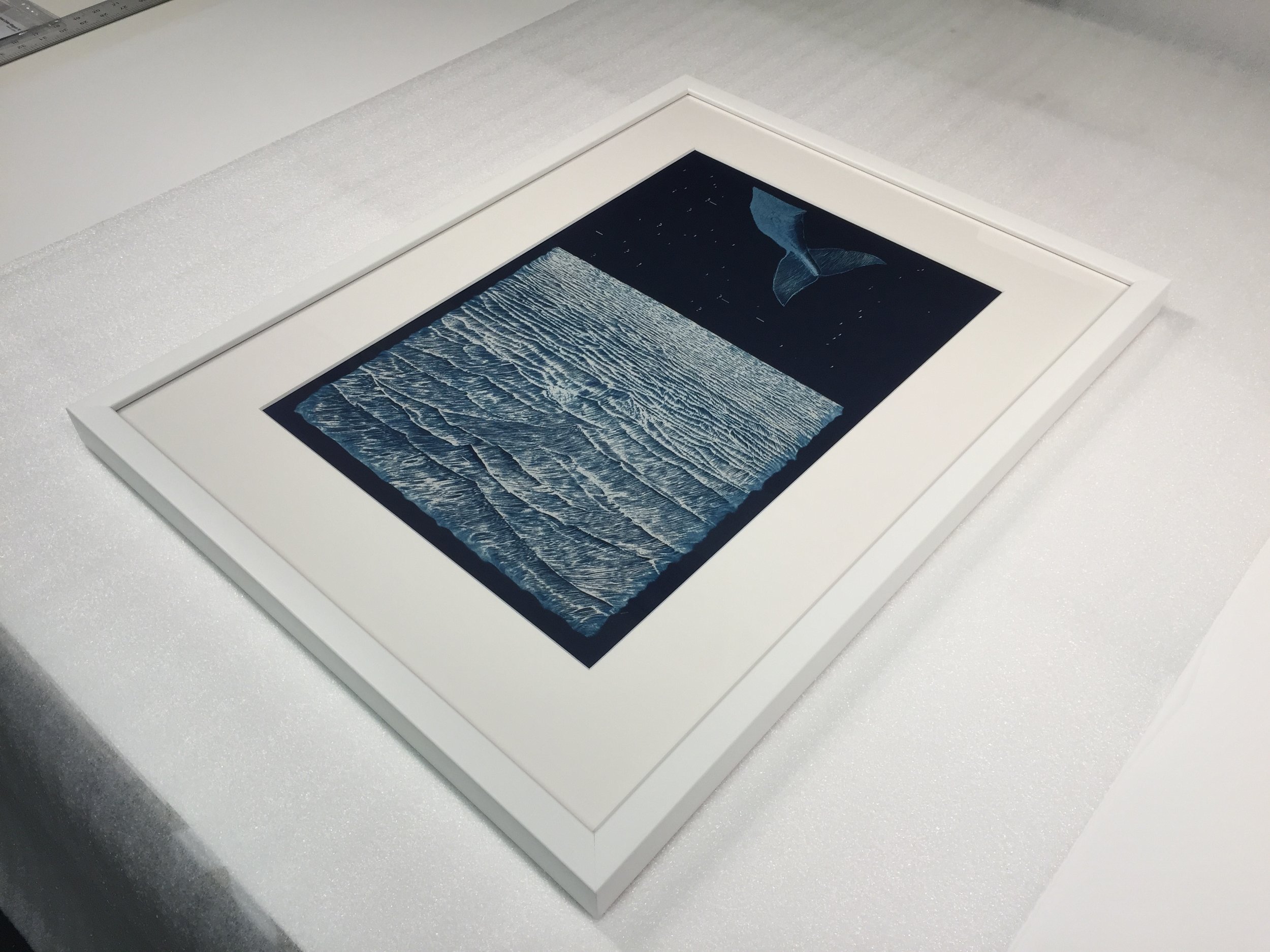
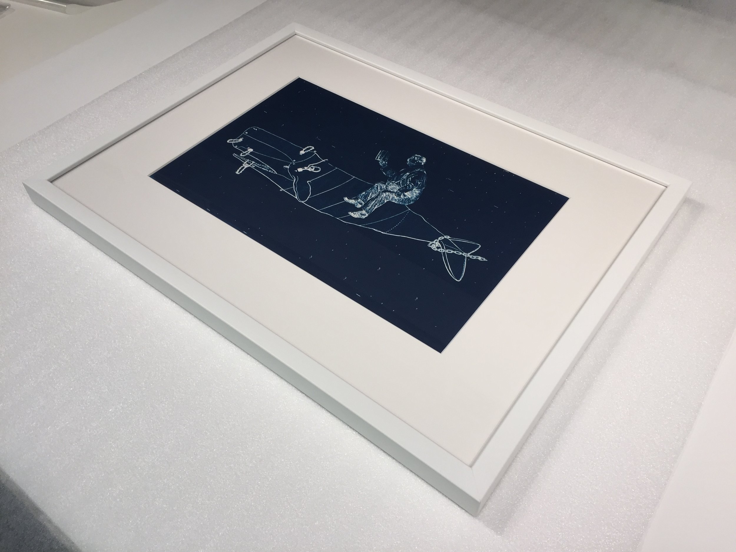
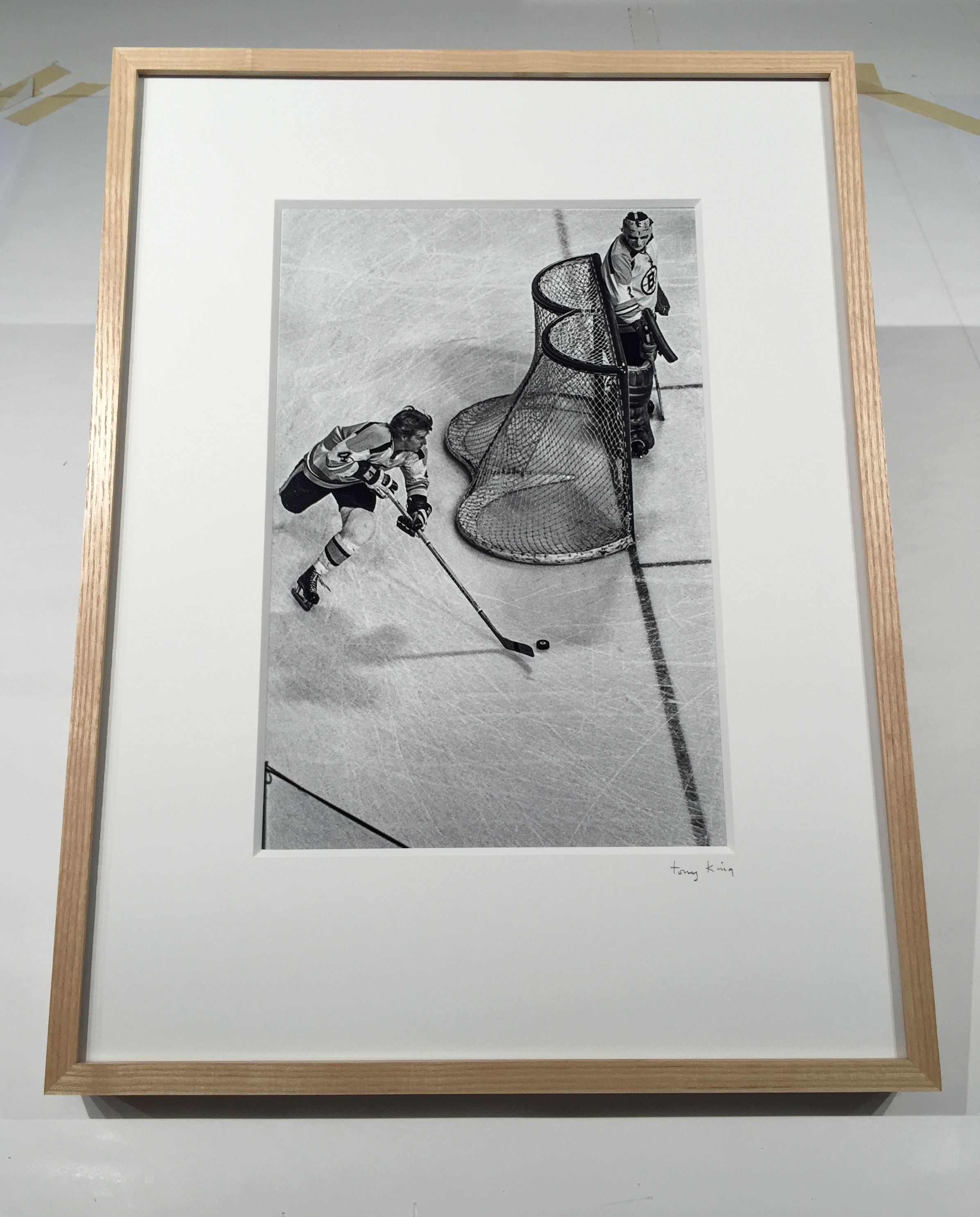
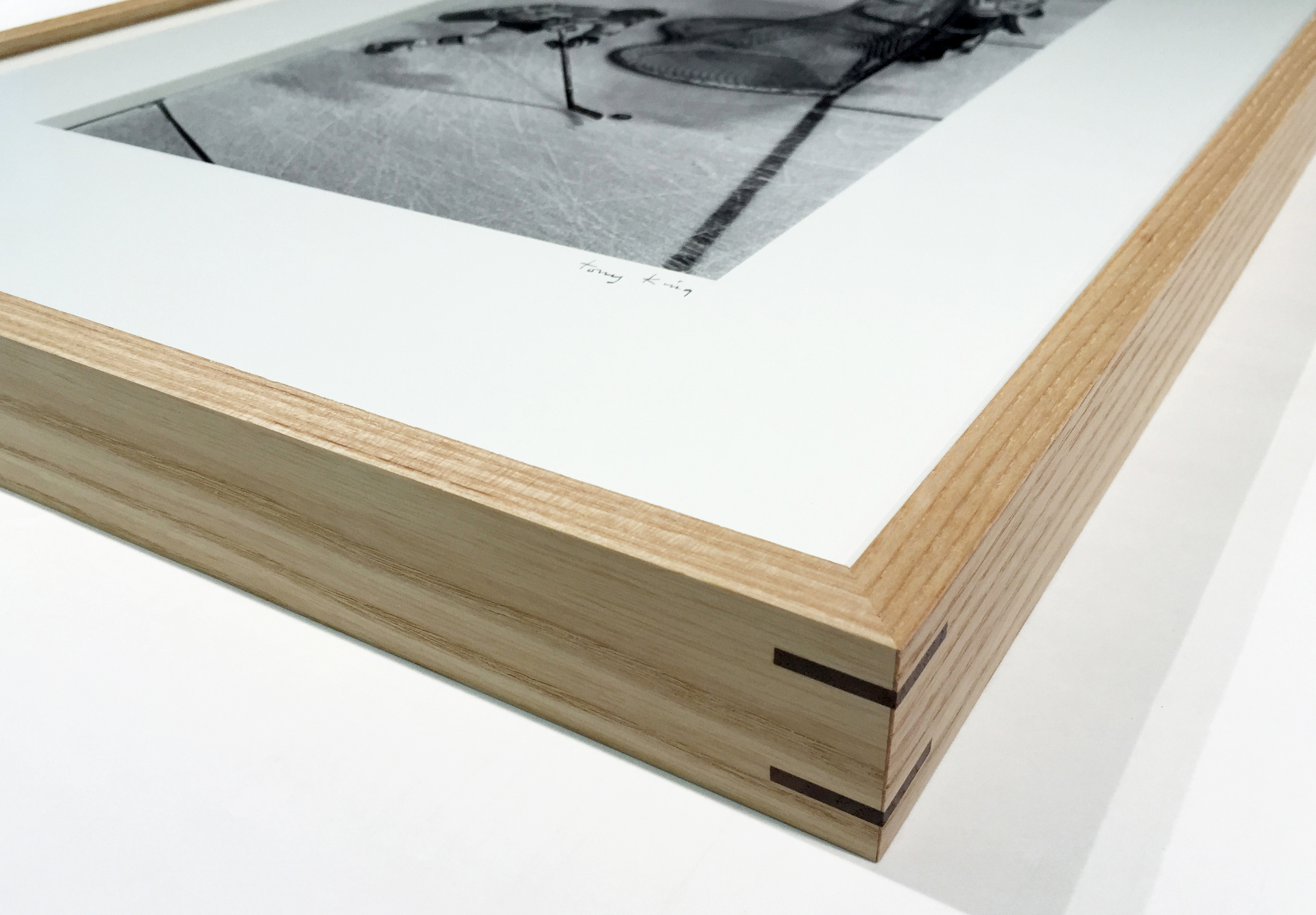
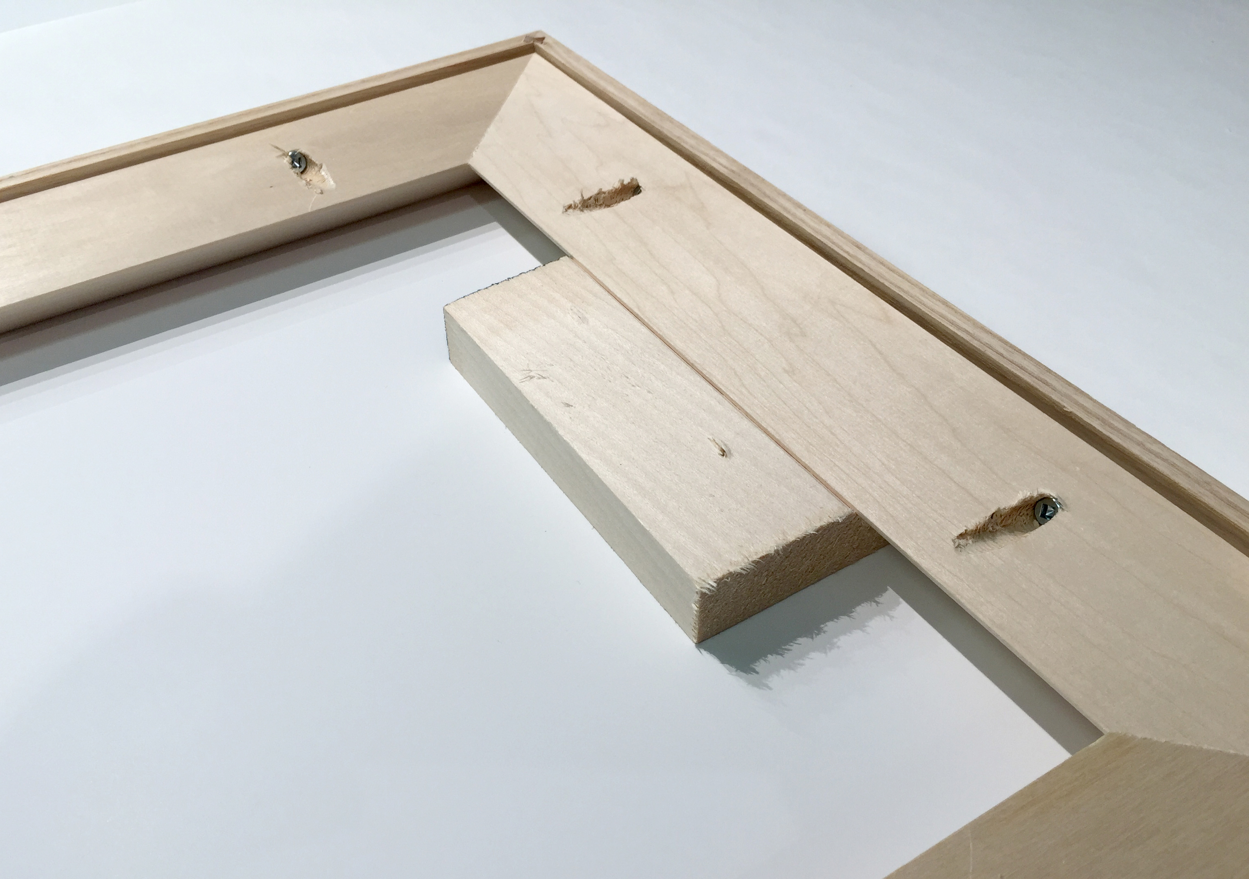
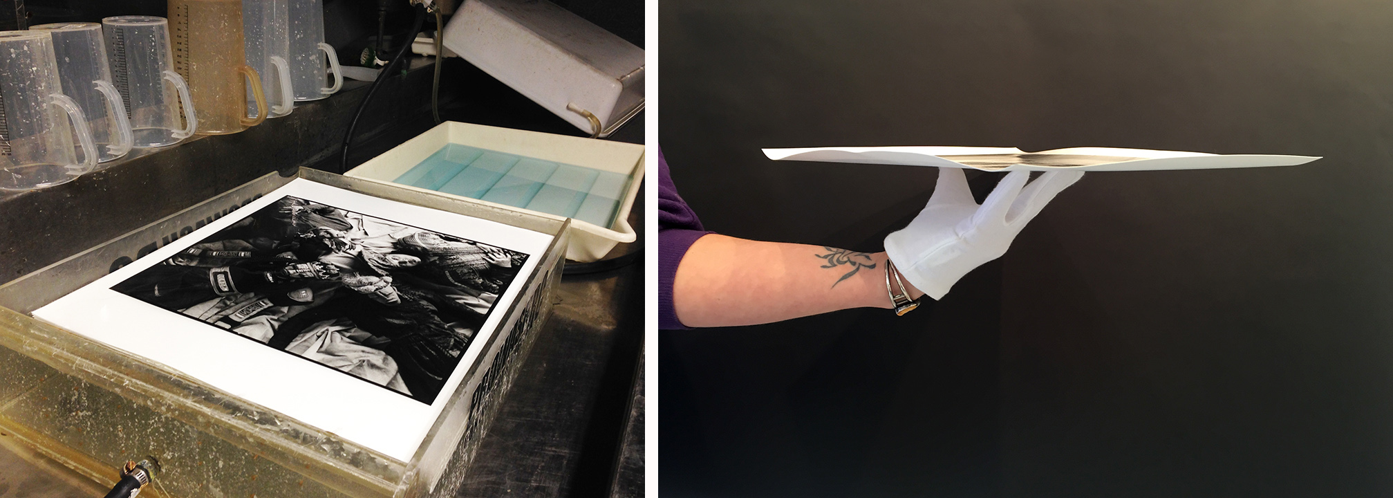
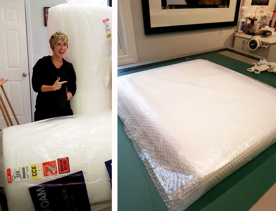
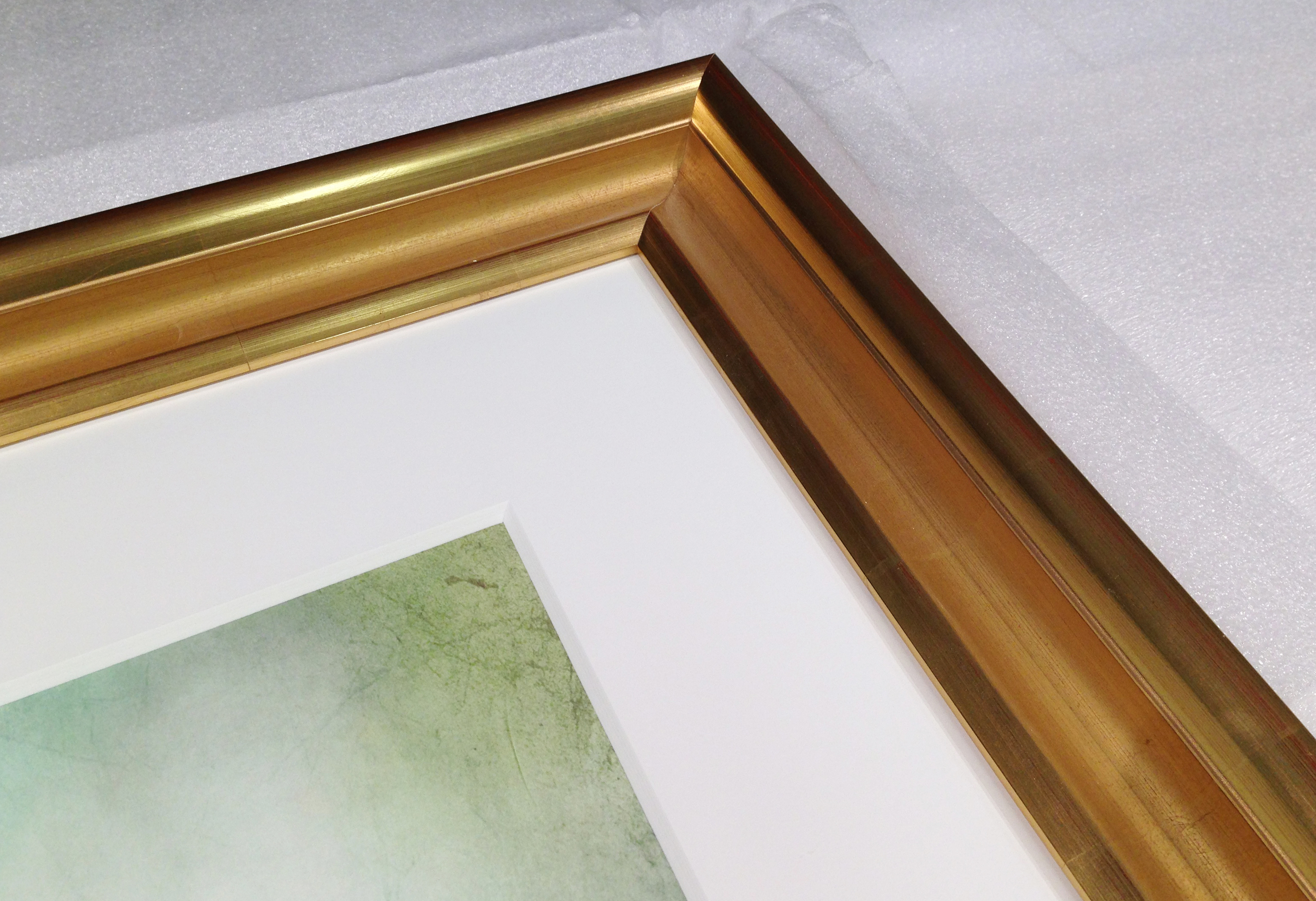
Another thing that many students worry about is the cost of printing and framing work. In the beginning, don't bother spending money printing on fancy papers. Use inexpensive paper to make smaller work prints. Until your work calls for larger sizes, there is no reason to shell out your hard earned money. If you get into a show and need to frame something, simple is usually best. Ask around. The people at the photo "cage" and your instructors will have some recommendations on places that will have what you need, either for do it yourself or full service framing. Don't be afraid to ask if they have a student discount. We here at Panopticon have a 15% discount with valid current student ID.
So, if you really want to purchase your own gear and software; make sure you will use them. Think of the 80/20 rule. Will you use it 80% of the time or 20% or the time? Do not buy it if you will only use it under special circumstances or just for one project. Most gear, if treated right, will last you a long time, take care of it and it will take care of you. If you feel you must purchase something, make sure you have tried it out for a while before you purchase. If your school doesn't have something there are brick and mortar and on line rental houses that probably do. They often have a weekend deal on rentals. Usually if you pick up on Friday and return Monday they don't charge for Sunday. Now with these places you are spending some money. This can be a good investment what if that piece of specialty gear just wasn't what you expected? or that camera really didn't make the images you wanted? some money spent but more saved.
What if it was all that and you have to have it? Well the used market is the place to start. Again ask around at your school. Chances are some one has something they bought and no longer need. If not those same instructors and "cage" staff know of the local or on line camera dealer where you can pick up what you need with a warranty at a fraction of the cost for new. Oh and those rental houses, they often are selling off gear they don't need any more some give them a look as well. Remember in a few years you might be the one putting up flyers to sell that piece of gear you needed so badly. It happens, what you thought you would be doing for the rest of your life in freshman year might be very different from what you are doing in your senior year. This is what college is for figuring all this out, finding what it is you want to do and growing as an artist and person.
Our best advice is to save your money for food, rent, and / or experiences that you would like to have in your college years before you graduate and lose access to all the wonderful things in the "lock up/Cage" for ever. Rent before you buy, and buy used from a reputable dealer if you do decide to buy. That and make lots of work!


