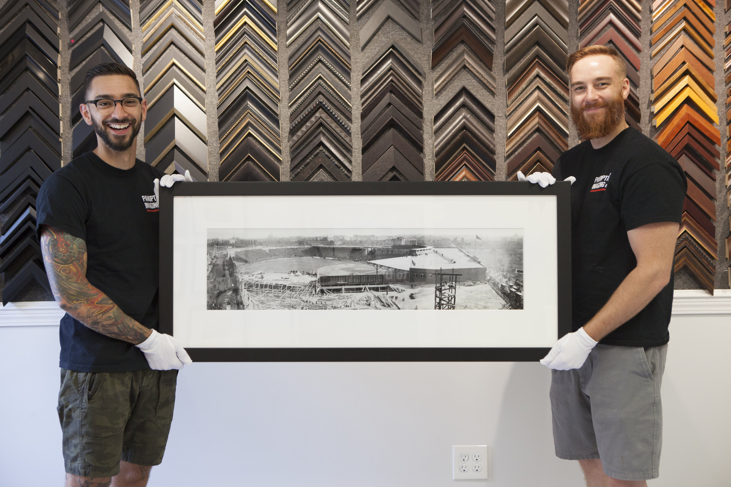
Submitting to calls for art is one of the most effective ways to build your exhibition history, gain visibility, and connect with galleries and curators. Whether you’re an emerging artist or have been exhibiting for years, a strong submission can make a significant difference for your art career.
Since we’re currently reviewing entries for First Look 2026, we wanted to share some helpful tips that apply to any call for art, while also giving you a sense of what we value at Panopticon Gallery.
1. Choose Work That Represents Your Current Artistic Voice
Most juried calls look for work that feels fresh, relevant, and reflective of where you are creatively. Select pieces that show what you’re exploring now, rather than older work that no longer aligns with your direction.
For First Look 2026, we especially appreciate submissions that show clarity of intention—whether the work is finished, experimental, or part of a developing series.
2. Edit Your Selection Thoughtfully
A cohesive submission is almost always stronger than a broad or varied one. Aim to choose works that speak to each other visually or conceptually.
For First Look, a focused submission shows us how your ideas connect, and it helps us understand your voice quickly and clearly.
3. Keep Your Artist Statement Clear and Concise
Jurors and curators appreciate statements that are readable, honest, and to the point. Avoid overly academic language unless it truly fits your practice.
For example, a strong statement for First Look might include:
Your subject, themes or questions.
Personal connection, or what drives the work you submitted.
Your artistic process.
No need for long essays, clarity and a strong personal connection is more impactful than length.
4. Share a Bit About Your Process
Many jurors appreciate knowing how the work was made, especially if your process directly informs the message of your project. Whether you use alternative processes, digital manipulation, or mixed media, a short explanation can often deepen our understanding.
For First Look, process notes are especially helpful because our audience loves both photographic craftsmanship and conceptual experimentation.
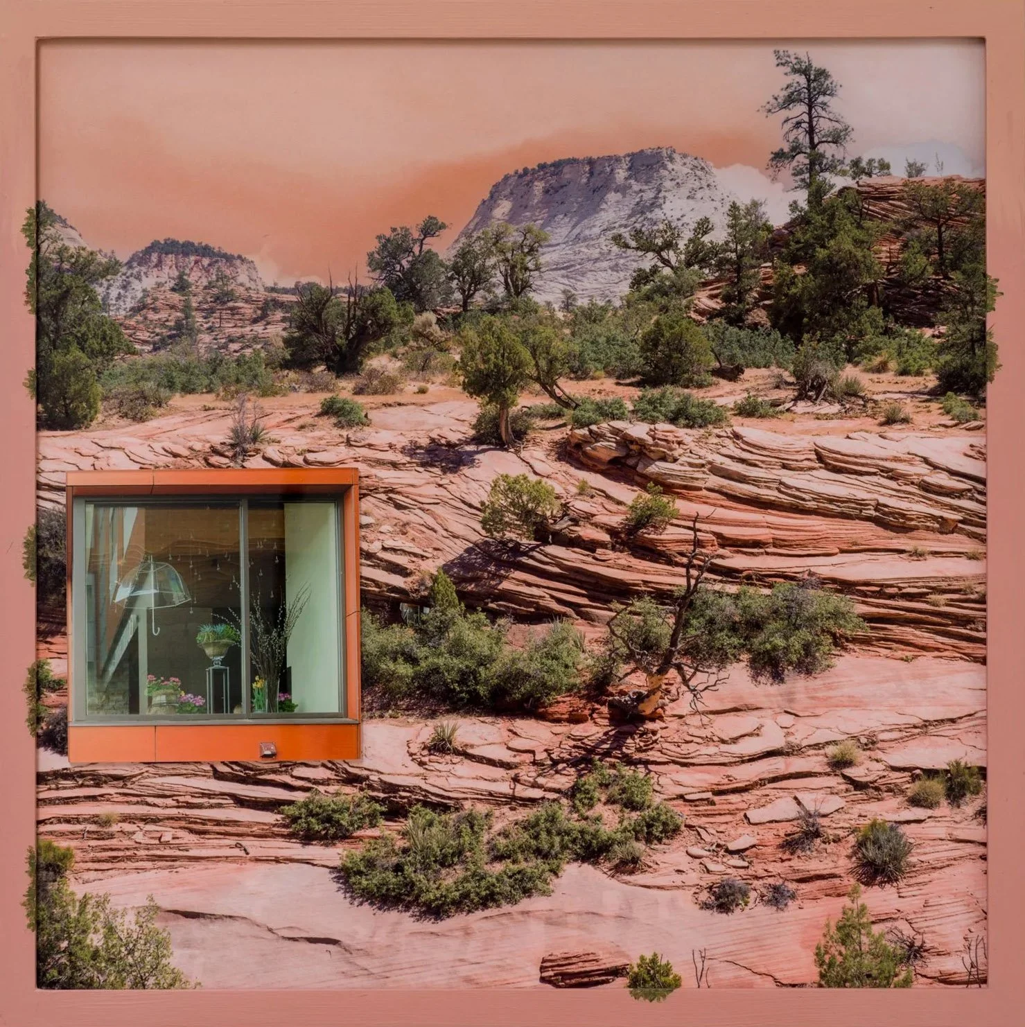
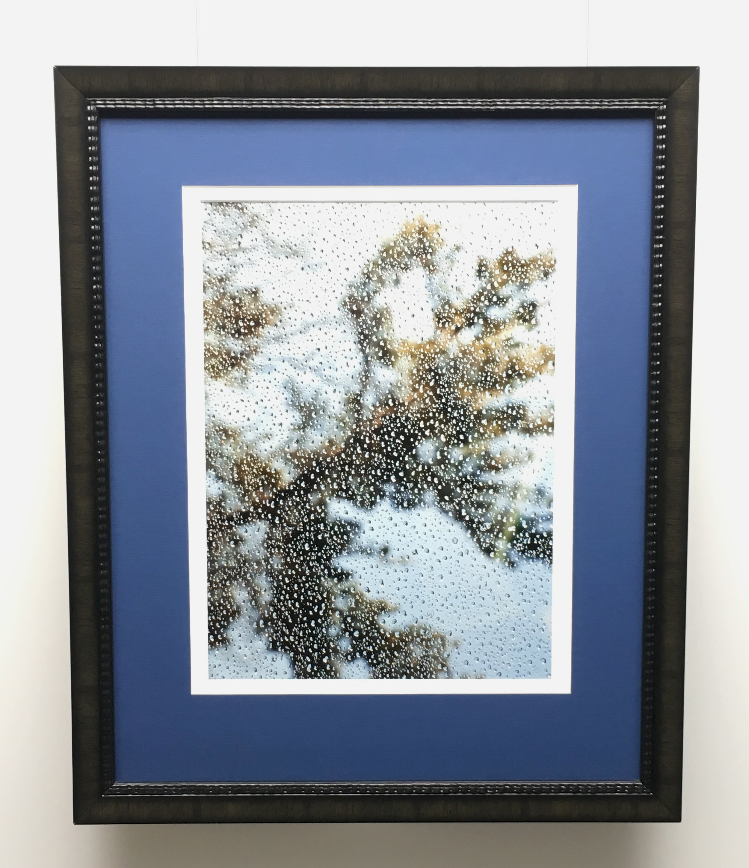
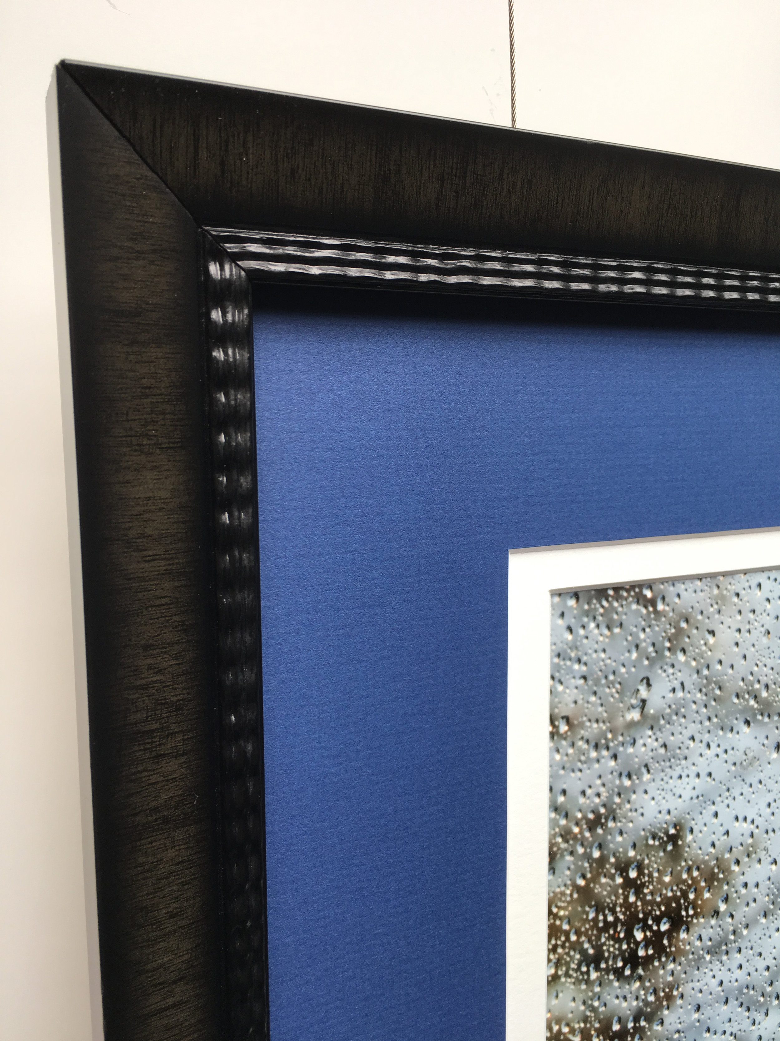
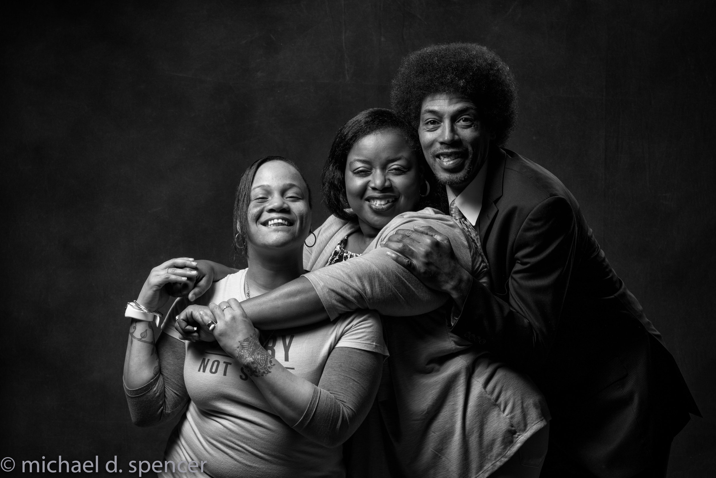
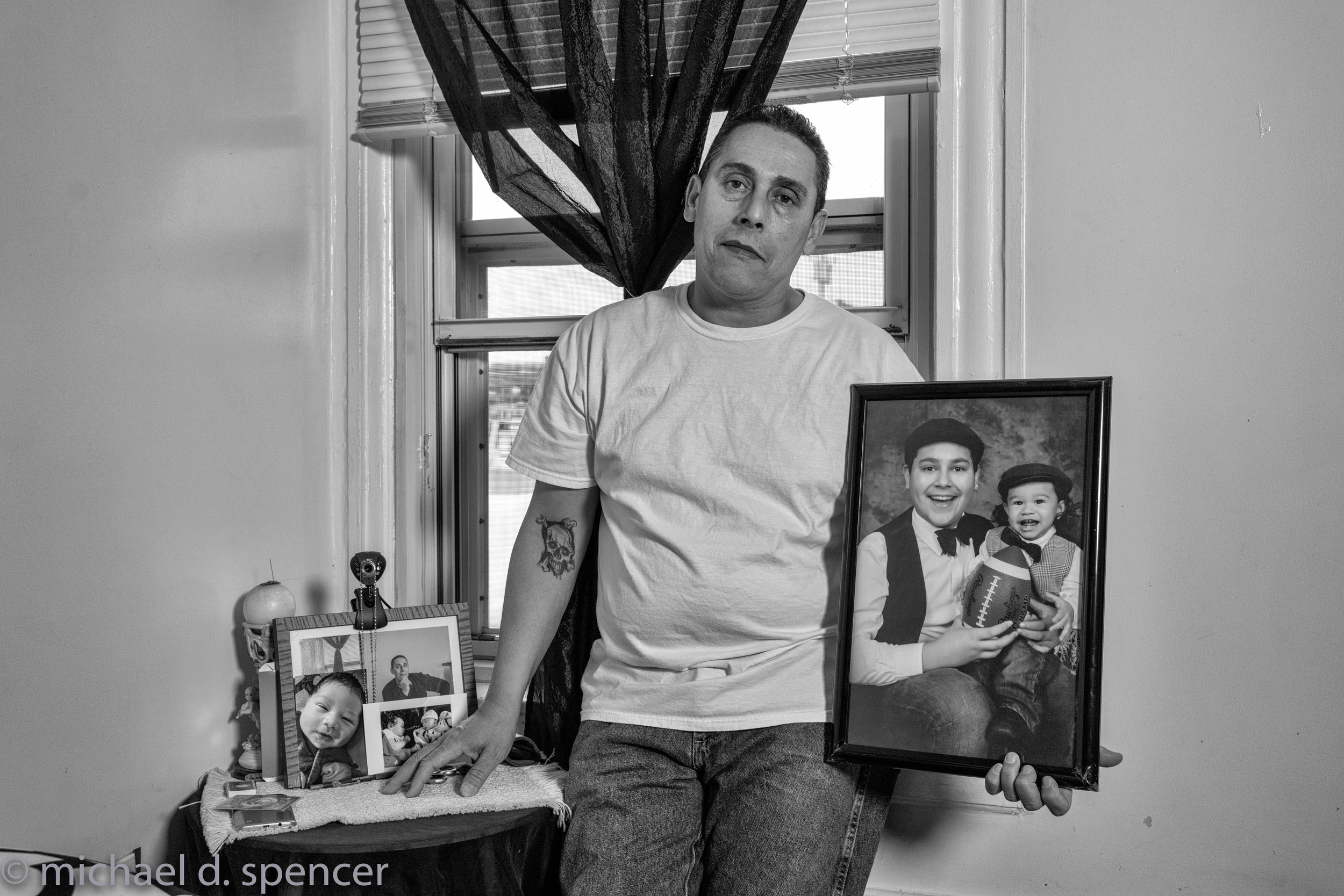
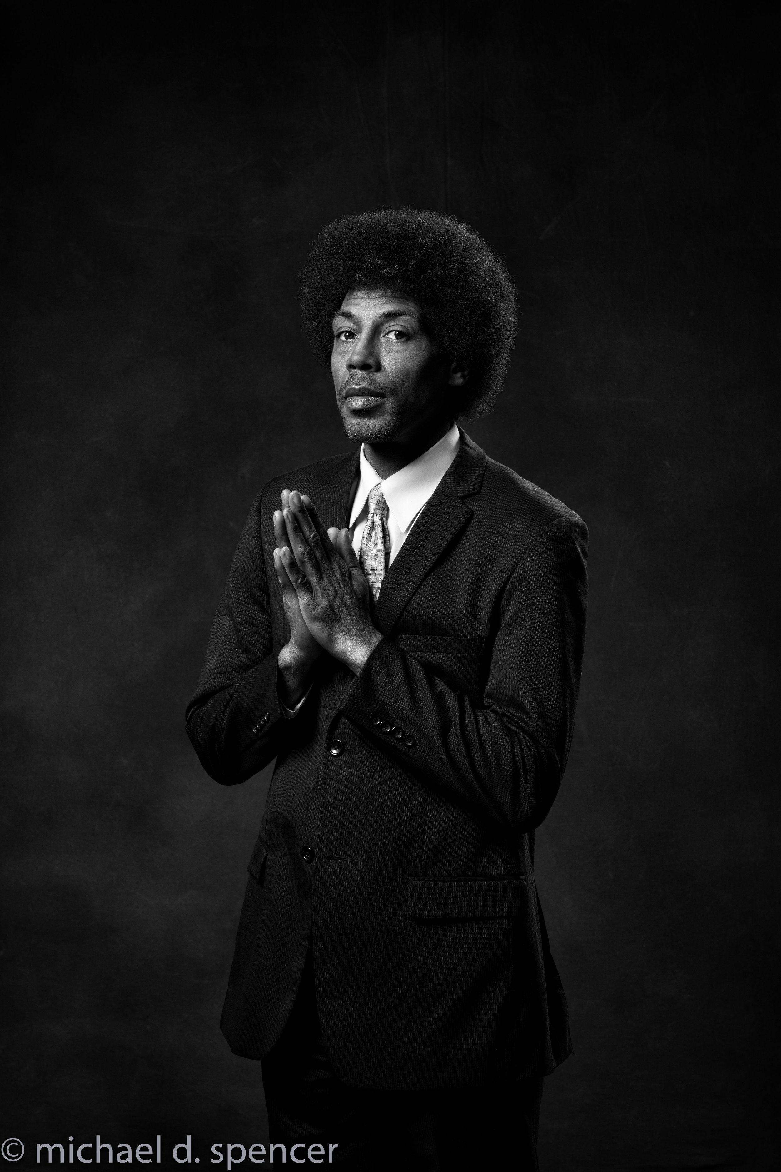
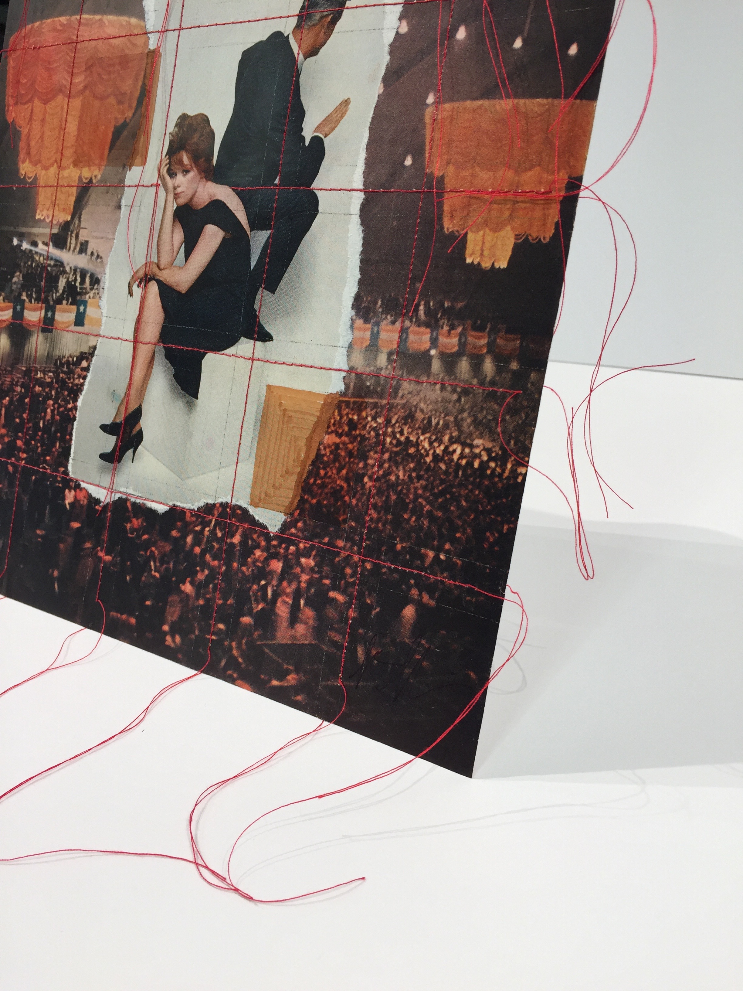
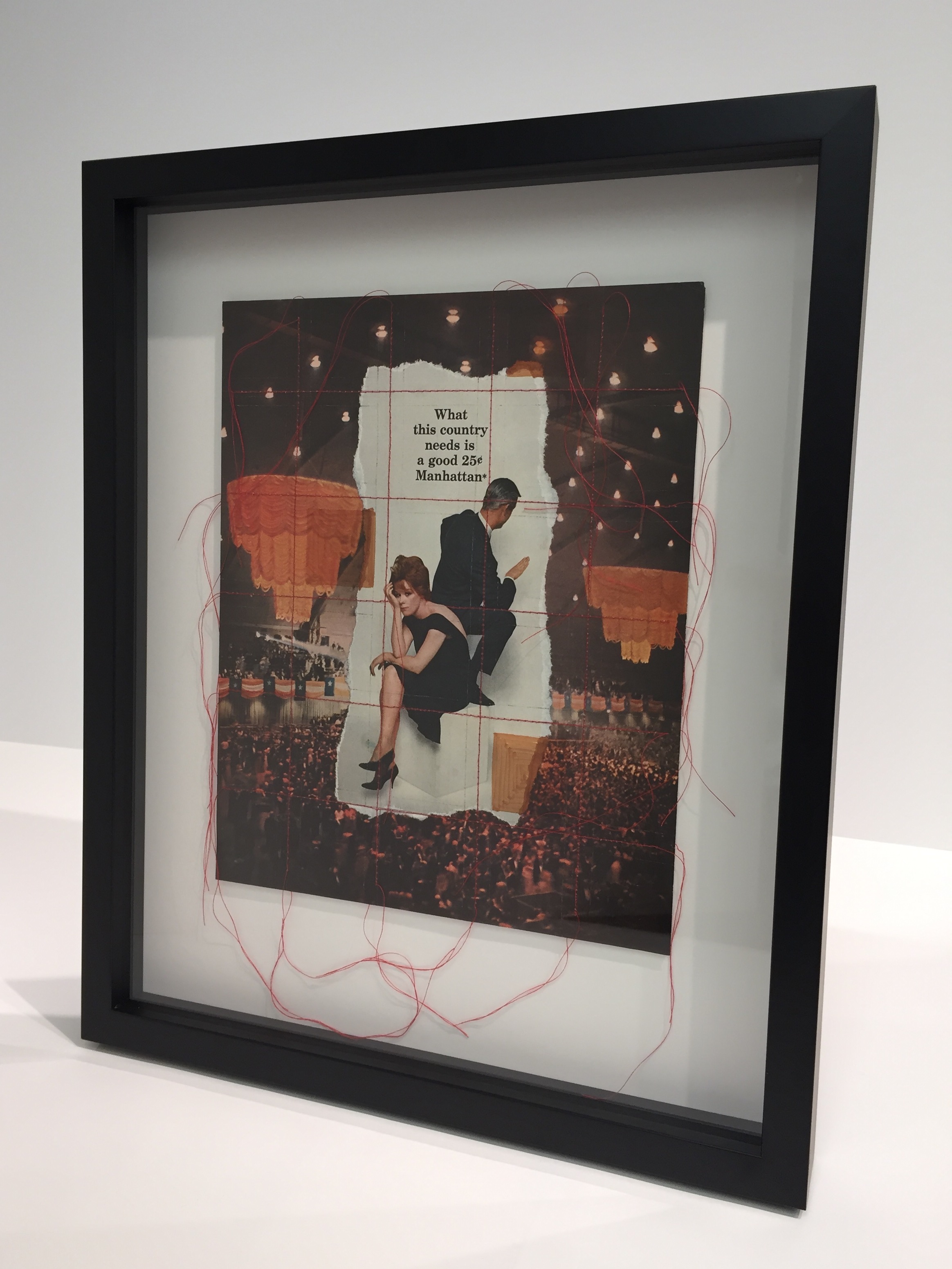
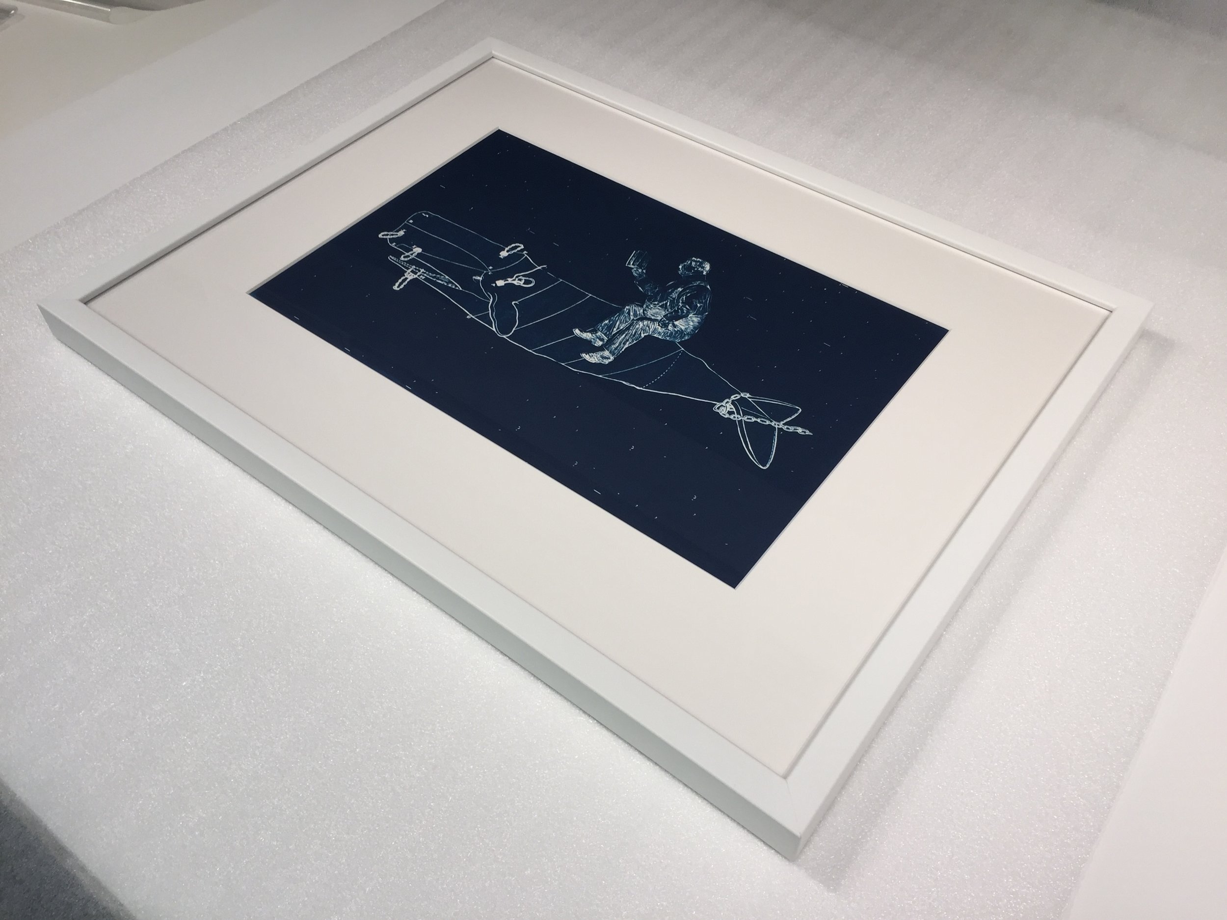
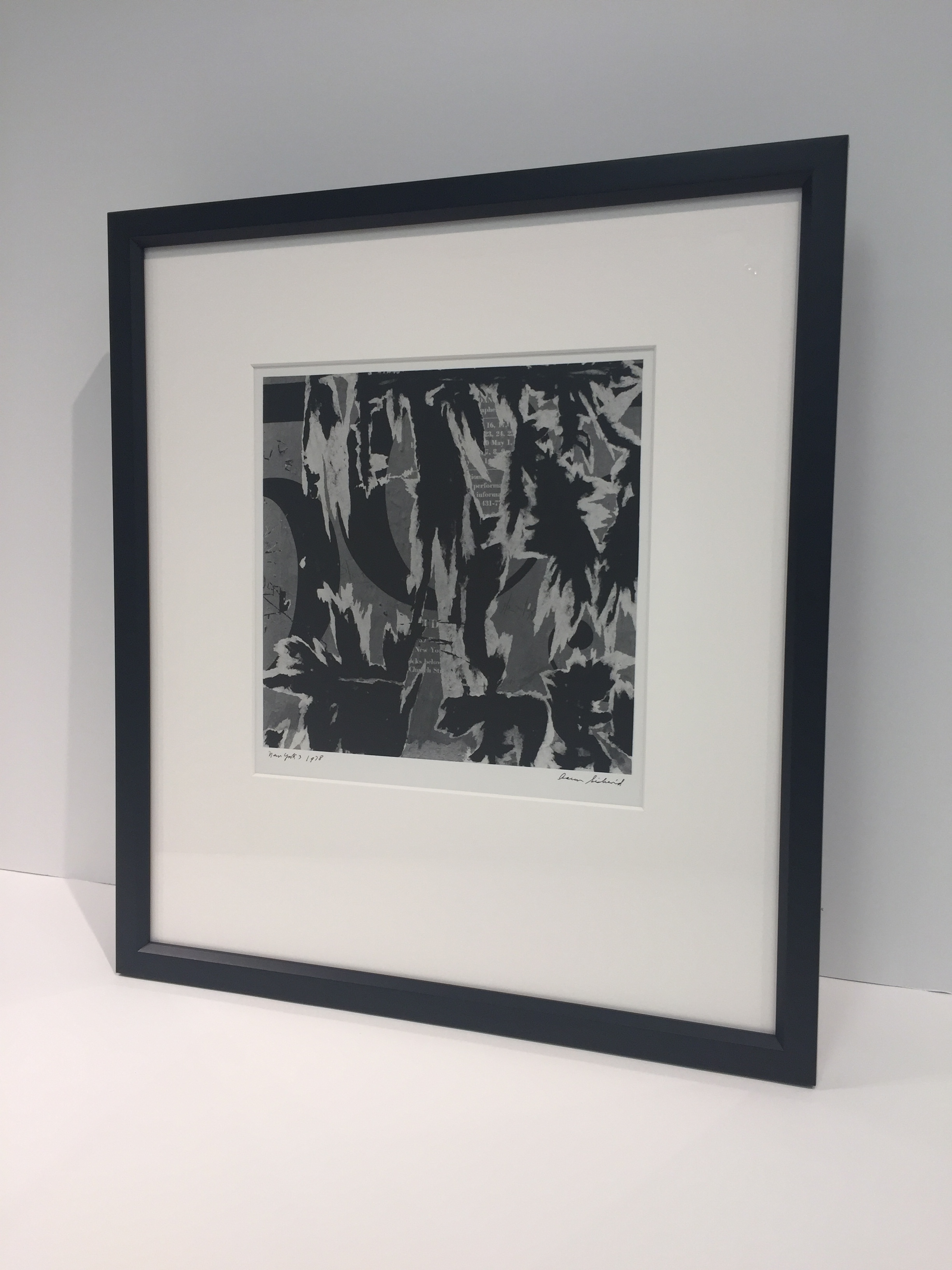
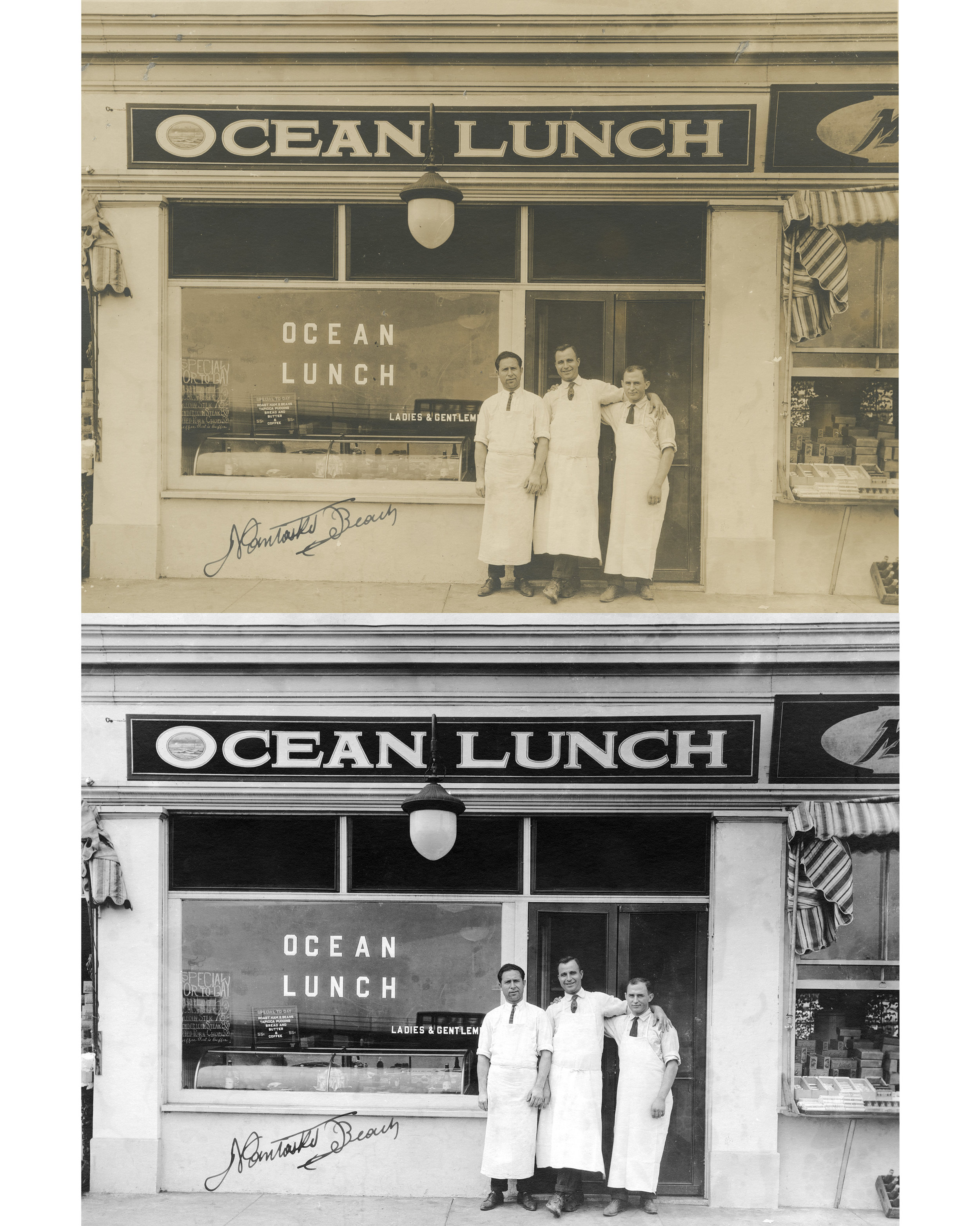
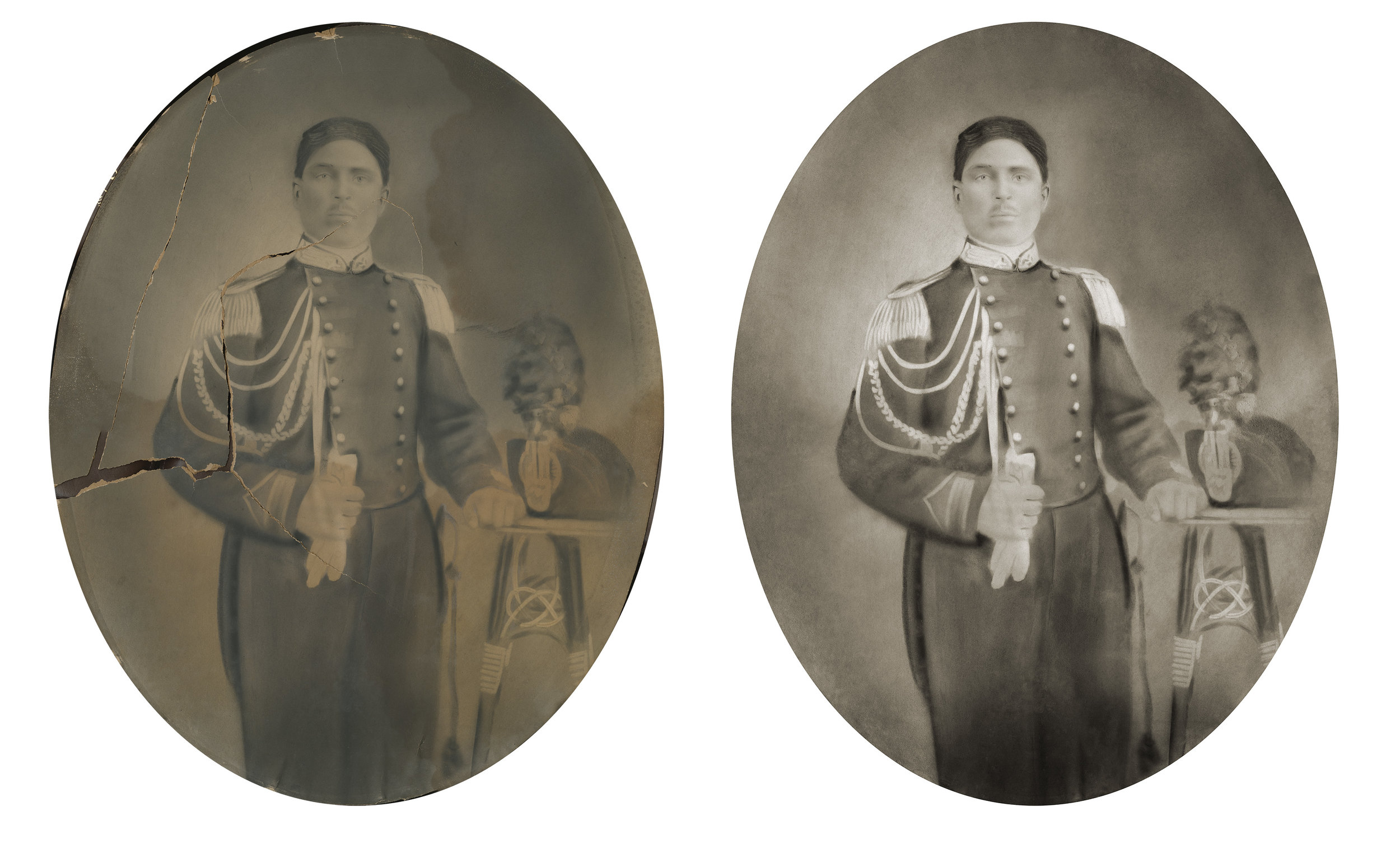
Image: Diana Nygren Cheren, Chance of Rain, First Look 2026
5. Follow File Guidelines Carefully (Size, Format, and Color Space Matter)
Most calls for art (especially photography-focused ones like First Look) rely entirely on digital files for the jurying process. Because of that, following the technical guidelines exactly is one of the most important, and most overlooked, parts of a strong submission.
Every gallery has slightly different requirements, but here are the essentials:
Match the requested file size and dimensions
Oversized files may not upload correctly, and undersized files can look pixelated or blurry during review. If a call asks for, say, 1500px on the long side or under 5MB, stick to it.Use the correct file format
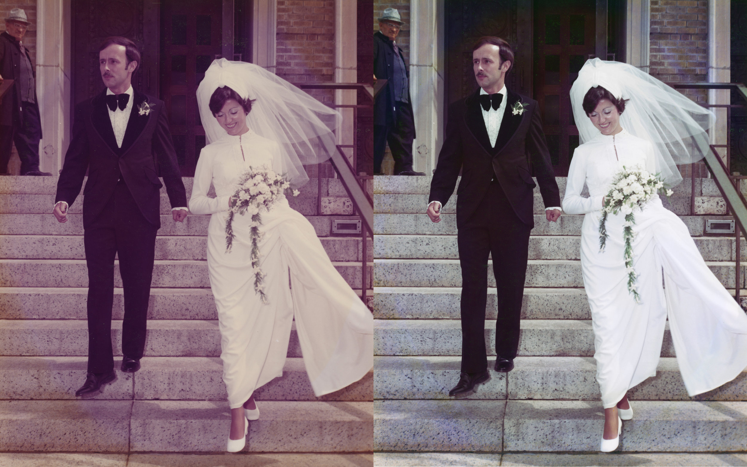
Most galleries (including Panopticon Gallery) prefer JPEGs because they load quickly. Avoid TIFFs, PSDs, or HEICs unless requested.Export in the requested color space
Calls often specify sRGB, as this is the preferred profile for digital viewing, which ensures consistent color across screens. Submitting files in AdobeRGB or ProPhoto can lead to muted or inaccurate colors when viewed by jurors, preventing your work from being viewed as you intended..Name your files clearly
Use the naming format provided by the call, usually something like:
LastName_FirstName_Title.jpg
Clear filenames help keep your submission organized for jurors during the review process.Avoid heavy compression
Over-compressed images show artifacts, banding, and loss of detail. Aim for high-quality JPEGs that meet the size guidelines without sacrificing clarity.Check your brightness and contrast on multiple screens
What looks correct on one device may appear too dark or washed out on another. A quick check on a second screen can make a big difference.
For First Look 2026, clean, properly exported files allow us to evaluate your work fairly and accurately. They help your images stand out for the right reasons.
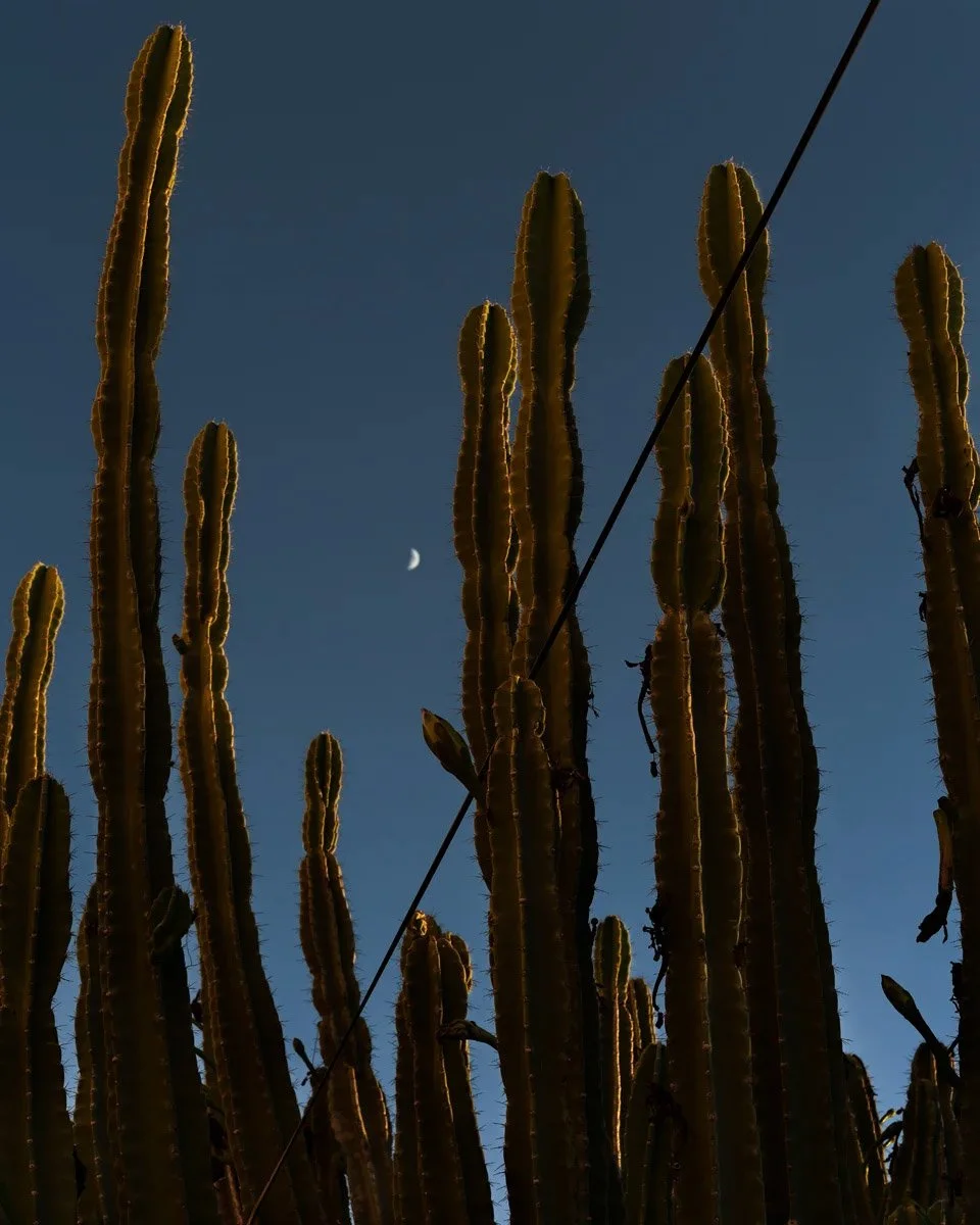

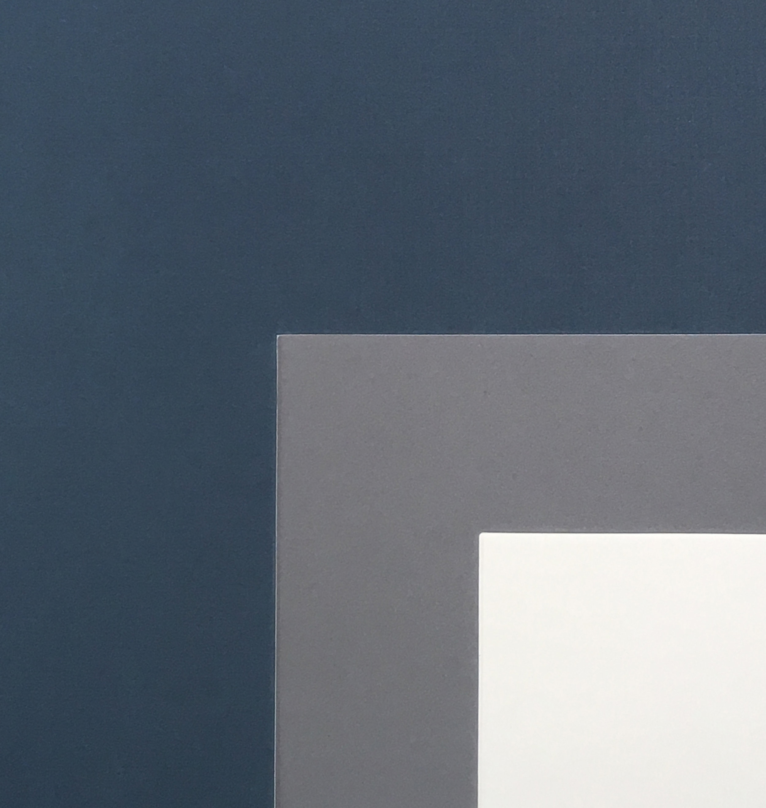
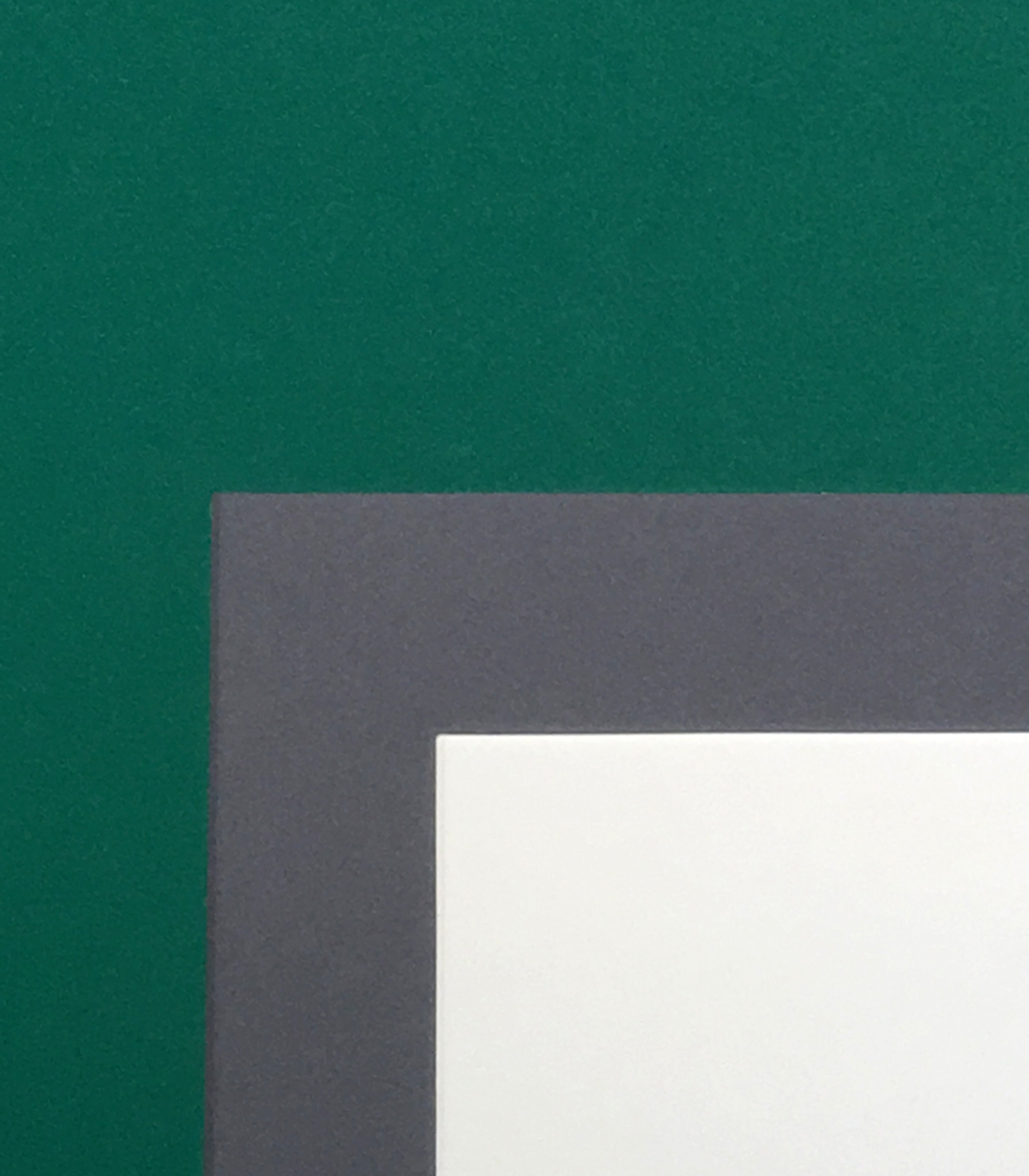
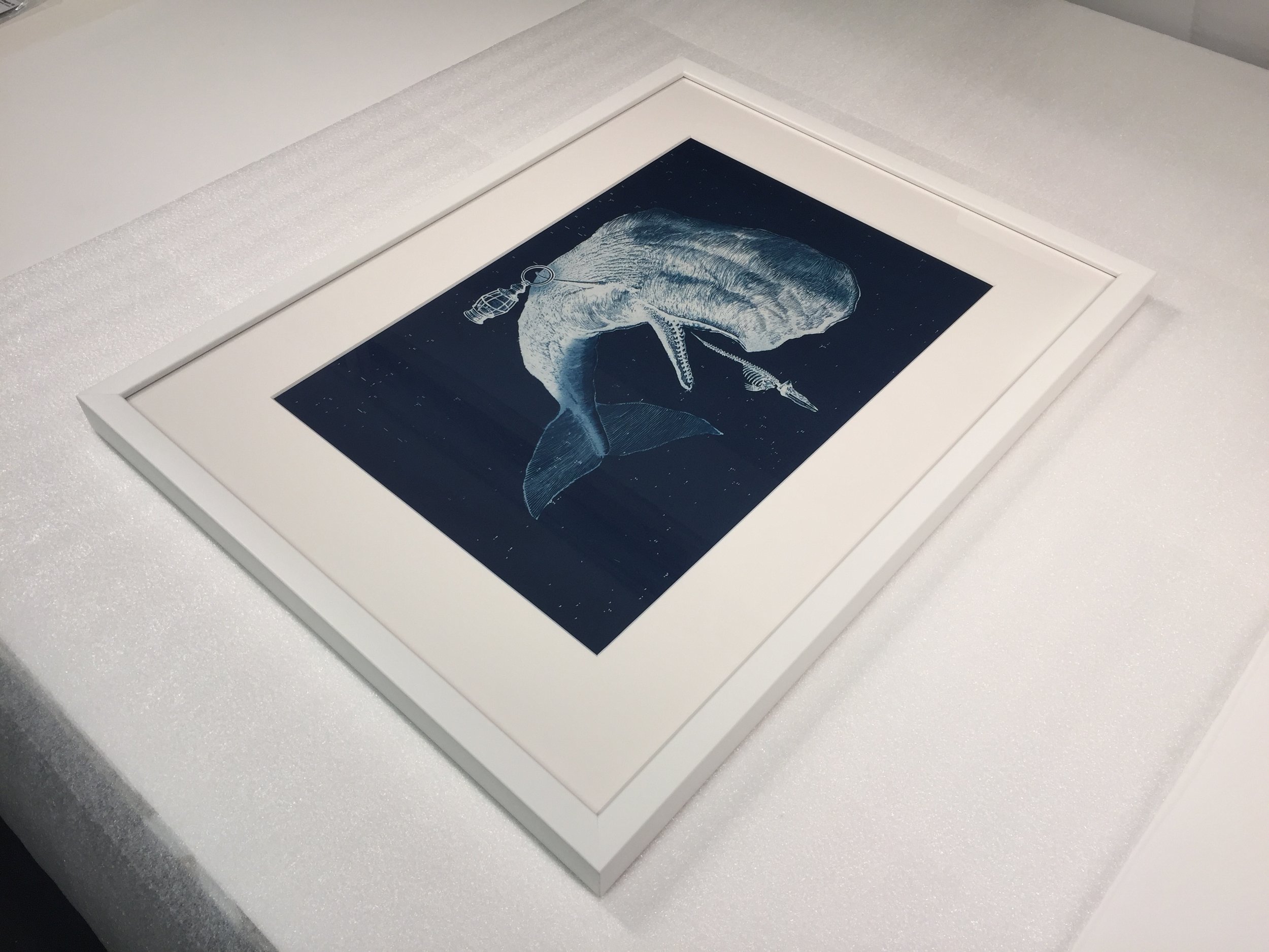
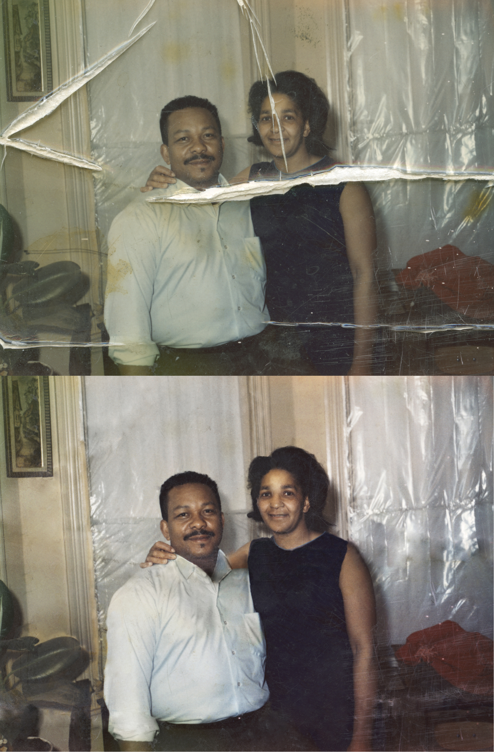
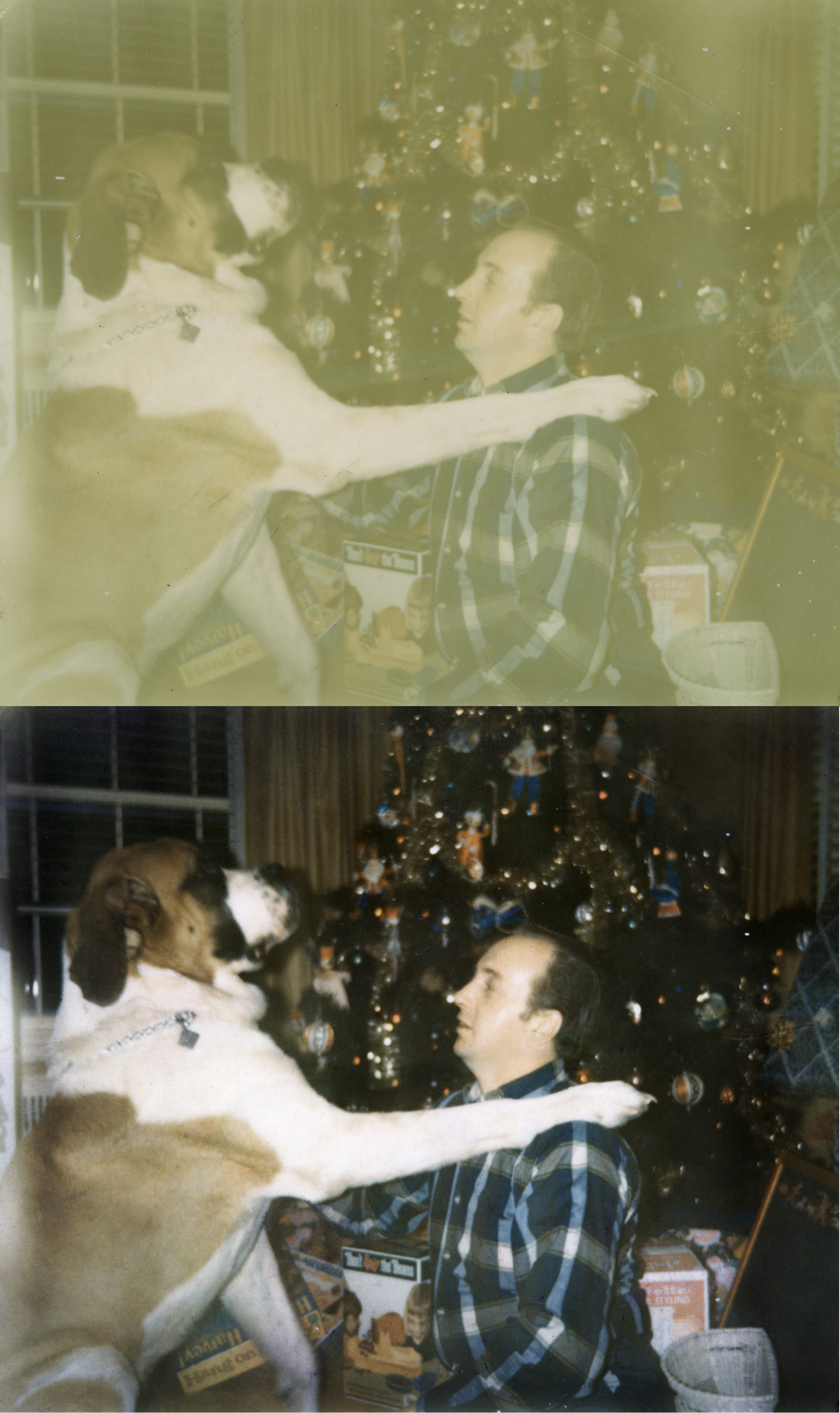
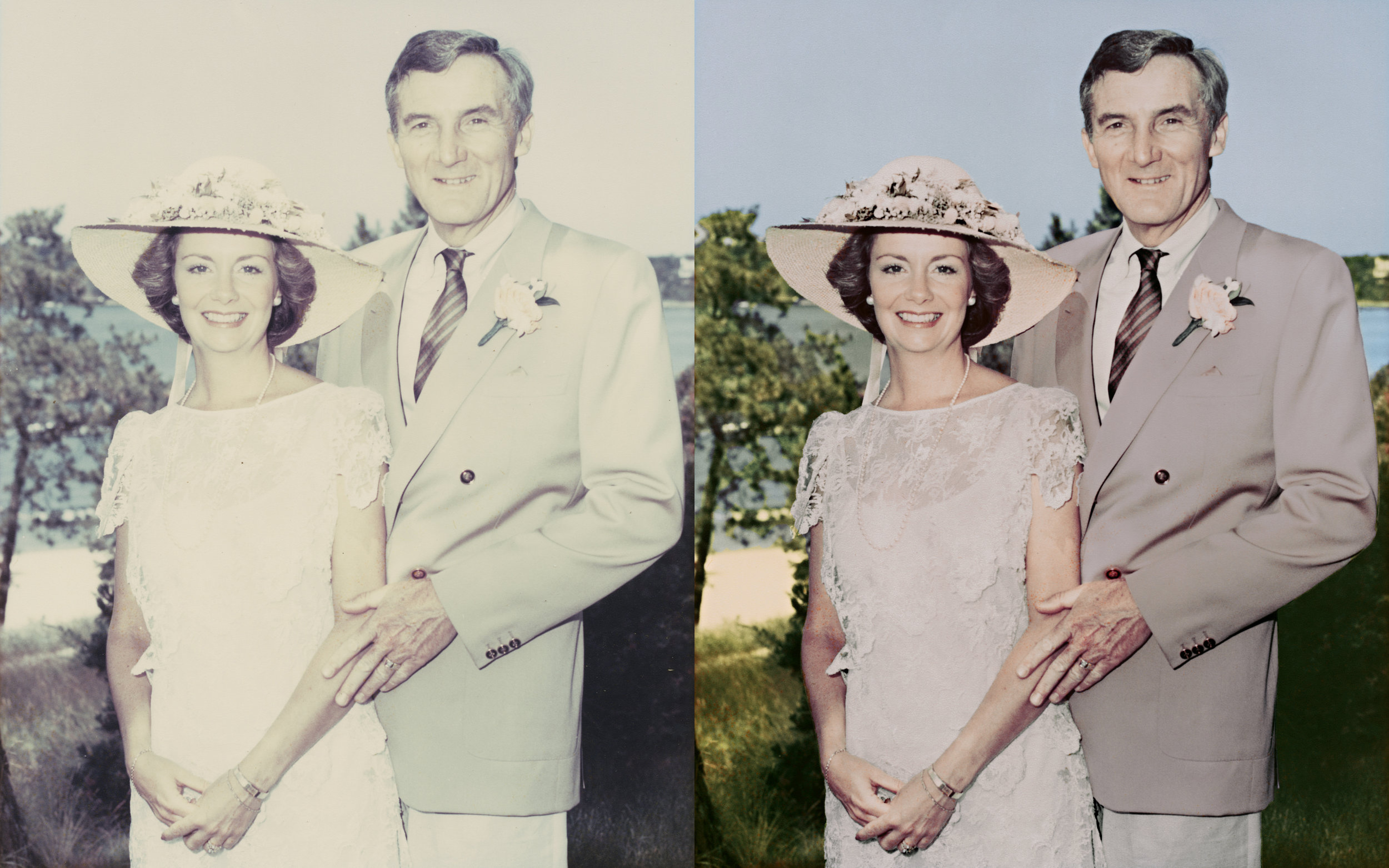
Left image shows the file exported correctly with sRGB, while the image on the right was incorrectly exported as ProPhoto. Note the differences in saturation, color, and contrast which change the way the image is represented. Image by Alexa Cushing
6. Consider How the Work Lives in Space
Even if the call doesn’t ask for presentation details, think about scale, context, and how the piece might appear in a gallery. This helps you select your strongest work and can guide you in describing it.
Because First Look is a gallery exhibition, we often envision how each piece could function on the wall or in conversation with other works throughout our jurying process.
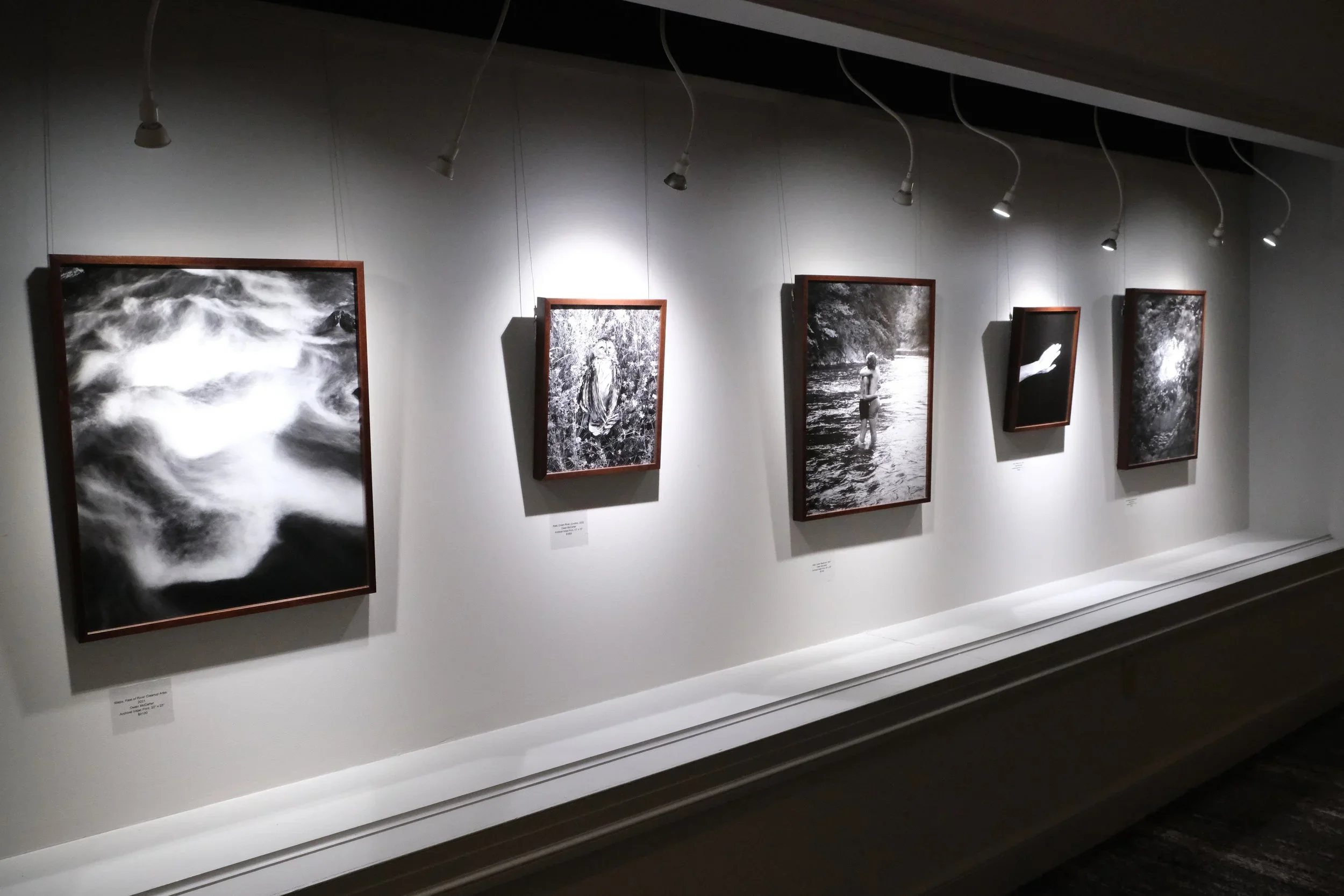
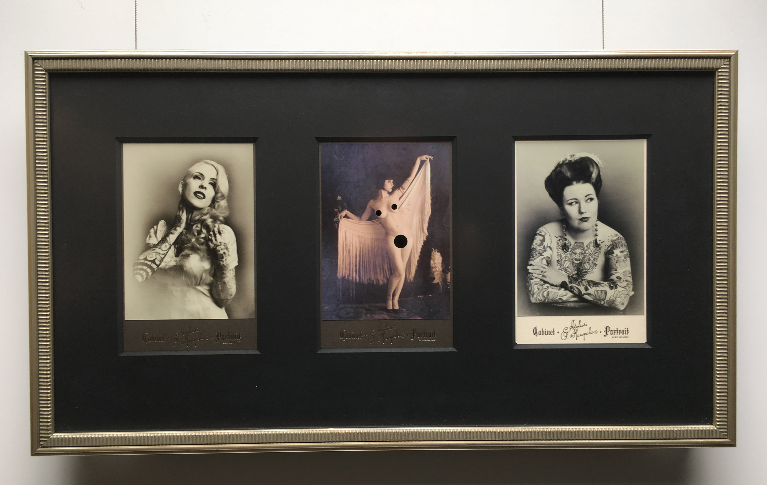
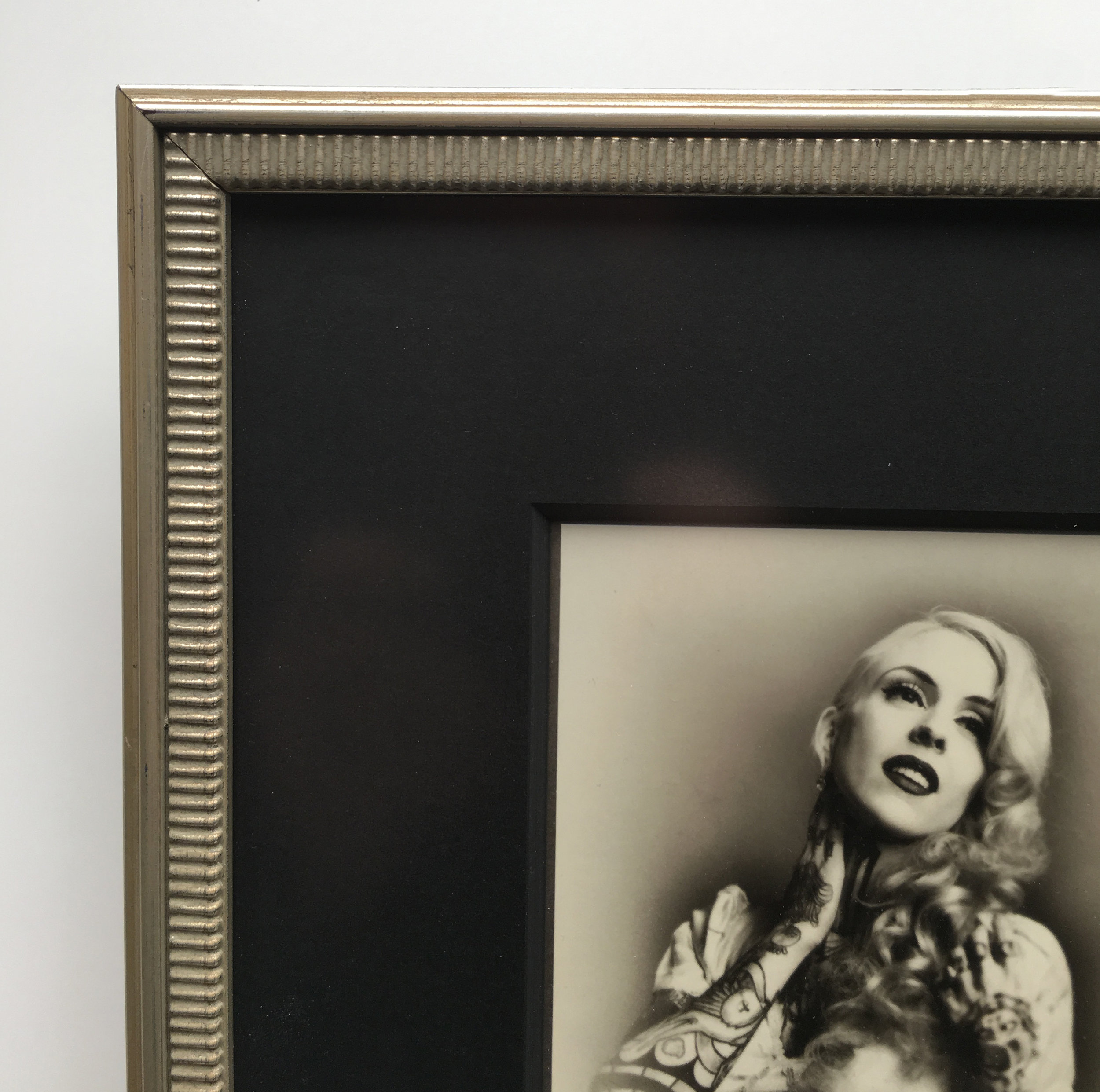
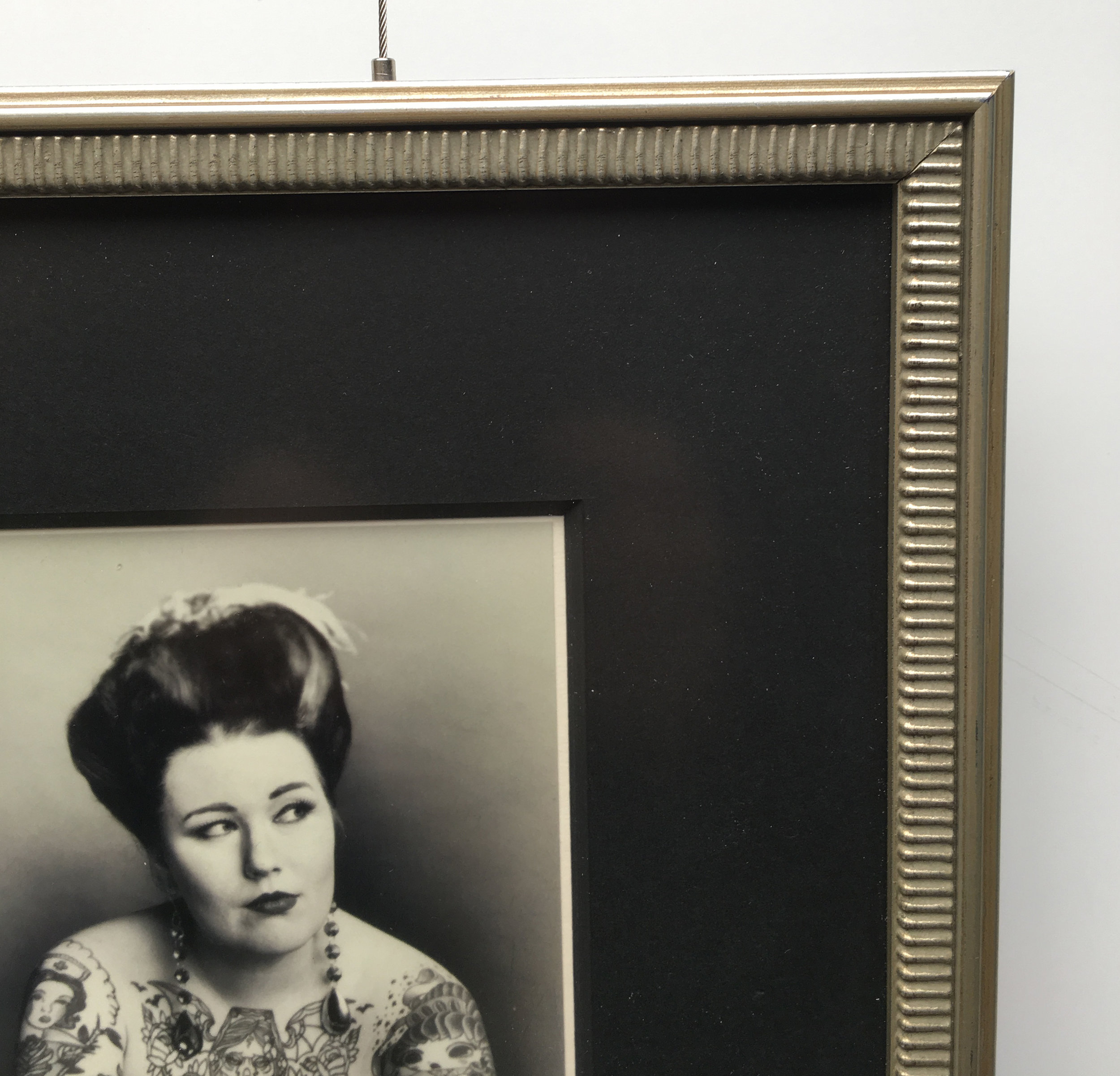
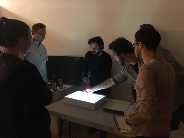
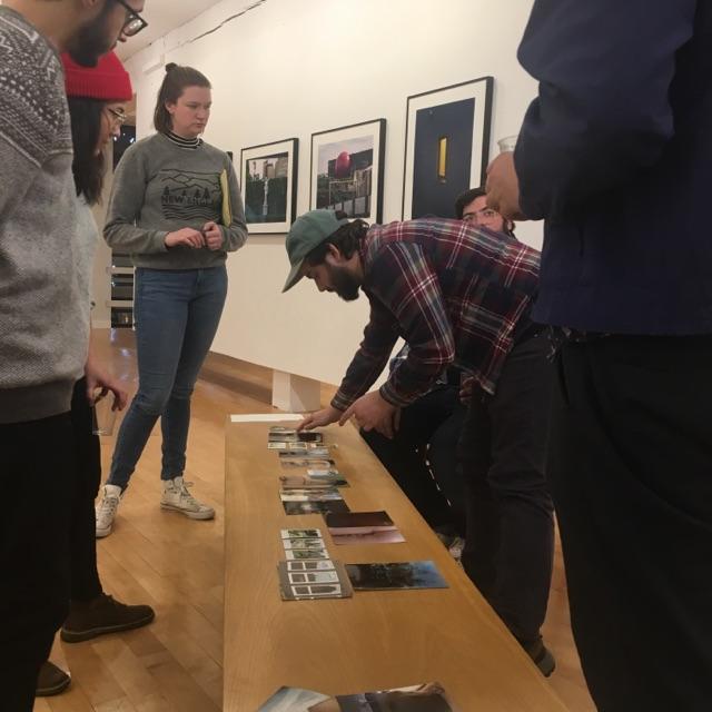
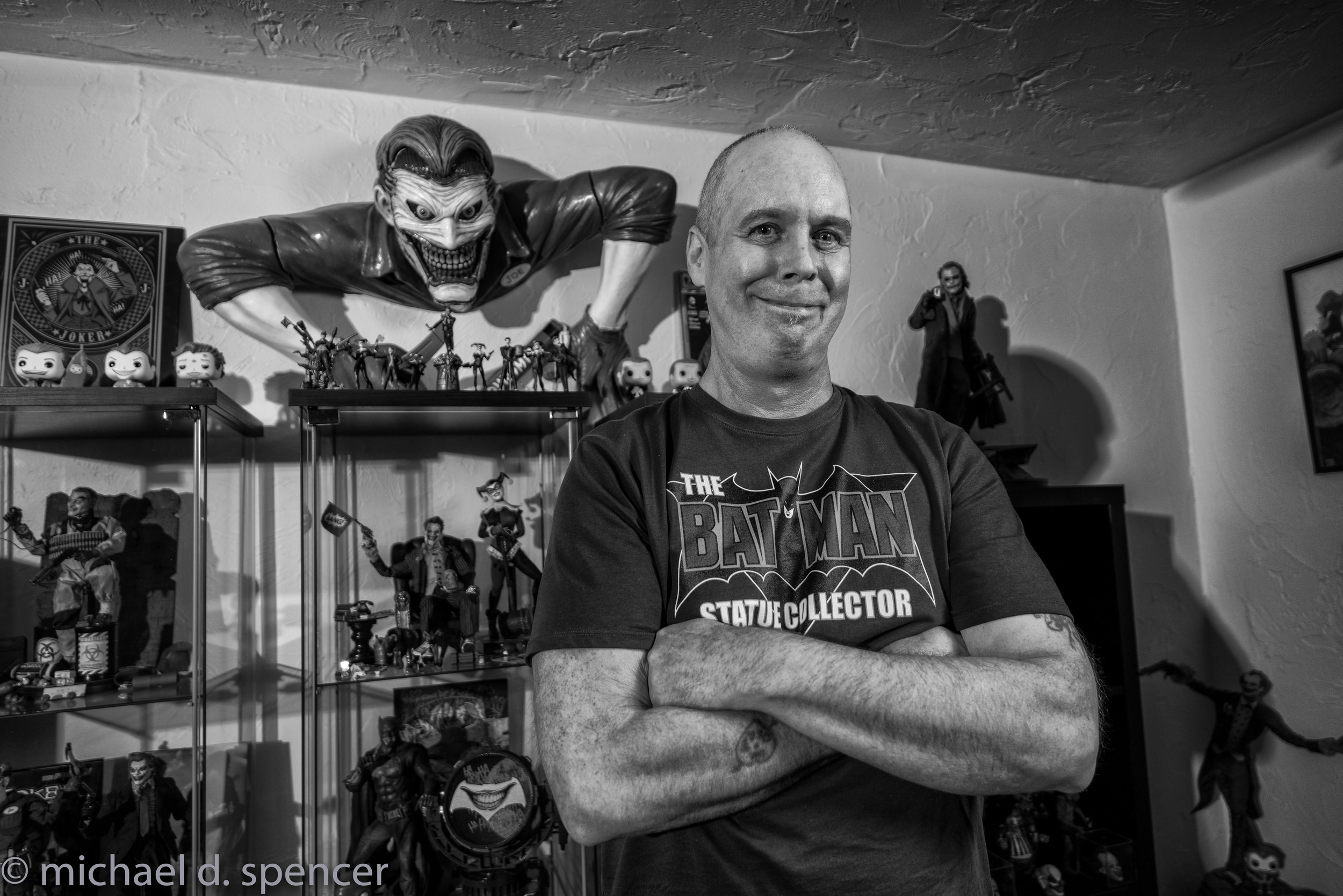
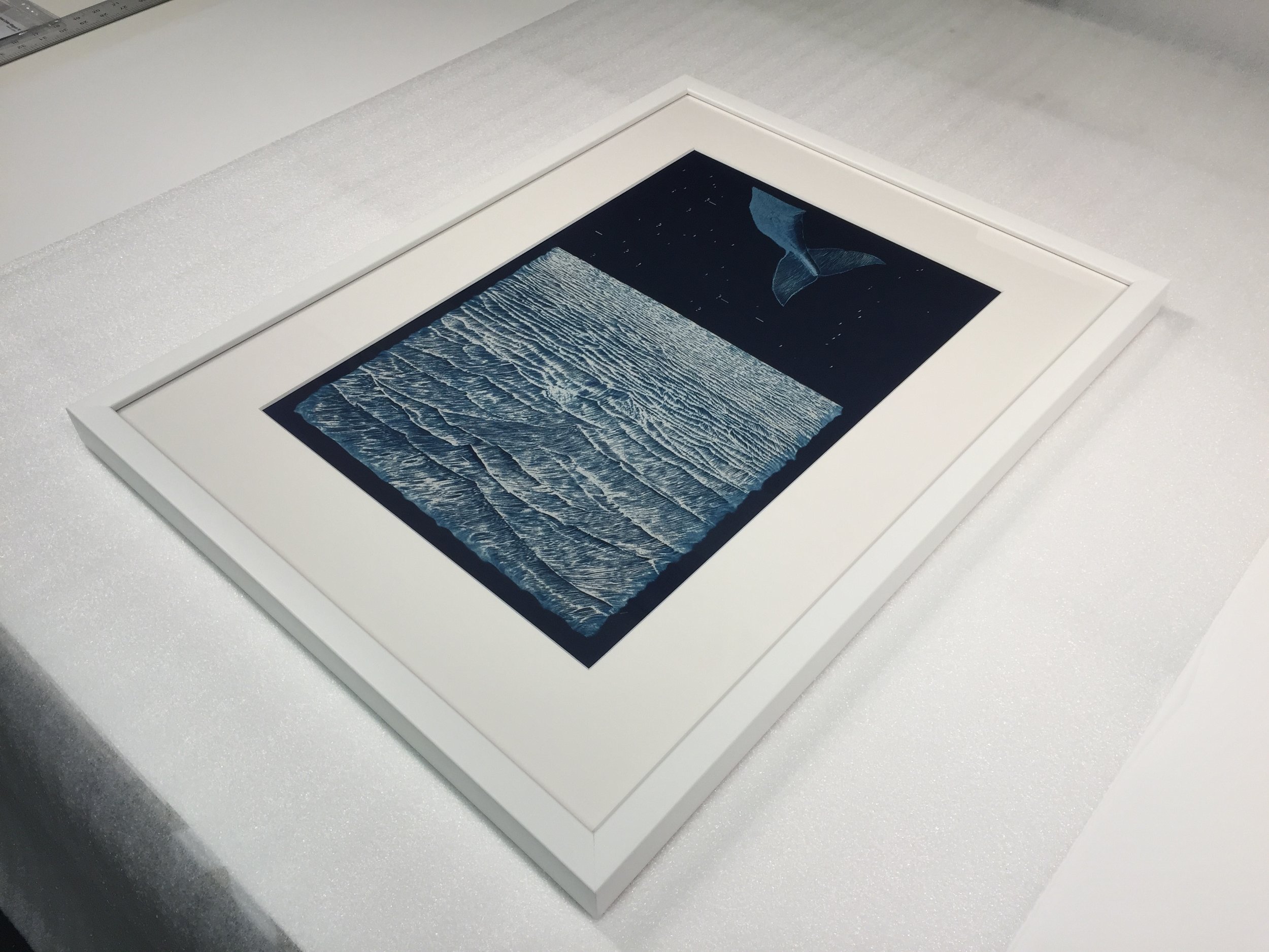
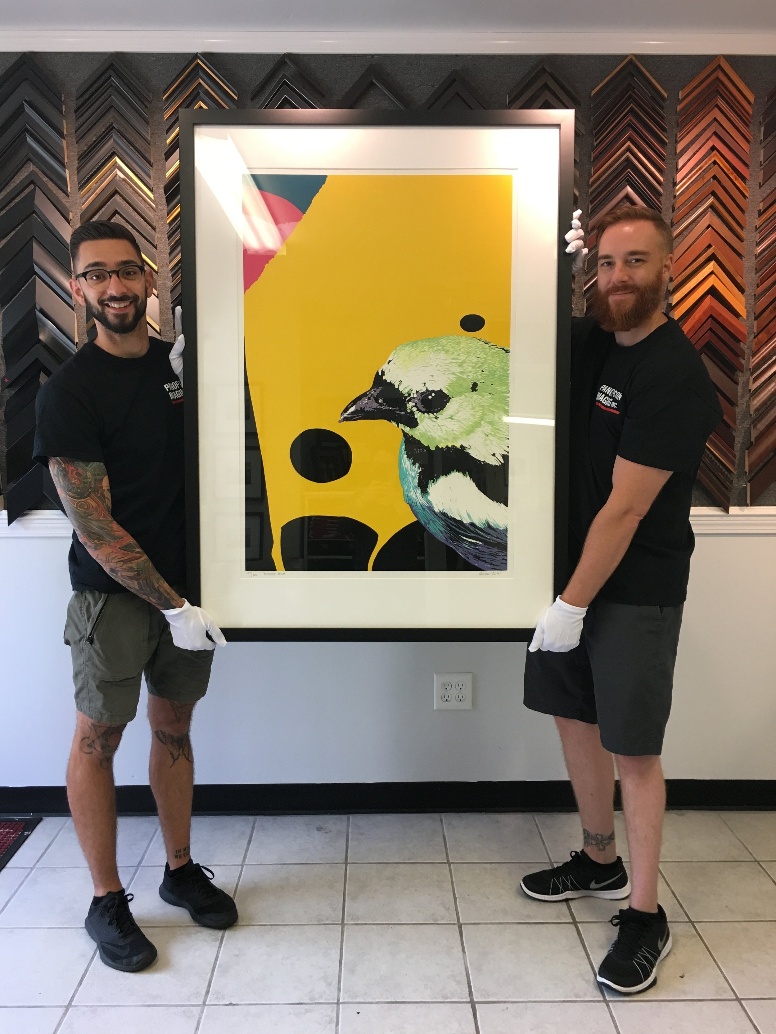
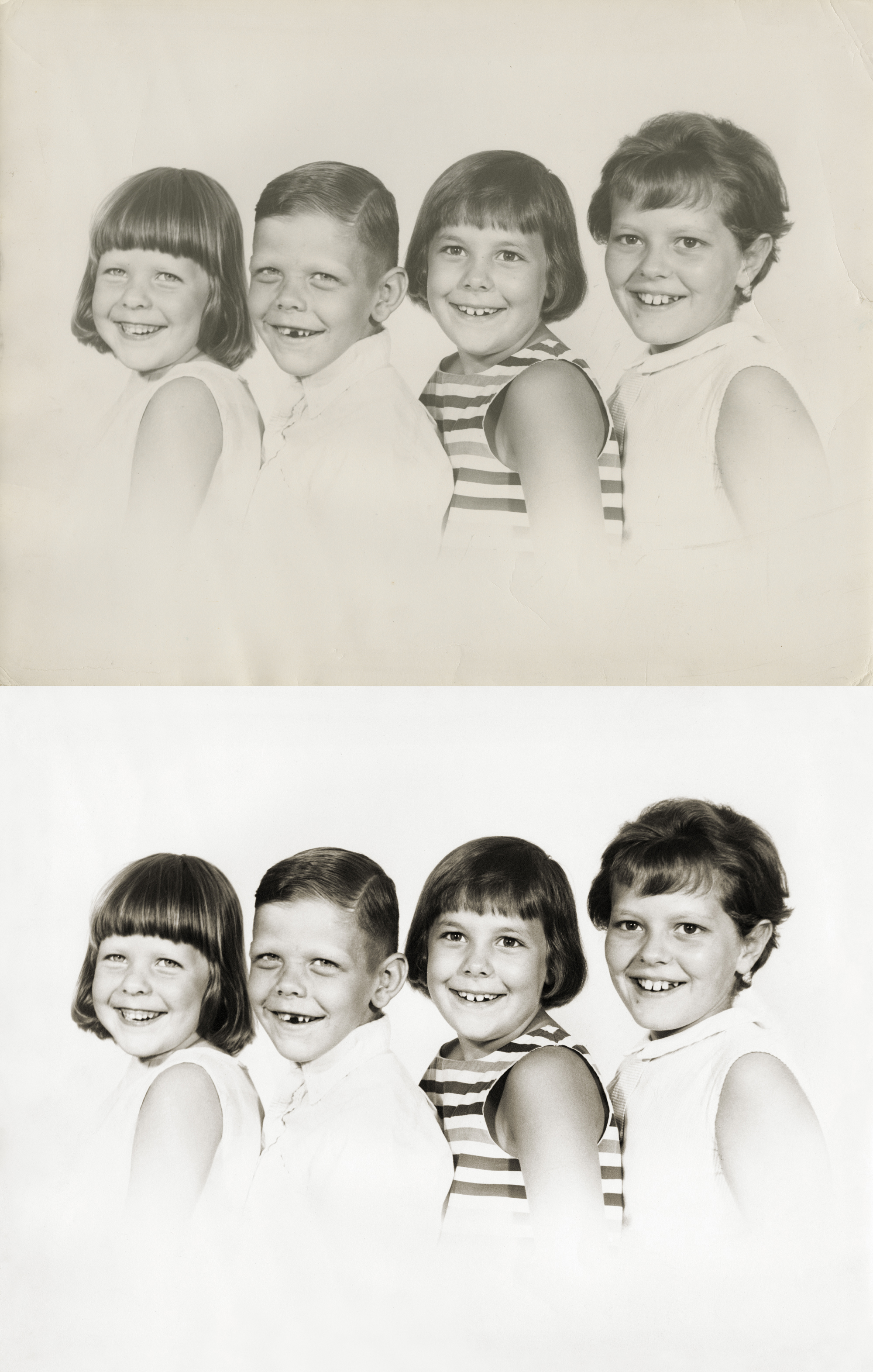
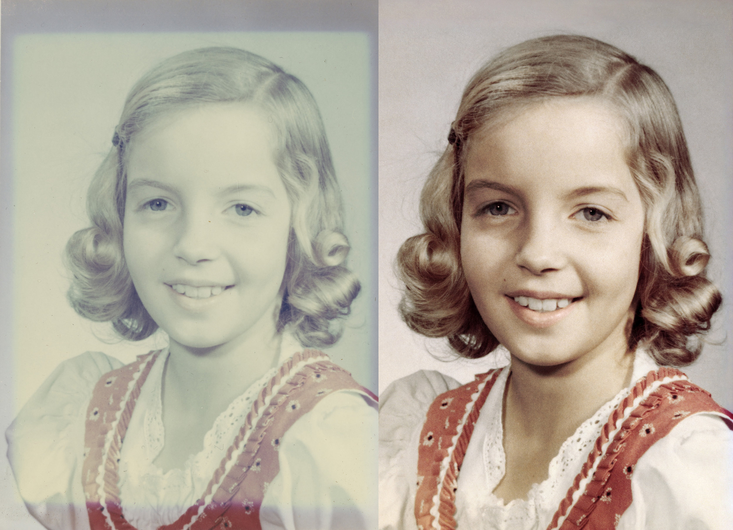
Photos: Owen McCarter, Three Eyed Fish from First Look 2023
7. Submit Before the Deadline if Possible
While many artists upload at the last minute (no shame!), submitting early has advantages:
Fewer technical issues
More time to review your materials
More time for curators to sit with your work
For First Look 2026, early submissions help us spend more time with each entry, and they tend to stand out. We also like to share current submissions on social media to promote the call for art, so submitting your work early allows for more opportunity for your work to be promoted!
Why Submitting to First Look Matters
If you’re looking for a strong opportunity to share your work, First Look is a great place to start. It’s one of the best ways to:
Get your work in front of both the team and patrons at Panopticon Gallery. Each year, First Look is one of my anticipated and highly viewed shows, so it is a great way to increase exposure to your work.
Introduce your practice for future opportunities. We use First Look submissions not only for the exhibition, but also as a way to connect with artists for future exhibitions after.
Not only be considered for First Look, but also for Second Glance, our annual small-works exhibition that runs in tandem alongside First Look. One entry puts you into the jurying for both shows.
Final Thoughts
Submitting to calls for art can feel intimidating, but with a clear, well-prepared entry, you give your work the best chance to connect with jurors. Whether you apply to First Look 2026 or another opportunity, these practices will help your submission stand out.
Ready to apply? You can submit to First Look 2026 here: https://www.panopticongallery.com/first-look-2026
Submissions are due December 29th 2025 11:59pm EST
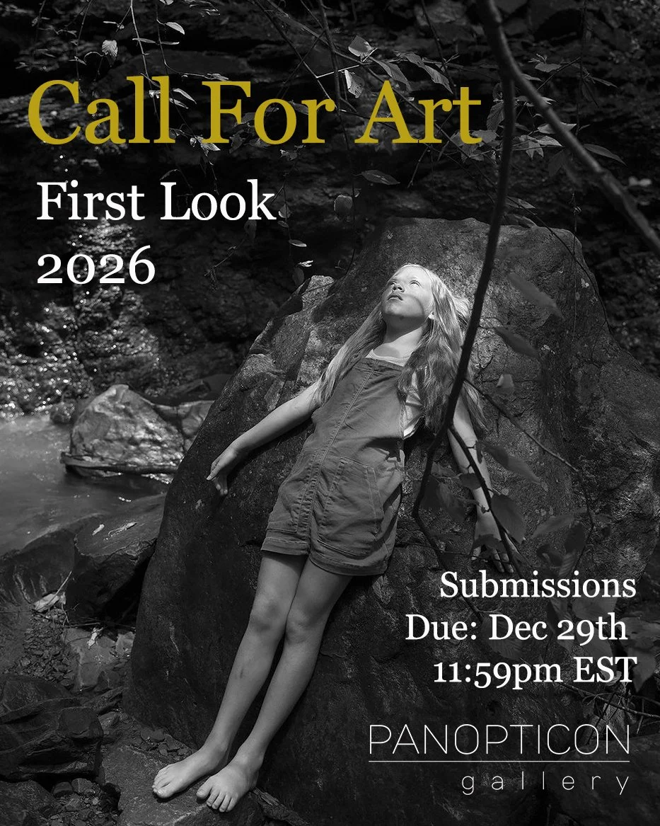
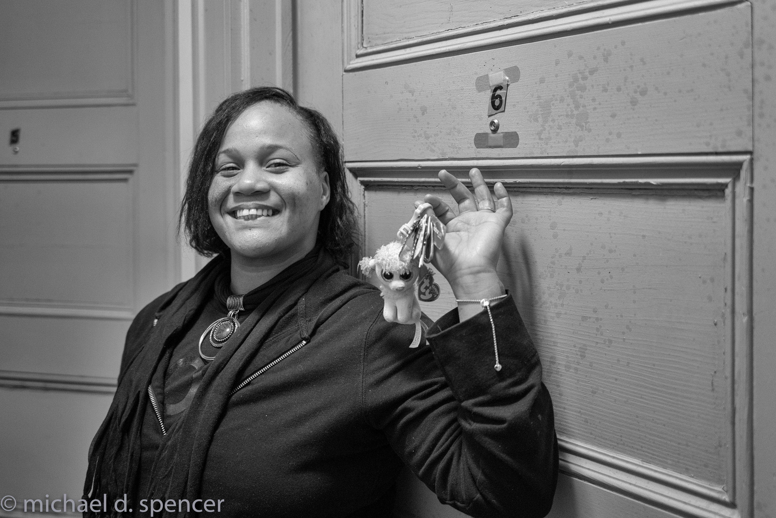
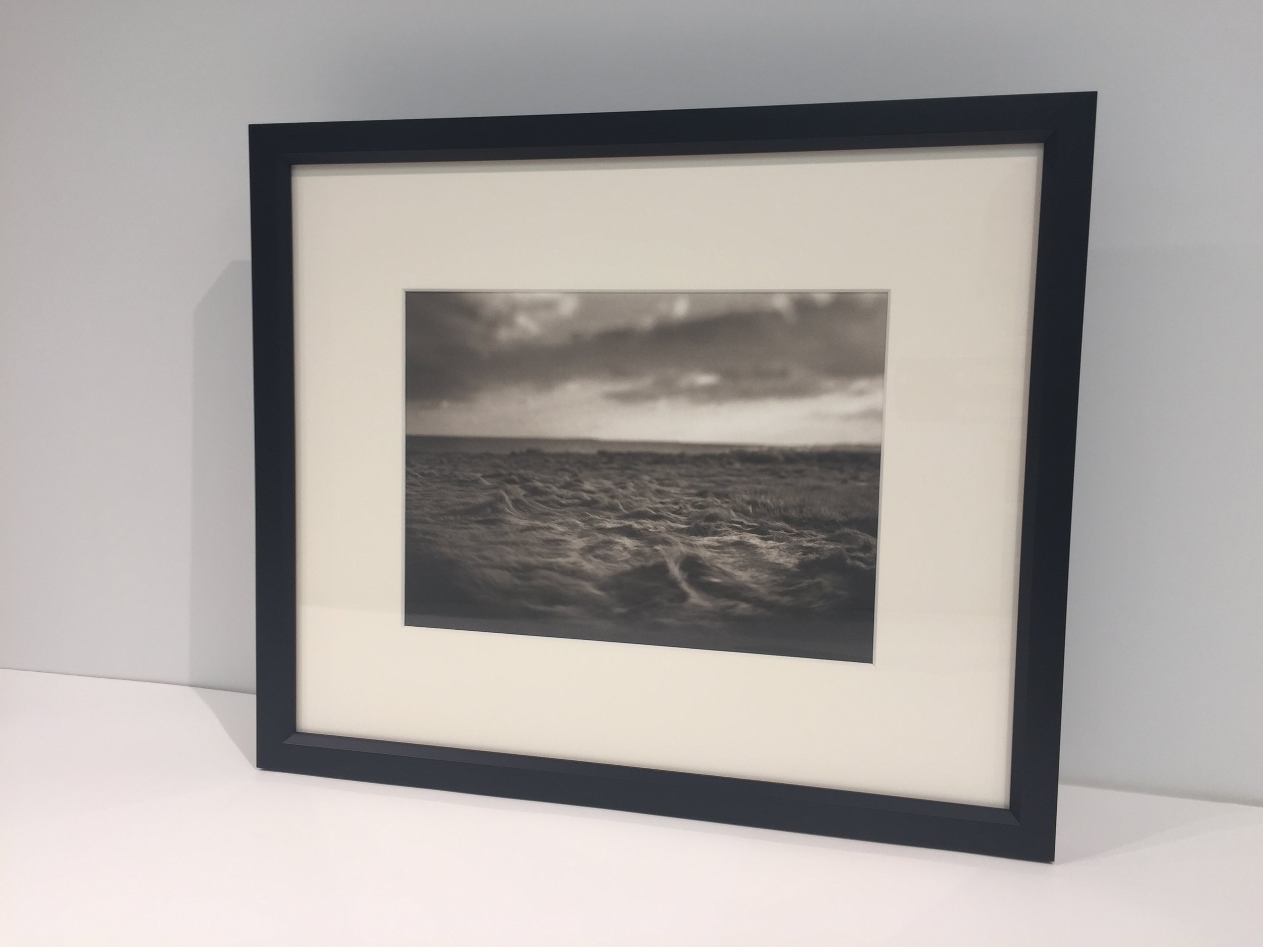
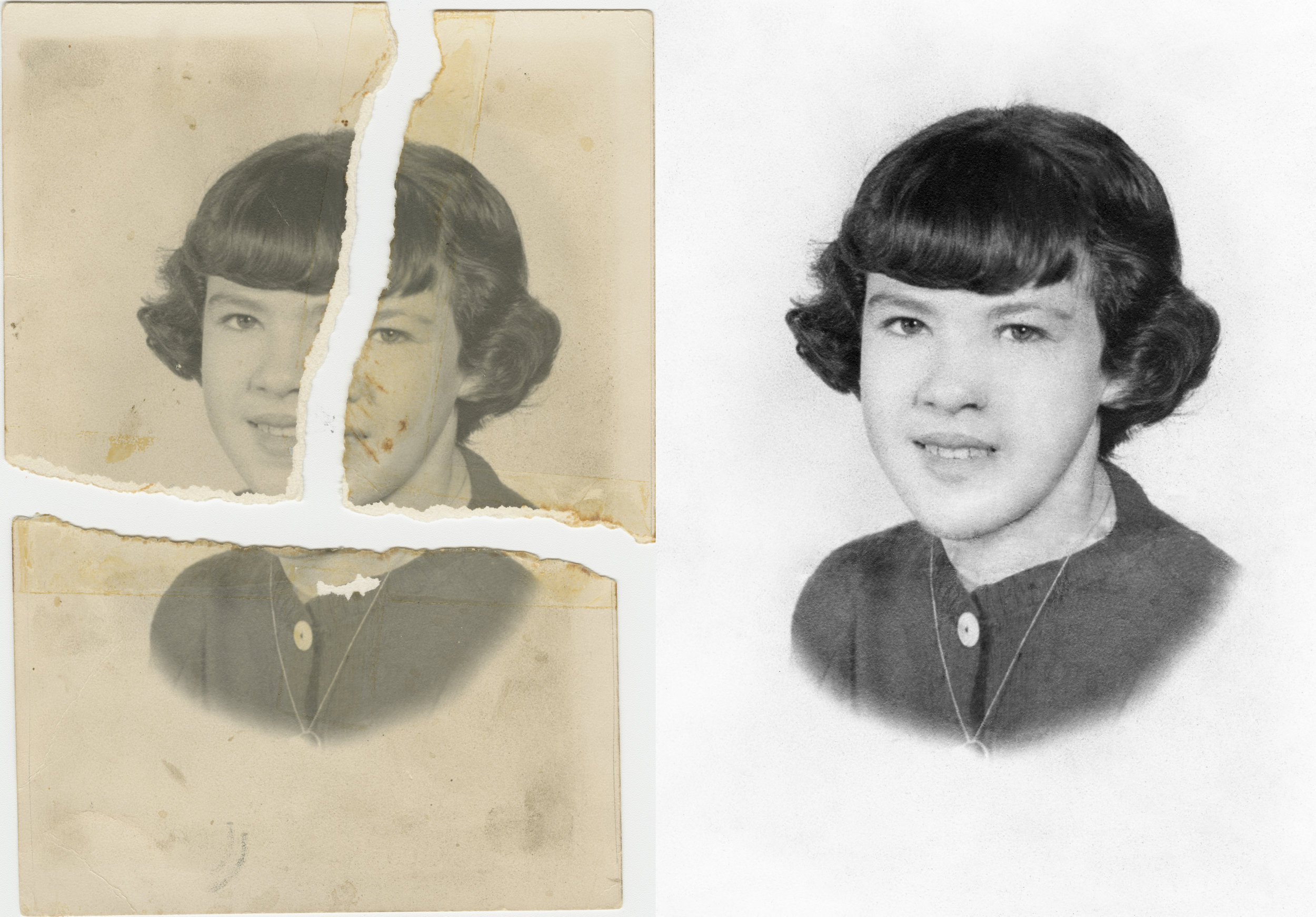
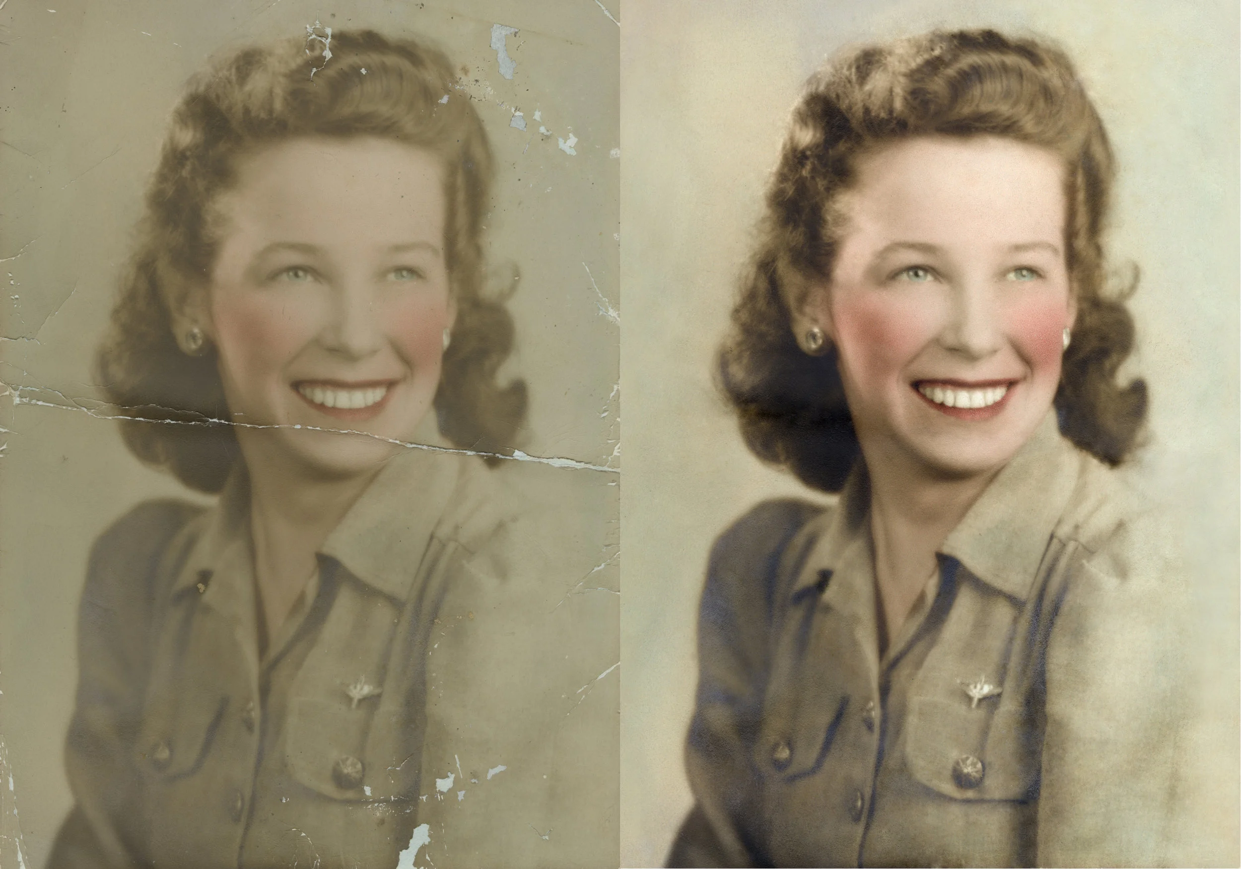
Image by Andriana Nativio, First Look 2025