Portfolio reviews have become one of the best ways to get your work seen. It is not only an opportunity to connect with curators, educators, and industry professionals, it also gives you feedback on your photographs. They range from small, intimate reviews to large scale and fast paced. They do cost money (some more than others) so starting out you should ask yourself what your budget is. It might be a good idea to find a local review to start with and work your way up to the big dogs. We have had the pleasure to work with artists preparing for portfolio reviews and wanted to share some thoughts & advice for other photographers interested in attending reviews.

Lindsey Beal's Ambryotypes, her presentation went all the way to the vintage suitcase & boxes she transports her work in.
1. Put your best foot forward! Presentation really counts at these reviews. You should have a consistent portfolio with an artist statement. You want exhibition quality prints with the understanding that the prints WILL BE HANDLED. While we would love our precious prints that we have worked so hard on (and spent money on!) to remain in perfect condition, odds are they will be handled quite a bit.
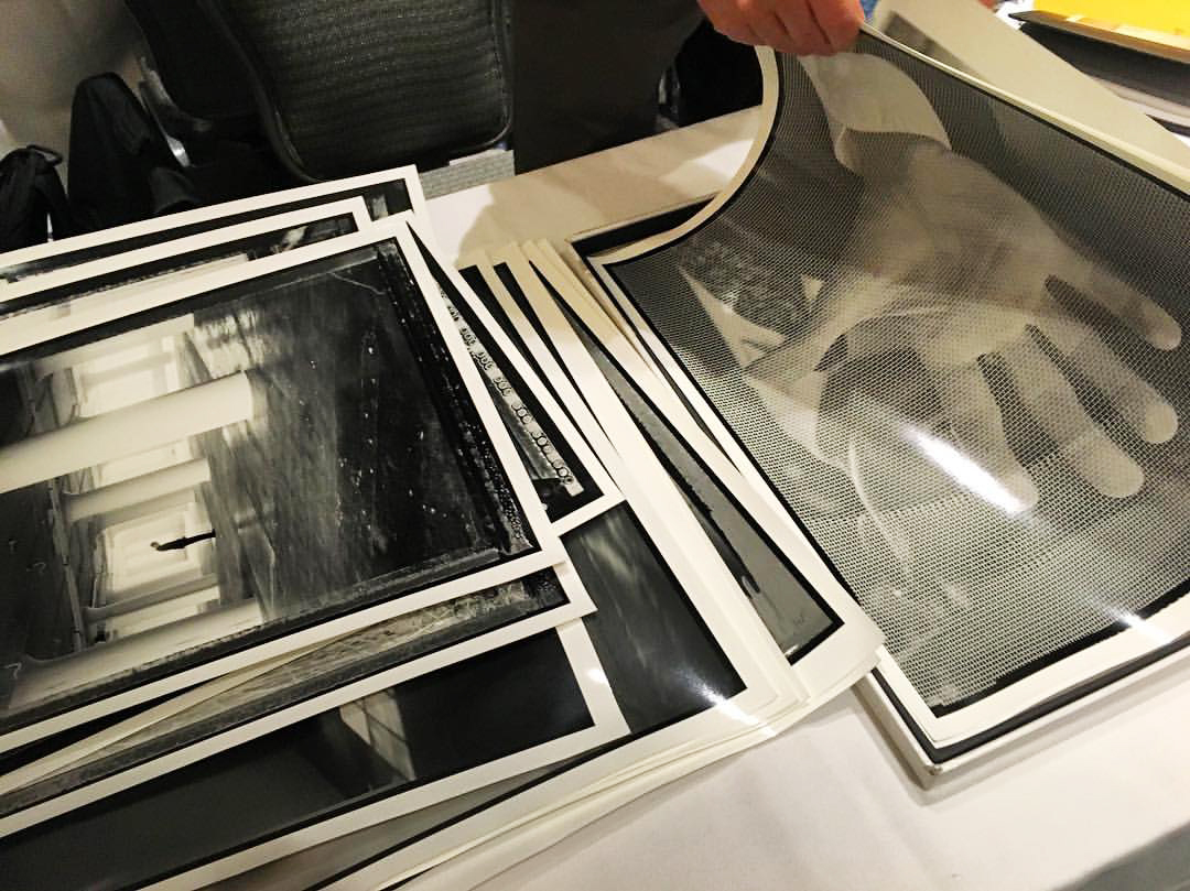
Stephen Sheffield's portfolio being reviewed
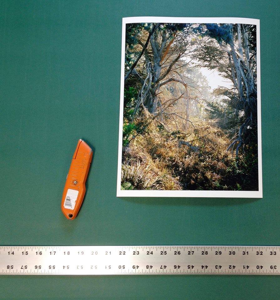
2. A few thoughts on portfolio sizes- because you are limited to the space of a normal fold out table the prints shouldn't be bigger than 20x24. If your exhibition size is larger than that maybe bring one example rolled in a tube and ask the reviewer if they would like to see the exhibition size. The number of recommended printsranges from 15-25. You want to edit your portfolio to have enough images to give the reviewer a good representation of the project but not too many that it is overwhelming or repetitive.

Suzanne Revy working on sequencing & editing her portfolio
3. Know what you want to get out of the review - are you working on a new project and looking for feedback? are you specifically looking for an exhibition? are you wanting to get the work published? Having a list of questions to ask each reviewer is helpful and makes you get the most out of your time with them.
4. Networking is HUGE at these events and knowing when to properly network is an art form in itself. The reviewers are usually wearing name tags and while it is tempting to try and talk to them about your work outside of your scheduled reviews keep in mind they are people too and need breaks! If you run into them in the coffee shop or in the lounge a hello and quick introduction is okay but DO NOT bring your portfolio out to start showing them while they are trying to eat their scone and heighten their caffeine intake. Ultimately it is all about respect and reading the situation. Perhaps they want to see your work but they will let you know when and where. Also take the time to network with your fellow photographers that are there. You never know when you can make a new photo buddy or learn a new photo process or bump into someone you went to school with!
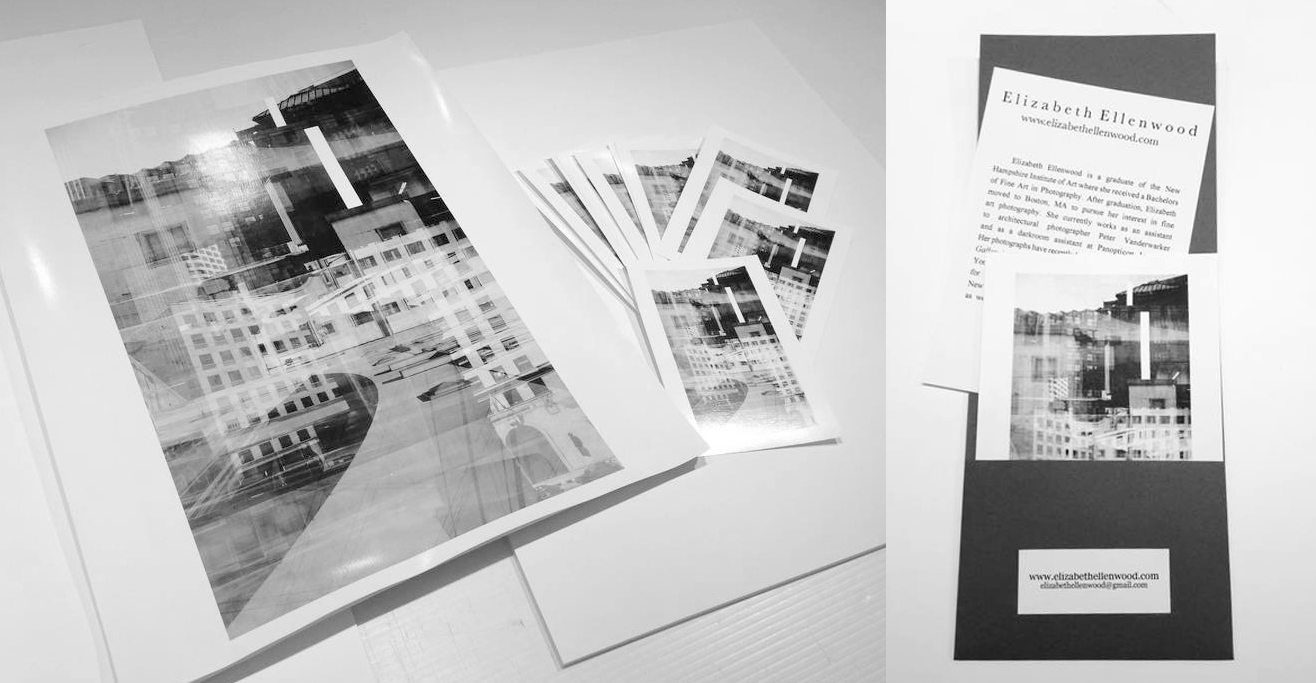
Elizabeth Ellenwood created a small edition of fiber prints for her leave behinds
5. Leave behinds - keep consistent with your work and BE MEMORABLE. The reviewers leave the events with bags full of photographer's leave behinds so how do you make yours stand out? Going further than just leaving a business card is huge. Perhaps the leave behind is a specific shape, color, or texture that correlates with your work. You should keep your branding consistent right down to the font and color you use for your name. Make it EASY for the reviewer to get in touch with you, the last thing they want to do is have to search your information for your email address and website.

Amy Theiss Giese showing her leave behinds - small one of a kind chemigrams
6. Lastly, the THANK YOU notes. It is very important to follow up your reviews with a thank you note to each reviewer. Whether it is an email or snail mail, you want to thank the reviewer for their time and feedback. Perhaps add a specific detail you found helpful from your review with them or maybe there was another question you forgot to ask and you could include that here too. Generosity and respect goes a long way!
Here are a few portfolio reviews to have on your radar:
Filter Photo Festival - Chicago, IL
PhotoNOLA Festival - New Orleans, LA
Atlanta Celebrates Photography - Atlanta, GA
Review Santa Fe - Santa Fe, NM