Artist Spotlight: Suzanne Revy

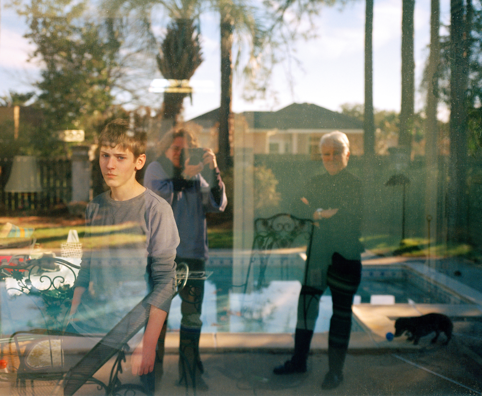
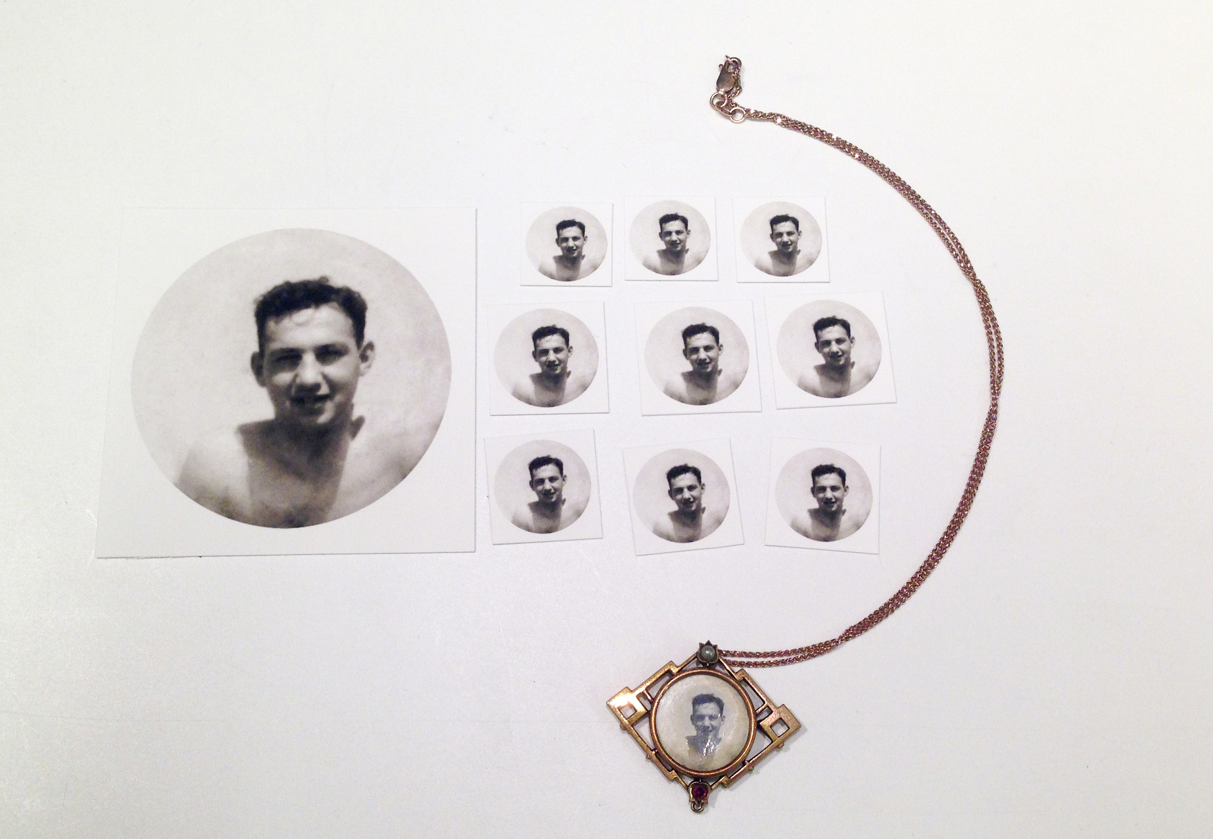
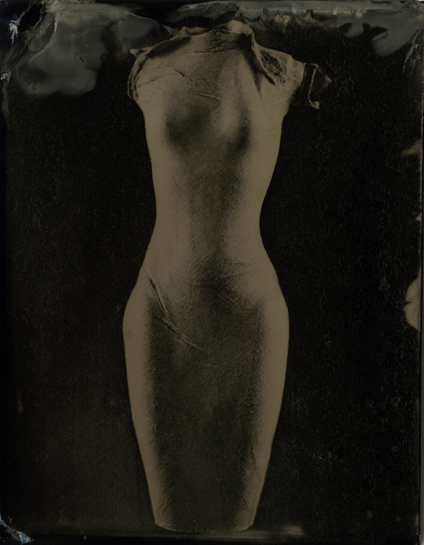
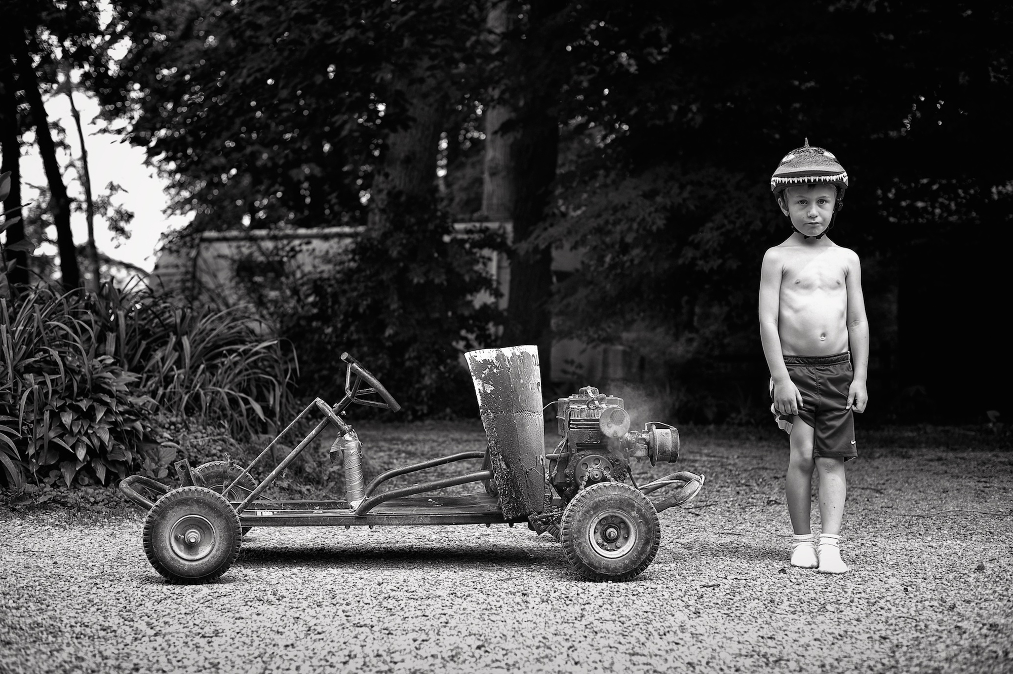
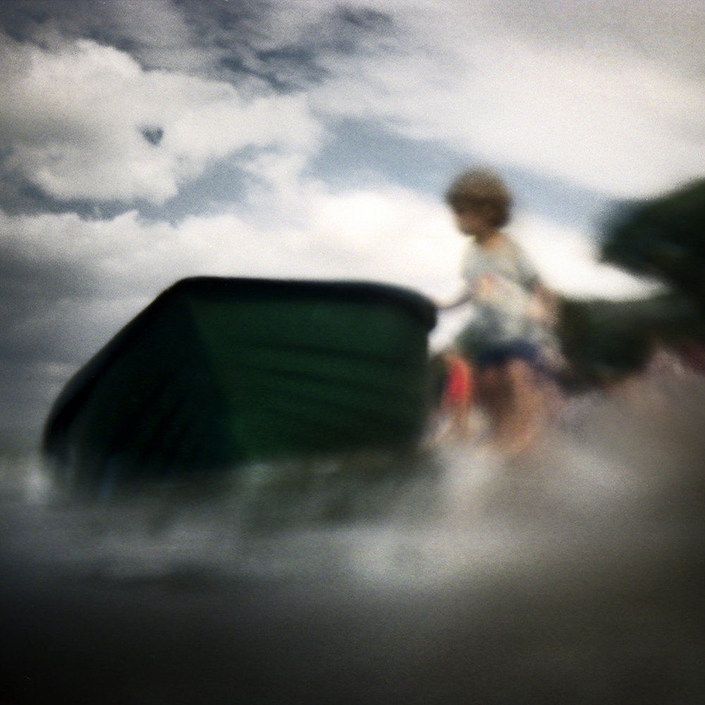
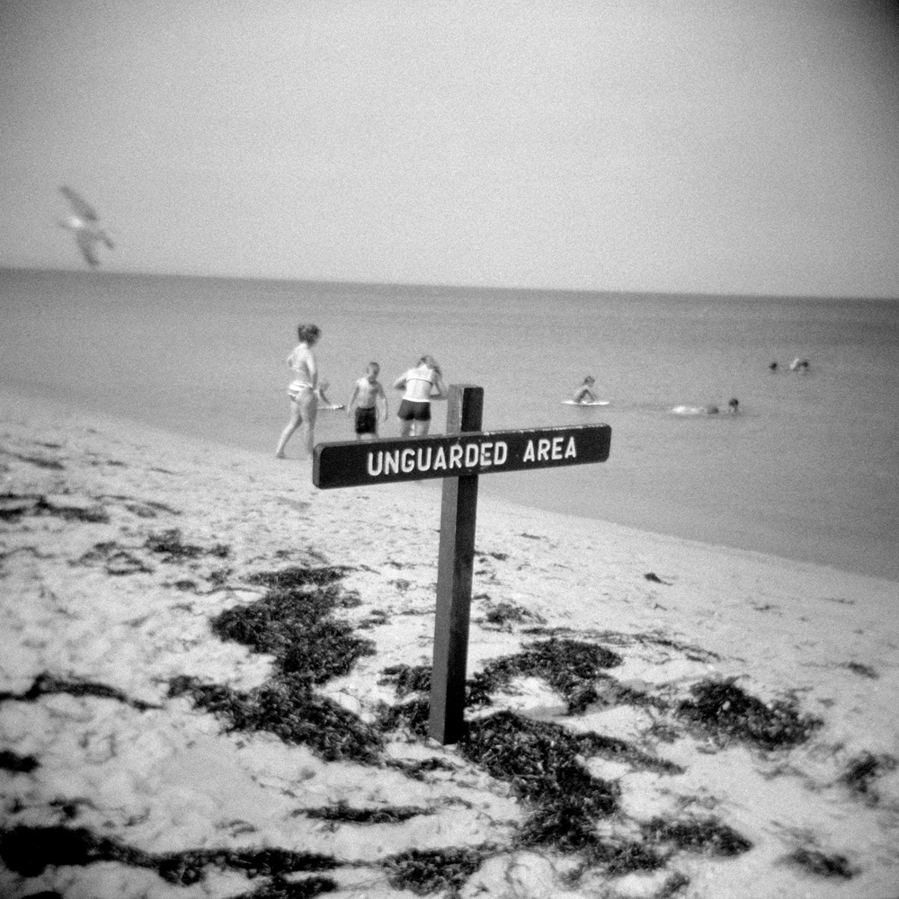
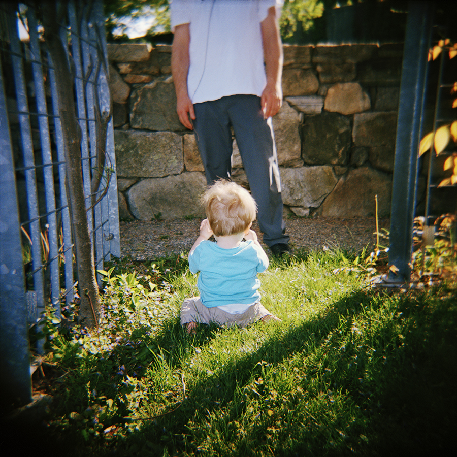
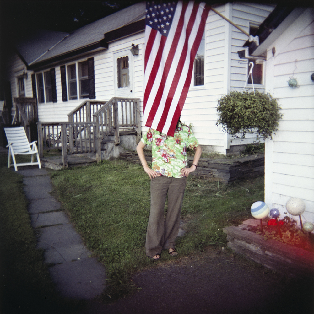
Suzanne Révy grew up in Los Angeles, California. After high school she moved to Brooklyn, NY where she earned a BFA in photography from the Pratt Institute. While there,  she was immersed in making and printing black and white photographs. After art school, she worked as a photography editor in magazine publishing atU.S.News & World Report and later at Yankee Magazine. With the arrival of two sons, she left publishing, and rekindled her interest in the darkroom. She photographed her boys, their cousins and friends, and built three portfolios of pictures over a fifteen year period.  The first,  a black and white series,  explored the culture and nature of childhood play. The second, made with a lo-fi plastic camera and color film,  represents her own emotional response as mother and witness to their growth and development. The third, a series of color pictures made in her home as her teen sons seemed to retreat into their rooms while she studied for her recently earned MFA at the New Hampshire Institute of Art.

  • You have been photographing your two children for the past (how many?) years. What are their reactions to your work? Do they like the photographs you have taken of them throughout the years?

SR: I’ve been photographing them seriously since about 2003 when I built the darkroom, so it’s been about thirteen years. When they were quite small, the camera was simply present during a lot of their outdoor play time. I’d observe them, how they handled, say… leaves or rocks or twigs, how they’d move while at the playground. I’d watch how light illuminated their gestures, and make pictures without interrupting their play. As they grew older, I’d need more of their cooperation, and as teenagers, I generally need at least grudging consent to make a picture. To some degree, I think they are quite happy that I’ve made this work, but the act of making pictures for them at this point, I think may feel like a tedious chore they do for me. In the long run, however, I think they will appreciate this work, especially when they have children.

  • You work in film weather it is color or black and white. Is there a specific reason why you haven’t made the switch to digital?

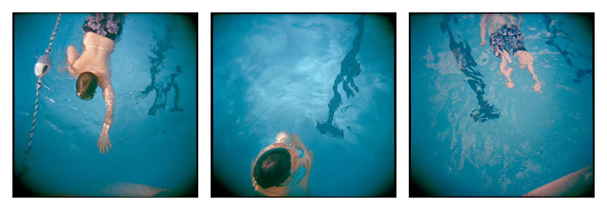
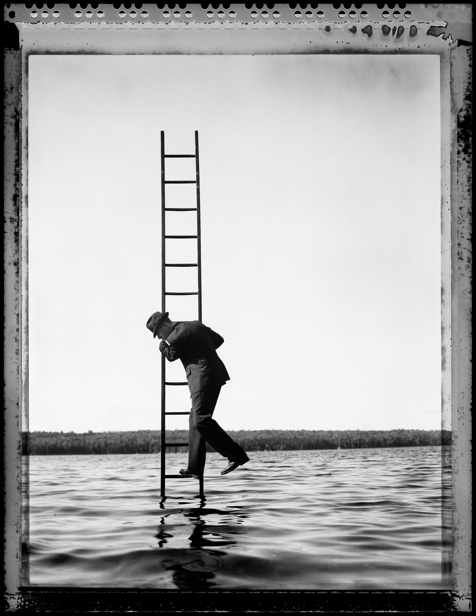
SR: When I began these projects, which weren’t really conceived as projects, I was using a film 35mm SLR with all the bells and whistles. It was a Nikon F100, great workhorse of a camera. In late 2004, I bought a Mamiya 7, and though the camera at first was harder to use, I found the pictures became more interesting, and I concluded that the Nikon was just too helpful. The focus points somehow forced me into a kind of repetitive use of the rule of thirds, and though the pictures I made weren’t bad,  they weren’t unexpected or surprising either. The ones I made with the Mamiya 7 were more interesting images, and far more fun to print in the darkroom than my 35mm negatives. As digital became better, I was committed to sticking with my medium format cameras, so I could keep seeing and recording my world with cameras that inherently slowed me down. I knew I didn’t want all those helpful bells and whistles. All that said, I did buy a mirrorless digital camera recently, but have rarely used it yet, though I love my phone camera and have been actively posting to Instagram with those pictures.

  •  When you are photographing how much of it is instinctual versus planned?

SR: More often than not it is intuitive and springs from my observations. Occasionally, I’ll see some bit of light, and I’ll ask one of my kids to just stand in that light or I’ll see them do something, and I’ll ask them to let me make some pictures of whatever they are doing, but I might need to have them move to a better spot of light. I don’t construct or plan pictures ahead of time.

SR: It had been a long time goal of mine to get an MFA, but the various stages of my life prevented it until my kids got a little older. There’s something to be said for going back to school in your early 50’s, I feel so grateful that I was able to pursue it while maintaining a semblance of family life with two teen boys. I think my work became better while studying.  Taking an extended period of time to think about the intuitive process I employ and how my work fits into the conversation of contemporary photography was invaluable.

  • You have recently attended quite a few portfolio reviews! Which reviews have you attended and what was the feedback you left with?

SR: I went to Foto Fest in Houston back in March and just recently attended Review Santa Fe. I got some excellent feedback on the work, and some good ideas for places to show it, and interesting ideas for how to start thinking about organizing it into a book. The best part of going to reviews, however, is connecting with other photographers. I’ve made great friends at these review events. They are expensive, and exhausting, however, so I won’t be attending anymore until I feel like I have another solid body of work ready to present.

  • What artists influence you and how do they influence your thinking, creating and career path?

SR: As an avid student in the history of photography, my influences vary widely. While at Pratt in the early 80’s, I was influenced by classic street photographers. Garry Winogrand was a particular favorite of mine. Then in the early 90’s, I became aware of the photo-secessonist Gertrude Käsebier’s work along with Emmet Gowin and Sally Mann who all made pictures close to home. Frustrated that their images often looked so set up, I felt that my medium format allowed me to photograph the children in the way I had made street photographs, but still provided a large negative to make beautiful prints. More recently, I’ve been looking at a lot of color photographers, William Eggelston, Larry Sultan, and a few more contemporary photographers such as Melissa Ann Pinney, Jessica Todd Harper and JoAnn Verburg.

  • What are some tips/advice you would give to someone just starting out in photography?

SR: It’s most important to do the work. Make and study your pictures everyday until you understand your own eye and your own voice within the medium.


Tech Blog: Colorspace, File Formats and Untagged Files

Have questions about digital printing? How to get images to us? What type of file to send? We have tried to start simply and move onto the more complex questions. If you have questions regarding any of this or just want to review the process with us, please call or email us! First things first… You can upload us files here and you will see this screen from Hightail. You can drag and drop your images for upload to us.

Do I send Jpg, tif or psd? Raw?

You can send us any of the above. We have provided some details below about the difference between each type of file.

Raw are the proprietary file from the camera manufacture. Some examples are: Canon (.crw, cr2), Nikon (.nef, .nrw), Sony (.arw, .srf, .sr2), Pentax (.pef, .ptx).  Raw files hold the most data from your digital camera and are the easiest file to adjust exposure, contrast, white balance and other fine tuning. We can edit your Raw files however this requires an editing charge.

JPG is best for web use, but still can be printed from if it has high enough resolution and was saved at a high enough quality. (80+ in Lightroom, 10+ in Photoshop).

PSD is an Adobe Photoshop proprietary format. It can handle all of Photoshop’s features, but has some compatibility issues with non-Adobe products and Lightroom. PSD has a 2gb files size limitation.  Due to the compatibility and size issues, PSD has been (or should be) replaced by TIF by most photographers.  We prefer TIF.

TIF is one of the most universally accepted formats. It can be opened by most image editing and page layout software. TIF supports all the same things as PSD and has a larger file size limitation (4gb).

Ultimately, just send us what you have and we’ll figure it out. Got layers, send us those too. We can always provide assistance with your files or if you want to sit with one of our Digital Technicians and review files in person.

OK, so a tif  file, 16bit or 8bit?

Either one is fine. Whatever works for you.

What color space should I sent it in? AdobeRGB98, sRGB, ProPhotoRGB

You can send us files in any of these color spaces. You should be working in either AdobeRGB98 or ProPhotoRGB to begin with. sRGB is meant as a web colorspace, anything you upload to your website or facebook should be in sRGB.

As far as AdobeRGB98 or ProPhotoRGB goes, it could go either way. ProPhotoRGB is much bigger than AdobeRGB98 and can produce more colors. However, you must work in 16bit with ProPhotoRGB otherwise you can end up with posterization effects (banding). The other down side to ProPhoto is it includes imaginary colors. Yes, I said imaginary colors. They (Kodak) made the ProPhotoRGB color space so big that 13% of the colors included do not exist in the real world and are not visible colors. This can lead to color issues when printing. Some colors will become over-saturated or will be estimated to its nearest in gamut color and can cause banding. Even the best printers in the world can’t print imaginary colors.

AdobeRGB98 is larger than sRGB, is easily printable by commercially available printers and includes no imaginary numbers. Its not perfect, nothing is, but it is the standard most of the photographic world uses.

If you have a gray scale file, that is fine as well. Gray Gamma 2.2 will do just fine.

What about CMYK?

Leave that to the offset printers. If you send us a file with a CMYK colorspace we will convert it to AdobeRGB98.

What about an untagged file?

If you send us a file with an untagged colorspace you will get a call from an angry elf… just ask Ron Cowie. Again, you can just send us what you have and we’ll figure it out. Following our recommendations makes it easier, but we are happy to help in whatever stage you are in!

Steps of a Photo Restoration

We see a lot of vintage photos here at Panopticon Imaging. They range from wedding portraits to family photos throughout the years to military portraits, the list goes on!  Here are the steps we go through for a photo restoration: STEP 1: Bring in your old photograph to the office. We will review the image with you & give you an estimate of how much & how long it will be to digitally restore. We DO NOT restore the original photograph. We scan it and digitally correct the image through Photoshop.

STEP 2: We scan your image. Using our high resolution Epson scanner, we create a digital copy from the original photograph.

STEP 3: We make adjustments in Photoshop. Here we fix cracks & damage to the image. This takes time and each photograph is different, it can take as little as 5 minutes or as much as 3 hours. We also adjust the contrast of the image, making faces lighter or certain areas darker. We can adjust the tone and make it black & white, sepia, or brown tone. The sepia is our most popular option, it makes the image still feel like an old photograph.

STEP 4: Time to print! We use all archival inks and papers here. This means your new print will last as long as it is treated properly (keeping it away from moisture & direct sunlight). When we meet with you we will tell you the sizes we recommend printing. Most vintage photographs are small to start with so they look the best staying in the 5x7 to 8x10 size.

These were the adjustments made to this image:

Whatever happened to your photograph, we are happy to help bring it back to life! Stop by the office or give us a call at 781-740-1300.

Artist Spotlight: Fern Nesson

Fern Nesson is a fine art photographer living in Cambridge, MA. She practiced as a lawyer for twenty years and taught history at the Cambridge School of Weston and, for the past ten years, she was the College Advisor at the Commonwealth School. Fern is currently in her first year of the MFA program at Maine Media College. Her abstract work is rooted in the elegance of light and line and is currently on display in our gallery until May 14, 2016.

"Light Lines 1"

  • You have a background in law, how did you transition into the art world?

FN: I have taken a long journey through many, varied careers – lawyer, American historian, fiction and non-fiction writer, history, math and law teacher, college counselor -- but the spine of photography has run throughout my life. My father gave me my first camera when I was 8 and he taught me to develop my photos in the darkroom not long after. Since then, I have been engaged in looking at the world through a camera.

Until recently, photography was my hobby. I knew several great photographers (my father included) and followed their work with interest. About ten years ago, I interviewed my father and we published a book of his work. I have also collected photographs for many years. I am proud to own photographs by Michael Kenna, Ansel Adams and Bruce Cratsley, among others.

Several years ago, I decided to pursue my own photography more seriously. My initial goal was to learn to take better photos. I began by reviewing my past work and publishing several books of my photographs. Then I took a workshop in photography at the Penland School in North Carolina. Finally, last year, I quit my counseling job to do photography full-time.

It’s taken me a long time to accept the challenge of pursuing life as an artist but I am so thrilled to be doing it! Photography provides, as always, a wonderful way to experience the world and the improvement in the quality of my work as a result of studying and practicing it full-time is immensely rewarding.

"Morning Light 1"

  • You are currently attending the low residency masters program at Maine Media, tell us a little bit about the program. How has your work changed since starting your studies there?

FN: For my first semester, I am completing synergistic studio and academic projects, both entitled “An Exploration of Seeing.” Since November, I have taken over 20,000 (!) photographs, read a dozen of the great books about “seeing ” and written three lengthy papers describing the evolution of my own artistic vision. As an intellectual and artistic experience, a Maine Media education can’t be beat!

"Light Lines 3"

  • Your abstractions of light and shadow show a playful & insightful side to subjects we see everyday. How do you choose what you point your camera at?

FN: Light is the theme in all of my work. I don’t shoot objects for themselves; I shoot their interaction with light: are they illumined from within? Are they transparent? Are they reflective? Are they suffused with light? Do they glow? Are they in shadow? Do they sparkle? My subjects are quite varied but it’s all about the light.

"Morning Light 5"

  • What inspires you as an artist?

FN: I am drawn to elegance. In choosing a subject or a scene, I seek elegance in pattern, line, color and shape. I prefer the intricate, small detail, over the panorama. My photographs are abstract but not in the sense of removing detail; just the opposite. I focus on an element and I abstract it through the use of an unusual perspective or point of view.

"Light Lines 5"

  • Your current exhibition in our gallery space is a selection of images from various portfolios. How do you feel the individual pieces interact with one another as a whole?

FN: The photographs in my show, “The Light Dances,” are selected from three different series, which I shot in 2015-6. Although they are of radically different subjects – trees at night, a Calder stabile, and the curtains in my bedroom – they have certain underlying and essential characteristics in common.

First, they are each about light: light as it illumines and ennobles a dark object, light as it enhances a sculpture by throwing off shadows, light as it sparkles and brightens a cold winter landscape.

Second they are multiples. Varying the point of view on a single object takes advantage of all angles of the object and allows maximum concentration upon its interaction with light. The multiplicity of views points up what is so great about our existence: we all see things differently from each other and it is that very diversity that makes art and life so interesting.

Third, they use the power of black. Light as a subject shows up so beautifully when it is contrasted with black. Color can seem sometimes to be cheating; it can make even a dull picture interesting but black is a challenge. If you use it well, you get drama; if you use it badly, you get nothing.

"Stabile 1 - 4"

Sum sum summertime- that's a wrap!

Whoa! Summer is always an exuberant time to go down the Cape, have some BBQ and for us down at Panopticon Imaging, make work! Our artists have been busy, so we have been having a great season of working with them on finalizing images, prints and exhibitions! We were so excited to work on so many of these projects we lost track of the time, but don't worry- there were a few outing with the Panopti-crew where we were able to steal some sun and fun. We ushered in the season with quite a bang at the Magenta Foundation's Flash Forward Festival! We have been working with the Festival and it's artists for the last three years, and it is always fantastic and quite a different array of work every time.

This year we helped with the printing and installation of the 7 shipping containers that were on the Rose Kennedy Greenway for all of May! In coordination with the Fence, this outdoor exhibition was so much fun, and such a great experience working with the international artists that made up the roster. Each shipping container held a solo exhibition from artists like Angélica Dass and Gregor Schmatz. 

Angélica Dass's solo exhibition in the shipping container.

Along with the Fence, we had the great pleasure of working with Boston Globe Legend Bill Brett on his Flash Forward solo exhibition.   We take great pride in managing and implementing all production for these kinds of exhibitions- from the proofing with the artists, printing, framing and even delivery to the exhibition venue.  This was the fist of the two large-scale exhibitions we helped produce at the beginning of this summer, the second being a brand new relationship we started with artist Emil Cohen!

The crew with Emil Cohen at the William Scott Gallery

Emil Cohen came to us for assistance in producing his solo exhibition, "Portraits in Provincetown" at the William Scott Gallery that was held in July.  The exhibition would be of 76 portraits he made of the good people of Provincetown, both large and small scale to be displayed.  The portraits are beautiful as well as playful and sometimes mischievous- just as you might expect from P-Town. Working from London now, Emil needed to produce the exhibition remotely, and we were happy to take on the task.  When the exhibition was finally ready for air-time, we took that opportunity to join him in P-Town for a little out-of-office research and development.  We hope if you were there this summer, you were able to see Emil's work, or him photographing for the project!

Our whole summer did not just consist of large-scale exhibitions, though.  We work on any photographic endeavor, and were happy to work on both printing and framing projects for a multitude of new clients.  Artists such as Lazaro Montano stopped by to have one of his great Color Block pieces printed and framed; as did Toni Pepe, who had some of her new work in this summer's Community of Artists exhibition at the Danforth Museum of Art.  It was also great to do some expert framing for the end-of-summer exhibition Landscape as Fetish at Gallery Kayafas, introducing us to the work of Angela Mittiga and Mark Dorf. 

Finished framed work by Lazaro Montano

It has been a delightful season, and we hope that the fall brings even more exciting projects as we get to see what everyone has been working on all summer! And don't worry, we haven't slowed down one bit.  We are currently preparing artist Betsy Schneider for her exhibition at Harvard's Carpenter Center, and looking forward to the great work that will be in the Griffin Museum of Photography's annual Atelier exhibition in September! Stay tuned for more, and have a great rest of August!

Family Restorations

We loved these latest restorations we received in house. The client had family members visiting and they brought these long lost images. They were very happy to have these images brought back to life. Here are the before & afters: