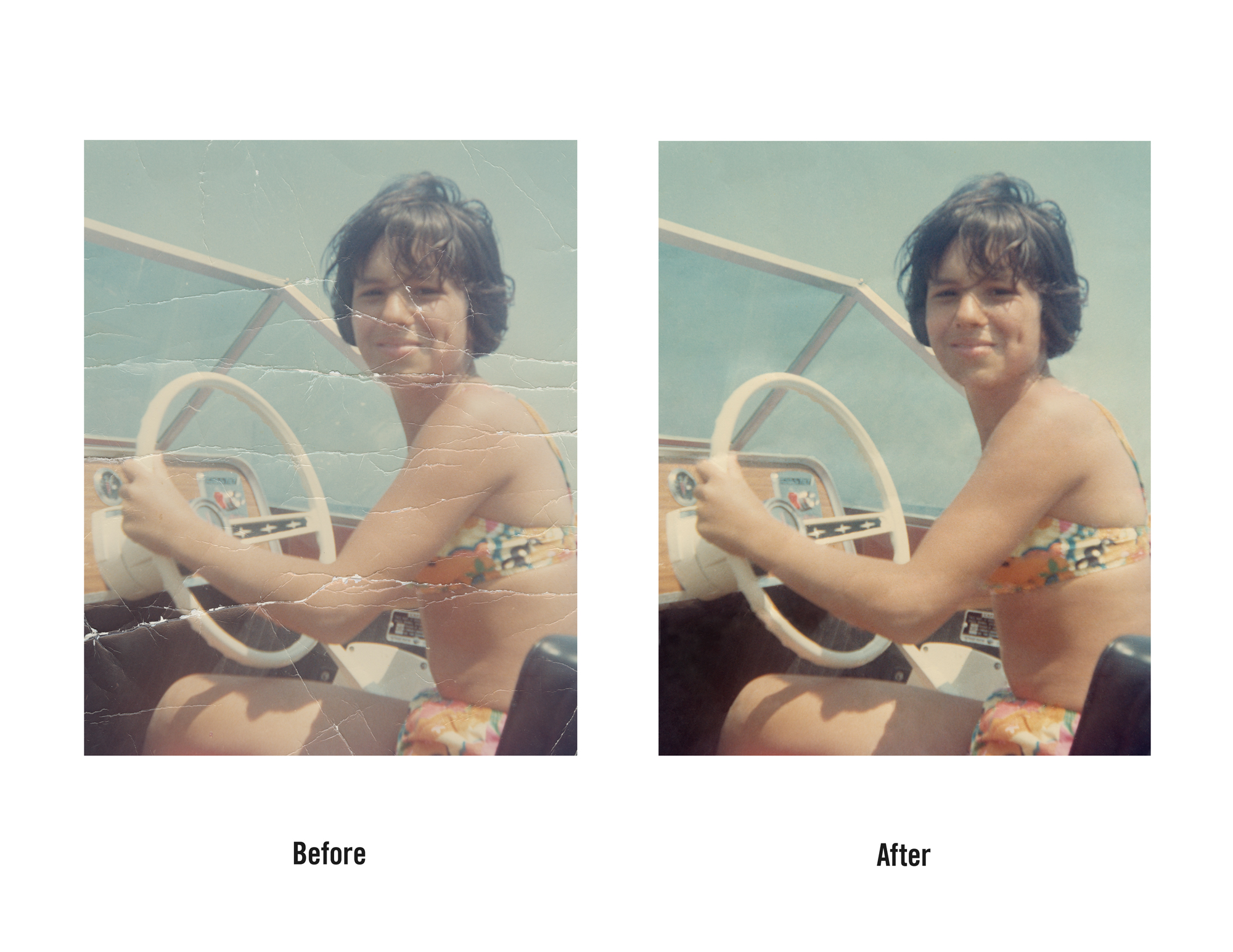
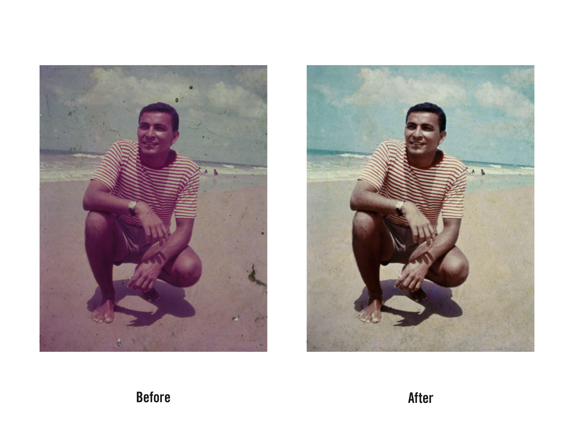
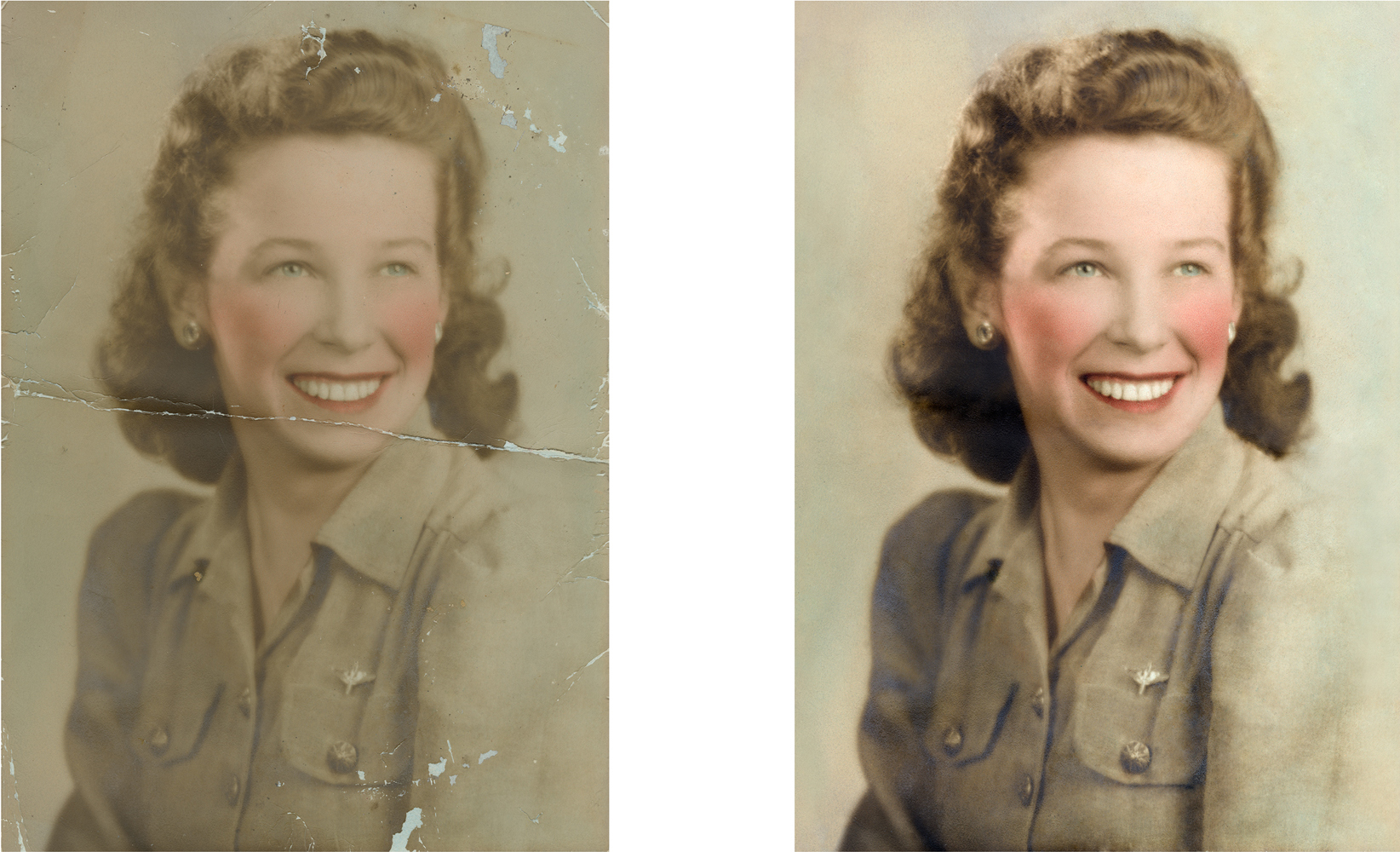
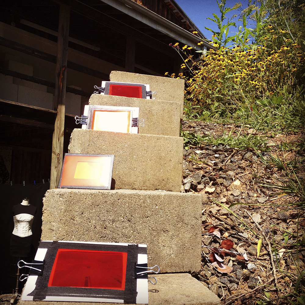
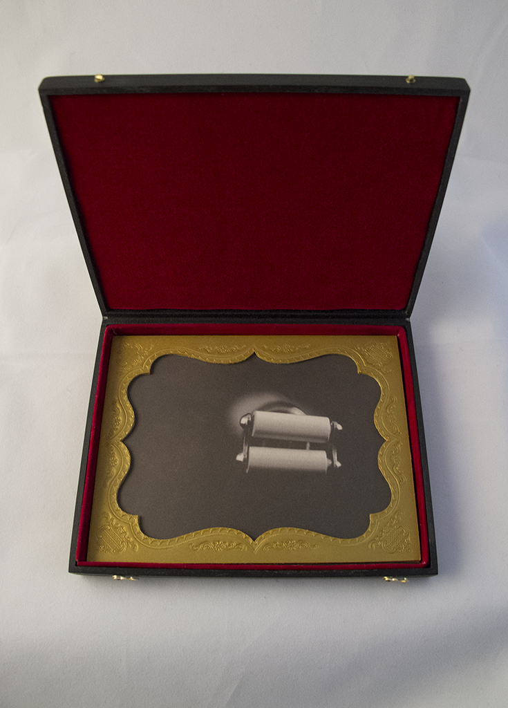
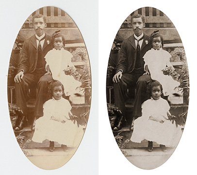
These restorations are getting us excited for sunny weather & beach time!


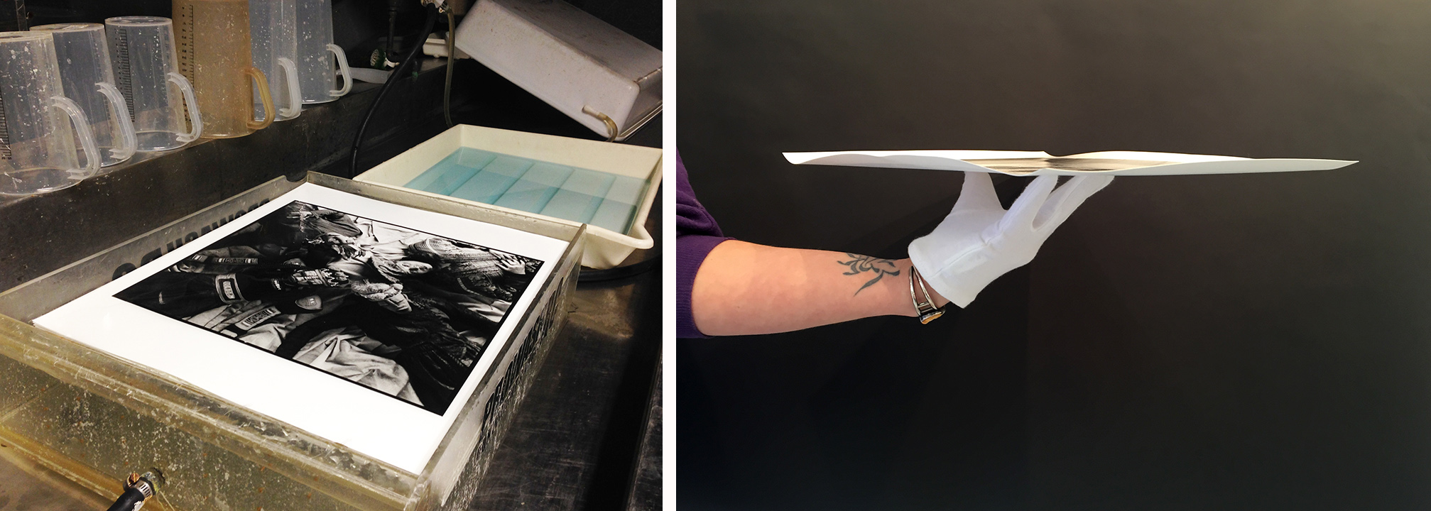
Darkroom Details: What is a RC Print, Fiber Print & more?
We have three working darkrooms here at Panopticon Imaging. Each room has its own specific purpose. One houses the printing lab, one our film processor and the third is where we create LVT digital negatives. In our printing lab we hand/tray process each print to ensure the consistency throughout the printing process. The film processor darkroom details are listed here. Our LVT darkroom is where we can create new negatives from digital files (more details below). We are happy to share information about these processes that we know and love. Video by: Frank Hegyi

rccombo_ver1.2
What is an RC Print?
RC or Resin Coated Paper is darkroom paper with a base that is sealed between two polyethylene layers, meaning it has a plastic base. Since the base is sealed between the two layers it does not actually absorb the chemicals, greatly reducing the amount of time RC prints need to be washed. This is the most affordable darkroom option, however, the least archival. There is developer in the paper to increase speed of development. Over time this will deteriorate giving your print a lifespan of 20-40 years depending upon storage conditions. This is used for contact prints of negatives and prints. This paper was popular with press & newspapers as they needed images fast for breaking news. The RC paper we print on is Ilford Glossy or Pearl with a weight of 190 gsm (Medium weight) paper.
fiberprint_combo1.2
What is a Silver Gelatin Fiber Print?
Silver print, Fiber prints, Gelatin silver as they are commonly referred to and are one and the same. This is a museum quality, tray printing process (not machine processed). Fiber paper is a paper base that is coated with photographic emulsion. The base of fiber prints are not sealed like the RC paper, this makes for a slower process with washing and drying. These beautiful, archival, exhibition quality, black & white, silver gelatin, fiber prints have superior tonal range, durability, and resistance to fading for over 200 years. All prints are finished with a Selenium bath to assure archival permanence. There is the option of warm tone, glossy or matte Ilford Papers. Fiber paper is 225 gsm which is a double weight paper.

Selenium_combo
What is a Selenium Bath / Toning?
We use a Selenium bath to increase the permanence of our Silver Gelatin Fiber prints. For this process we use a combination of diluted Selenium, Fixer Remover and water for a short bath prior to a final wash. Selenium converts some of the original silver image to silver selenide, a more stable form of silver. The Selenium also increases the tonal range available in the paper, deepening the blacks and brightening the lights just a touch. If it is desired, Selenium can also be used to change the color tone of the print. A diluted solution of only Selenium and water will give you a red-brown tone. While a stronger Selenium solution with result in a purple-brown tone.

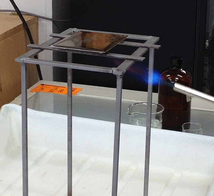
lvtneg
What is an LVT Negative?
LVT stands for Light Valve Technology. This process which is also known as a Digital Negative or Digital to Silver process is used to create a new negative from a digital file. We have several machines that can create these beautiful negatives on 8x10 sheet film. We have many clients that have damaged negatives that need to be digitally restored and then new negatives made. Also, if you are shooting digitally this give you the option to have prints made in the darkroom. Film is not dead!
LVT negatives: Stephen Sheffield
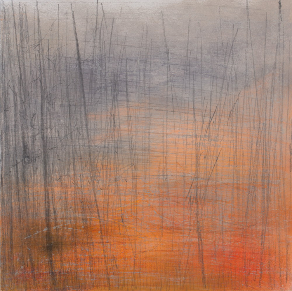
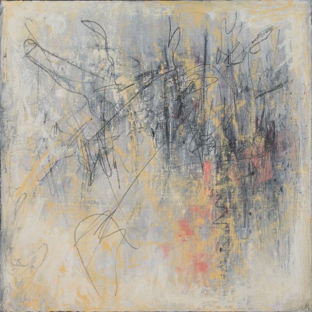
Artist Spotlight: Michaela Harlow
"Rain in September" 2015 - Graphite, Pastel and Polychromos Pencils
We have had the privilege to scan and digitally reproduce Michaela’s pastel & oil paintings and are delighted to share her beautiful work with you.
Michaela has exhibited her paintings and drawings in galleries and juried shows throughout the United States since 1994. Her work has been featured and reviewed in various publications —including Vermont Arts and Living, Santa Fean Magazine and Pasatiempo— and is included in public, corporate and private collections here and abroad. In addition to her work as a visual artist, Michaela is also a landscape designer, published garden writer and photographer, as well as a licensed pilot. Inspired by nature and the complex relationship between human beings and their environment, Michaela Harlow’s contemporary oils, pastels and mixed media works incorporate both figurative and abstract elements. Her work is now represented in New England at West Branch Gallery in Stowe, Vermont.
"Song of the Solstice" 2015 - Oil, Graphite and Polychromos Pencil
- First off, we have to ask about you being a licensed pilot! It is such a fun fact about you that we did not know – when did you learn how to fly a plane? Does it influence your art in anyway?
MH: I began flying in the summer of 1999 and earned my private pilot certificate in January, 2000. I've always loved images taken from above earth and once I started flying, I quickly developed an interest in aerial photography. However, flying an aircraft requires undivided attention, so for more than a decade, I simply observed while airborne, and collected books by well-known aerial photographers such as Arthus-Bertrand, George Steinmetz and Bernhard Edmaier. Just recently ---over the past two years or so--- I've begun making photos when flying with another pilot. I absolutely love it. That process ---seeing and documenting abstract land shapes and patterns --- has definitely informed my painting as well as my work in landscape design.

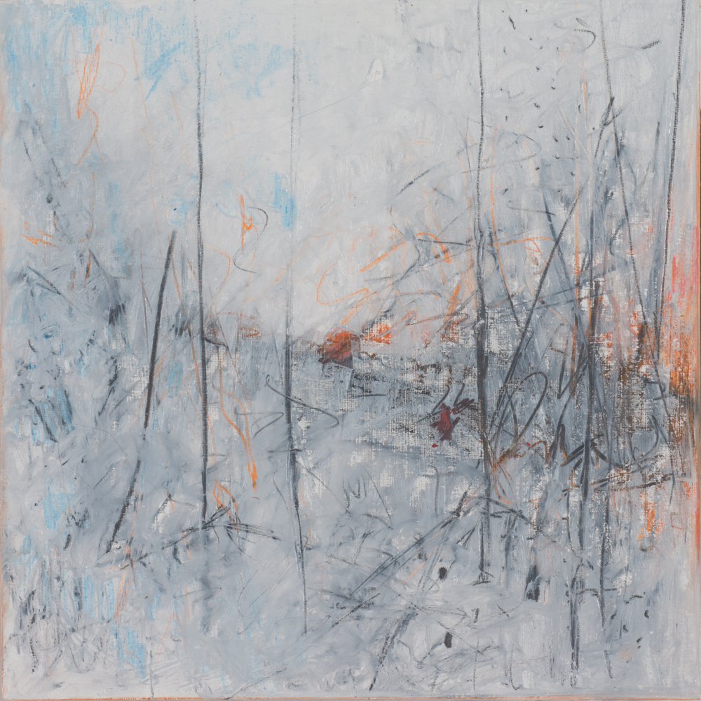
"Fog of Memory" 2015 - Oil and Graphite
- You are a gardener, a photographer, and a painter – do you think all of your art forms relate to one another?
MH: That is an interesting question. To be honest, until recently, I hadn't given the connection between my interests much thought. I've simply pursued passions. I am only now beginning to see the complex ways that they interrelate. Like the study of languages, I think the more forms of art you practice, the richer and deeper your understanding of each becomes. My formal training as a painter has given me confidence when experimenting with a camera. It has also assisted me greatly with aspects of landscape design; especially when it comes to color, form, shape and texture. I see more and more connections each day.

"Black Birch Cross" 2015 - Oil, Graphite, Polychromos Pencil
- How long have you been working with pastels & what is your process in choosing colors for each piece?
MH: I first experimented with soft pastels as a kid when I was given a small box of them by a family friend. They move and flow like paint and blend easily with bare fingers or tools. Almost immediately they became my favorite medium for drawing. Later, I worked with a private instructor and learned how to use oil pastels. Over the years I've experimented with soft and hard pastels, pastel pencils and combinations of these with other materials. I still love their portability and ease-of-use.
Often, I choose colors based on the mood I'm trying to capture. Color is a great way to stir emotion. But I also draw my palette from nature and/or my surroundings.

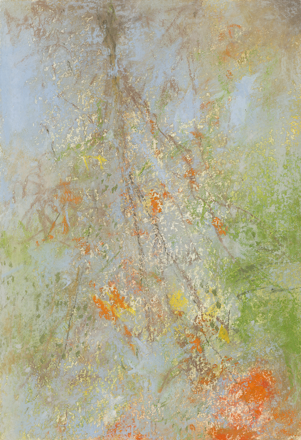
"Sweet Water" 2014 - Pastel on Paper
- How has your career path as an artist changed over the years?
MH: Oh, my, my my. If I were to map it out on paper, my career path probably looks more like a complex labyrinth than a sensible road map! Economic necessity coupled with varied interests has resulted in many professional detours. However, I will say that all of my work and life experiences have lead to artistic growth. Switching focus from two dimensional work to the three dimensional practice of landscape design has proven very beneficial.
And just this past year, I gave myself a season-long sabbatical from landscape design, to focus on my painting career. I'm very pleased with what I was able to accomplish in 2015, and I plan to strictly limit landscape design projects ---adding one or two per year--- until I find the right balance.
"In The Still" 2014 - pastel on paper
- How has digital reproductions affected your work? -– do you print bigger sizes? Do you have open or closed editions?
MH: By having my work professionally documented and digitally archived, I've been able to offer signed, limited edition prints on demand, making my work available to a much wider audience. Archival prints are very popular with art consultants and interior designers; particularly when working with the hospitality industry. Original artwork isn't always the best choice for a hotel, restaurant or cruise ship. High quality, archival prints offer designers a beautiful, affordable solution when security concerns or budget constraints rule out original paintings.

"Amphibious" 2015 - Oil and Graphite
- I found on your blog your post about Thirty in Thirty. I absolutely love this project – thirty straight days of making art! Can you share with us your end experience with this challenge? Do you recommend other artists try this challenge?
MH: The Thirty-in-Thirty challenge began when I was working full time in landscape design. I had very limited hours for art making during the growing season, but months of free time in winter. The idea was to kick start my process during the quiet month of January with a daily work schedule and goal. I discovered that by aiming to complete one small work of art per day, that I inadvertently freed myself from the perfectionism and self criticism; enemies of experimentation and process. The end result for me is that I no longer wait for inspiration before going to work. I just get up, go to the studio and set to work. Usually, when I'm in my studio, surrounded by materials, inspiration finds me. If I feel stuck, I start with sketching to loosen up, or prime a few panels. I find it's a lot like running: lace up your shoes, stretch a little and just get moving.
I think Thirty-in-Thirty can be a very liberating exercise for artists. I believe Andy Warhol said "Don't think about making art, just get it done. Let everyone else decide if it's good or bad, whether they love it or hate it. While they are deciding, make even more art.” If you want to critique and edit your work, fine. But make a separate time for that. The making is your practice.
"Between Showers" 2015 - Oil and Graphite
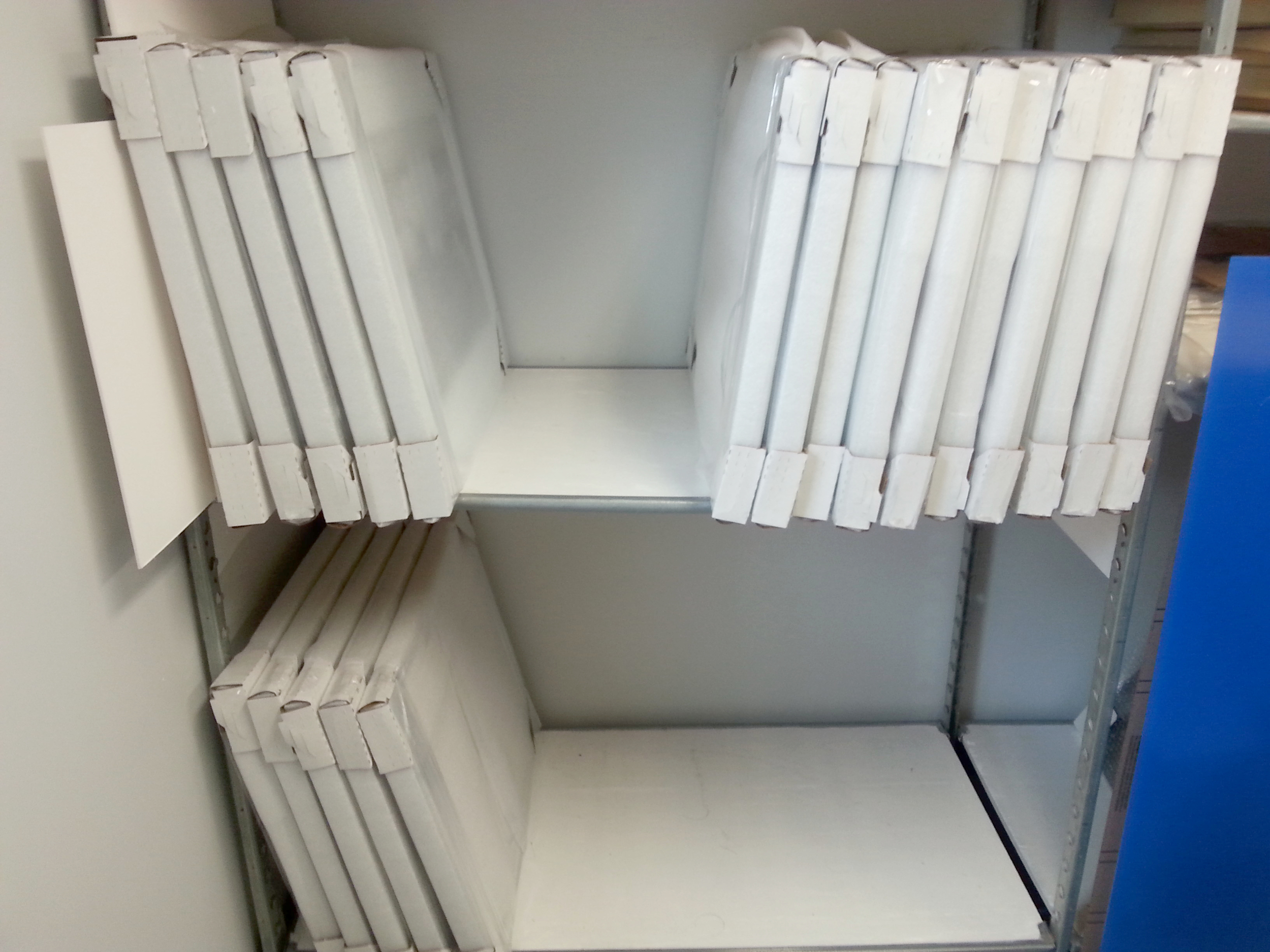
Packing Tips: Safe ways to wrap & handle Your Artwork
Here at Panopticon we have seen it all for packing material; Blankets, towels, trash bags or worst of all nothing. Framing is expensive and we have some tips on how to keep your frames and artwork safe!
- Cardboard Corner Protectors
You can always DIY them yourself using scrap cardboard, buy them from Amazon in small batches or order bulk from Uline. This will prevent any rubbing / scratching of the frames. Corners are helpful if you have multiple frames that are all the same size. However, this will not protect the whole frame or the glass/PlexiGlas.

- Properly Stack them
Make sure to stack your frames vertically and to place them glass to glass and back to back while storing them. This will prevent the hardware from rubbing against your frame. The metal hardware and wire will ding the wood or scratch metal frame very easily. This goes for when they are wrapped or unwrapped.
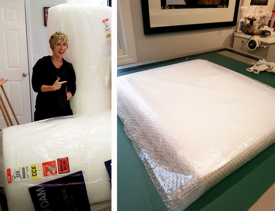
- Bubble Wrap
Keep your towels for the beach! While towels might be helpful at home this is not a good or effective solution for preventing damage, as there is no spring to the towel. Foam wrap or bubble wrap will take the impact and prevent your frame from getting damaged. You can order bubble online, pick it up from Uline or your local office supply store.
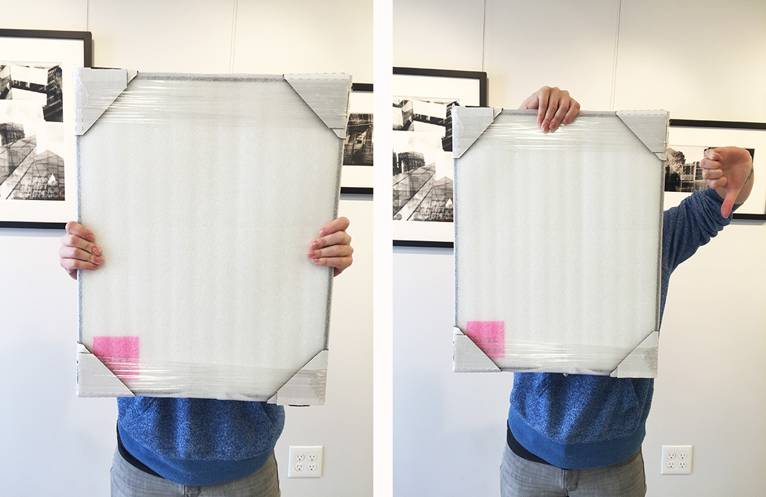
- Use Two Hands
Always pic up your frame using two hands! If it is a large image and you grab it by the top it can pull and your glazing can pop out of the frame. Ten and two just like driving school.
- Have us wrap it for you!
If all of this material is too much to handle we can ease your burden! Wrapping images properly is fun for us. We take care of your beloved artwork and make sure it is safe for handling and transport. If it is local we can deliver it for you or even ship your images. Let us know!


UV Glass – Small Upgrade that makes a BIG difference
UV Glass is like putting sunglasses on your artwork without any tinting and all the benefits!
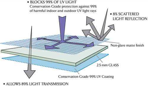
The upgrade from premium clear (regular glass) to UV Glass (conservation clear) is not an expensive jump in price. It is usually only a few dollars difference (depending on size). This way when you hang your artwork you don’t have to worry about the sun fading it!

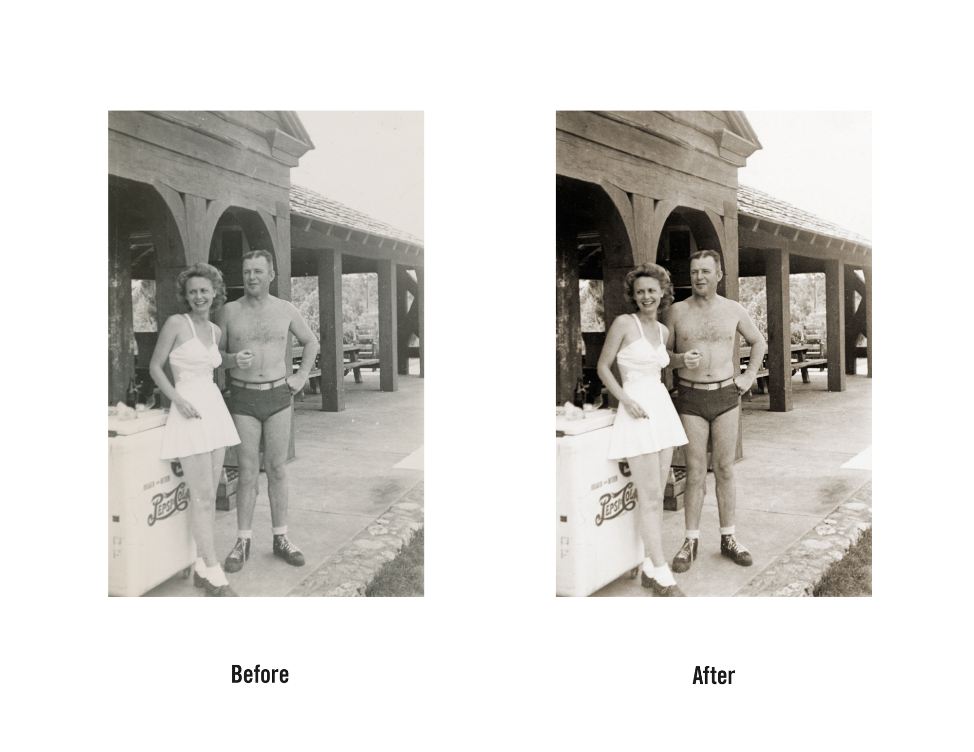
Military Restorations


Panopticon staffers received many restorations in house this month. We just had to share the number of military portraits we were able to bring new life to. It was an honor to work on them and share these brave and proud servicemen and women.

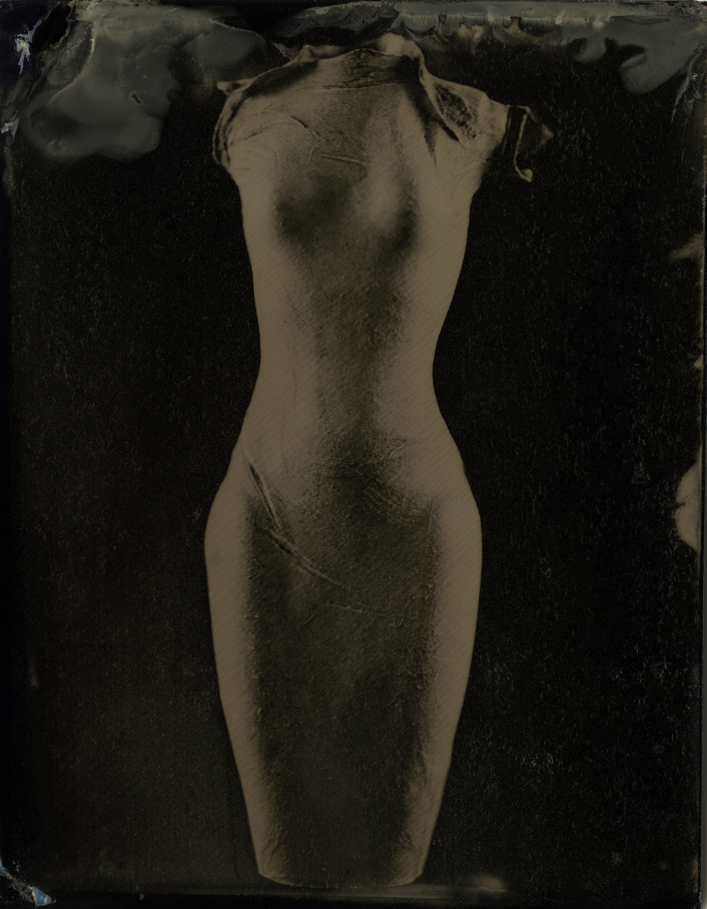
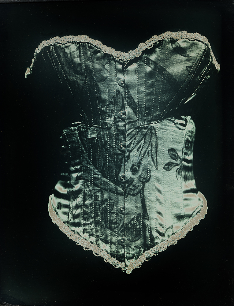
Artist Spotlight: Lindsey Beal
"Foundations" (Daguerreotype)
Lindsey Beal is a photo-based artist in coastal Rhode Island where she teaches at Rhode Island School of Design, Massachusetts College of Art & Design and the New Hampshire Institute of Art's MFA program. She has an M.F.A. in Photography from the University of Iowa and a Certificate in Book Arts at the University of Iowa’s Center for the Book. Her work can be found at Boston's Panopticon Gallery, Miami's Dina Mitrani Gallery and Portland's 23 Sandy Gallery. Her work combines historical & contemporary women’s lives with historical photographic processes. She is interested in the photograph as object and often includes sculpture, papermaking and artist books into her work. Her work has been shown at national museums, galleries & universities, including recent solo shows at the Griffin Museum of Photography and Danforth Art Museum. She has been featured on Lenscratch, LensCulture, Light Leaked, & Don’t Take Pictures and has been published in Diffusion, The Hand, Square Magazine, View Camera and 500 Handmade Books Volume Two. She recently earned a travel grant from Duke University and the Juror’s Award for Medium Festival’s “Size Matters” exhibit.
"Figure #19" (Ambrotype)
- When and why did you first start using alternative photographic processes in your work?
LB: I originally worked in silver gelatin and then color film, first printing in the darkroom and then scanning my film. When I was applying to graduate school, I knew that I wanted to learn alternative photography but I didn’t know that I would end up working pretty strictly in those processes! Two things were the catalyst for that. First, I was working all-digitally in my “Reproduction(s)” series and missed the tactile and physical work of the darkroom. This lead me to go back into the darkroom but working with historical photographic processes, as well as with printmaking, artist books and papermaking. Secondly, through studying the history of photography (which I love!), I was frustrated by the lack of explanation of what these processes were and how they were done. While there are some great videos now created by the George Eastman Museum and the like at the time, I wanted to see how these iconic images were made--not a short summary in the margins of a textbook or as a label on a slide. I think if you see how a daguerreotype was made, it makes the history of photography so much more real and you appreciate how hard it was to get those first images.

"Ball Grip" (Ziatype)
- How has your work evolved and changed throughout the past few years?
LB: My work continues to explore combining historical photographic processes with women’s lives past and present and has recently focused on how women use technology for pleasure. I am also exploring clothing such as corsets and stays that changed women’s bodies, as well as historical OB/GYN tools used in delivering babies. However, I recently opened up this idea of how the past is present that runs through my work by looking at how social media is similar to the Victorian practice of keeping commonplace books. So this idea of technology and how the past & present overlap, could be something I continue in future work.

"Diaphragm" (archival digital)
- You recently attended a workshop on Daguerreotypes taught by Jerry Spagnoli at Penland School of Crafts in North Carolina. Can you give us a look into that week learning this historical process?
LB: Penland is incredible and I would highly recommend it to anyone who wants to learn a new craft or process, or to get inspired by working with instructors who are world-renown in their craft and to be with other like-minded creatives. The daguerreotype (becquerel) class was the shortest session I attended at Penland (one week!) to learn this intensive process. But Jerry is an incredible educator and we all came away with some incredible plates and a firm grounding in the process. Generally, at Penland there are demos all week so you get a comprehensive education in the process and then practice it yourself with guidance by the instructor and studio assistant. In the evenings, there are artist talks, open house & art openings and plenty of time for inspirational conversation. One thing that is a strength for a place like Penland, is that there is a lot of room for collaboration with the other studios and with your classmates. I have attended three times and have seen some beautiful collaborations between photography and the book arts & letterpress studios.
- Tell us a little bit about your current solo exhibition at the Danforth Museum of Art in Framingham – how did the exhibition come to be & how did you work on the installation? In a way this show is a retrospective for you and it includes most of your projects – how do the individual pieces interact with one another as a whole?
LB: I was first introduced to the Danforth with their call for entry for their photo biennial two years ago when Francine Weiss juried the show. That show, artist talks and openings introduced me to so many in the New England photography community, (many who have become close friends). Jessica Roscio is the amazing curator there and we got along so well, bonding over photo history and early women photographers. We stayed in touch, meeting a few times with my new work. As curator, she invited me to be in a show she was curating on the interior and domesticity. This summer I brought all of my work to the museum and we went through it, with Jessica pulling work that worked together and addressed the show’s theme of making the private public. You are right that “Private Lives, Public Spaces” is a retrospective (minus my cyanotype work) and for me it is pretty amazing to see all of my work in one space. Although all of my work addresses past and present women’s lives, usually using historical photographic processes, I compartmentalize my work into separate series. To have them all interacting with each other in one space was overwhelming in a positive way. The dialogue that occurs between the series in the way that Jessica installed and curated it brings out the common themes of the work.
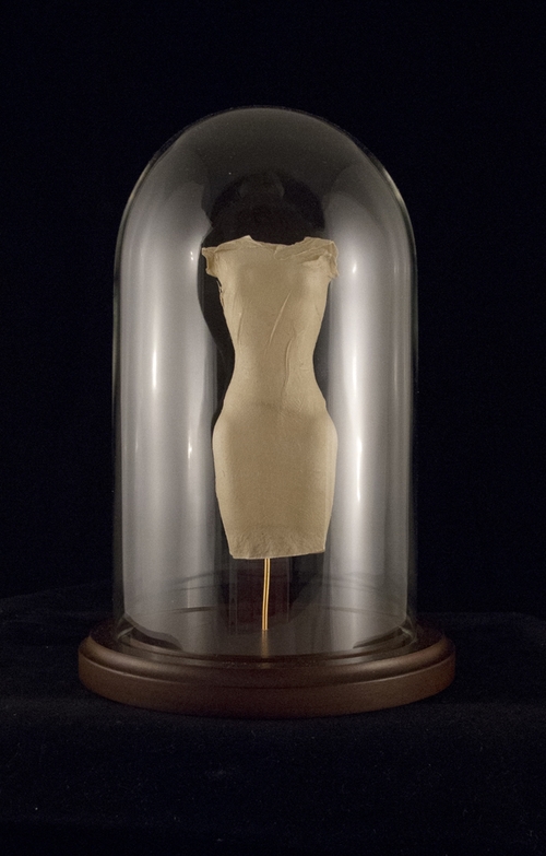
"Venus Figurine" (handmade paper & bell jar)
- Because your work is rooted in alternative photography how does presentation come into play? For example your “Transmission” series are all presented in Petri dishes with gold metal labels fixed to the frame. Do you have the end exhibition in mind when you first begin a project?
LB: Since I began working in photography, I wanted to present prints in a non-traditional format that encourages viewer interaction or creates pieces that act as three-dimensional objects. Early on, I created installations using fabric and scrolls or silver gelatin prints. From there I created wallpaper from my photographs to completely cover a space. Even my wet plates from my “Venus Series” were originally installed unframed on a picture rail that blended in with the gallery wall. I create the prints first with the idea that they will altered in some form or turned into objects. The work’s content needs to fit with the installation or sculptural process so some time and research is needed with the prints. For example, with the “Transmission” series, I took cyanotypes and created circular prints, embedding them in resin within a glass Petri dish. From there, I took inspiration from Victorian natural history museums and the way they present specimens using glass and wood cases. I mounted the plates with copper wire in shadowboxes and used the Latin names of each STD which were engraved on brass name plates.

"Bacterial Vaginosis" (cyanotype embedded in resin & petri dish)
- How has modern technology played a role in your approach to such historical processes?
LB: I incorporate digital photography, editing software like Photoshop and inkjet printers to print my negatives into the historical processes I use. Although I work in historical photographic processes, traditional bookbinding and papermaking, for me, these processes can still utilize contemporary technology. These processes force me to slow down and focus on the process, yet with digital technology, I can slightly speed up my workflow. Being able to use digitally edited images and printing them as negatives through an inkjet printer onto materials like Pictorico film gives people the option to go back into the darkroom. In this way the historical and the contemporary can be easily combined.
"The Electric Coronet Beauty Patter" (Ziatype in vintage case)
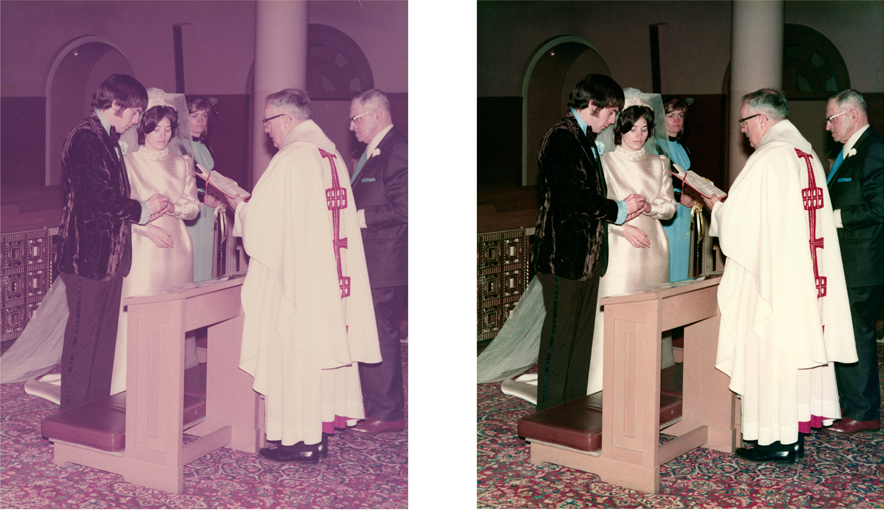
Wedding Restorations
This holiday season was very busy for us at the office. We got in so many photo restorations and started to notice a trend. As always they are sentimental images but this year was the year of the beautiful brides! We received so many we couldn't share all of them so we included a few of our favorites!


Artist Spotlight: Molly Lamb
"In Their Purse Pockets"
Molly Lamb holds an MFA in Photography from the Massachusetts College of Art and Design and a BA in American Studies from the University of Massachusetts, Boston. Her work has been exhibited nationally, most recently at the Griffin Museum of Photography, the Center for Photography at Woodstock, the Houston Center for Photography, the Annenberg Space for Photography, and the Ogden Museum of Southern Art. In 2015, she was named one of Photo District News’ 30 New and Emerging Photographers to Watch as well as one of LensCulture’s 50 Emerging Talents. She was awarded an Artist Fellowship grant from the Massachusetts Cultural Council, she was a finalist for the New Orleans Photo Alliance’s Clarence John Laughlin Award, and she has been a Critical Mass finalist the past two years. She currently teaches art at the Museum of Fine Arts, Boston, and she teaches photography at Simmons College and the Massachusetts College of Art and Design. She is represented by Rick Wester Fine Art, New York. Her solo exhibition “Ghost Stepping” is currently on display at the Danforth Art Museum in Framingham.

"He Asked Me To Name Him, Red Bear"
- How did the series Ghost Stepping begin? Do you remember the first photograph you took for the project?
ML: There wasn’t a specific point at which this series began. It was a long, gradual process. I started photographing ideas related to it before I realized that’s what I was doing. Because I had been working as a newspaper photographer, I was so used to thinking about photographing the lives of others that it took a while for me to think about photographing aspects of my own life, or to understand that I was doing it without realizing it.
When I started graduate school at MassArt, I knew that I wanted to focus on photographing ideas about my family history. It was at MassArt that I really began to flesh out all of the ideas that went into this series. My first pictures were mostly of my family’s belongings and they looked as if I had just found them and photographed them that way. Over time, I began to experiment with bringing myself more into each image and including my own ideas and emotions about my history in the way that I worked.

"Tissues"
- What artists influence you and how do they influence your thinking, creating and career path?
ML: It’s difficult for me to name specific artists who influence me because there are so many and I wouldn’t want to leave anyone out. Because of social media and online publications, I encounter and am influenced by visual ideas constantly. I love that. I also attend as many artist lectures, exhibitions, and opening receptions as I can.
As I was working on this series, I spent a lot of time looking at the work of photographers who were thinking about family history, memory, and loss as well as photographers who were photographing objects and photographing the landscape as metaphor. I was inspired by Rebecca Norris Webb’s book My Dakota,Susan Worsham’s series “Bittersweet on Bostwick Lane,”Jitka Hanzlova’s series “Forest,” and David Favrod’s series “Gaijin.”Rinko Kawauchi’s work always inspires me as well.
A little more than a year ago, I began teaching art at the Museum of Fine Arts in Boston. It’s been an amazing experience and an incredible influence on me. I’m able to absorb artwork gradually and consistently because of spending so much time in the galleries. I think a lot about how light is portrayed, about how much emotion is held in a gesture, and about how ideas are visualized. I’ve also learned a tremendous amount about the artwork and the history of art.
“In The Wake: Japanese Photographers Respond to 3/11” was a photography exhibition at the MFA that affected me deeply. Seventeen photographers were included and each responded to the earthquake, the tsunami, and the Fukushima disaster in such different ways - so beautifully, so movingly. The wall text with each photographer’s work was also very powerful because it included the artists’ thoughts and experiences. I spent a lot of time in these galleries yet each time felt like an entirely new experience. Lieko Shiga’s photographs in that exhibition really stuck with me and have been on my mind as I’ve been making new work.
I also love words - books, stories, poems, and conversations. And I love how words and photographs harmonize. I read as much as I can and it has become very important to me to include poetry with the photographs that I’m making. The words and photographs exist simultaneously for me but each brings something different to the story. I think of “Ghost Stepping” as a chapter, the first in a larger body of work that explores my family history and the influence that it has on me. Each chapter incorporates poetry and my hope is to compile a larger story about my family history with many chapters, each a vignette of photographs and poems.

"Waiting"
- Your color palette is mostly soft & subtle – what influences you as you photograph to make these choices?
ML: I think the color palette has developed because I photograph intuitively. As I’ve been working on these ideas about my family history, I’ve realized that I think of the light and the colors as characters in the stories that I’m telling. I look for them and recognize them like long lost friends. And I think a lot of that also has to do with my own personal memories and history. I spent a lot of time outside or wishing that I could be outside as I was growing up in the South. I was always watching the light, the plays of the light, the gestures that the light graced, and the colors of it all. And I still do.

"Unraveling"
- You recently attended the portfolio reviews at Photolucida can you share a few of your experiences from that weekend?
ML: I’ve been to two portfolio reviews so far, Review Santa Fe and Photolucida. Both have been incredible experiences that have broadened my world. We’re so lucky as photographers to have gatherings like these - to be able to meet photographers and reviewers whose work we love, to hear their thoughts about our work, and to be able to talk about life with others who think about and express ideas about it visually. My life has changed and grown in so many positive ways because of both of these portfolio reviews. I can’t recommend them enough.
"Their Feathers Seemed Like Omens"
- You currently teach at the Museum of Fine Arts in Boston, Simmons College, and at the Massachusetts College of Art and Design. What do you enjoy most about teaching?
ML: Teaching is another layer of experiences that influences me as a person and an artist. It’s also a way for me to give back. Art has always been a resource for me for thinking about the world and processing my ideas and experiences. My hope is that I’m able to help, even in some small way, those who are looking for ways to visually express the ideas and experiences that are important to them.
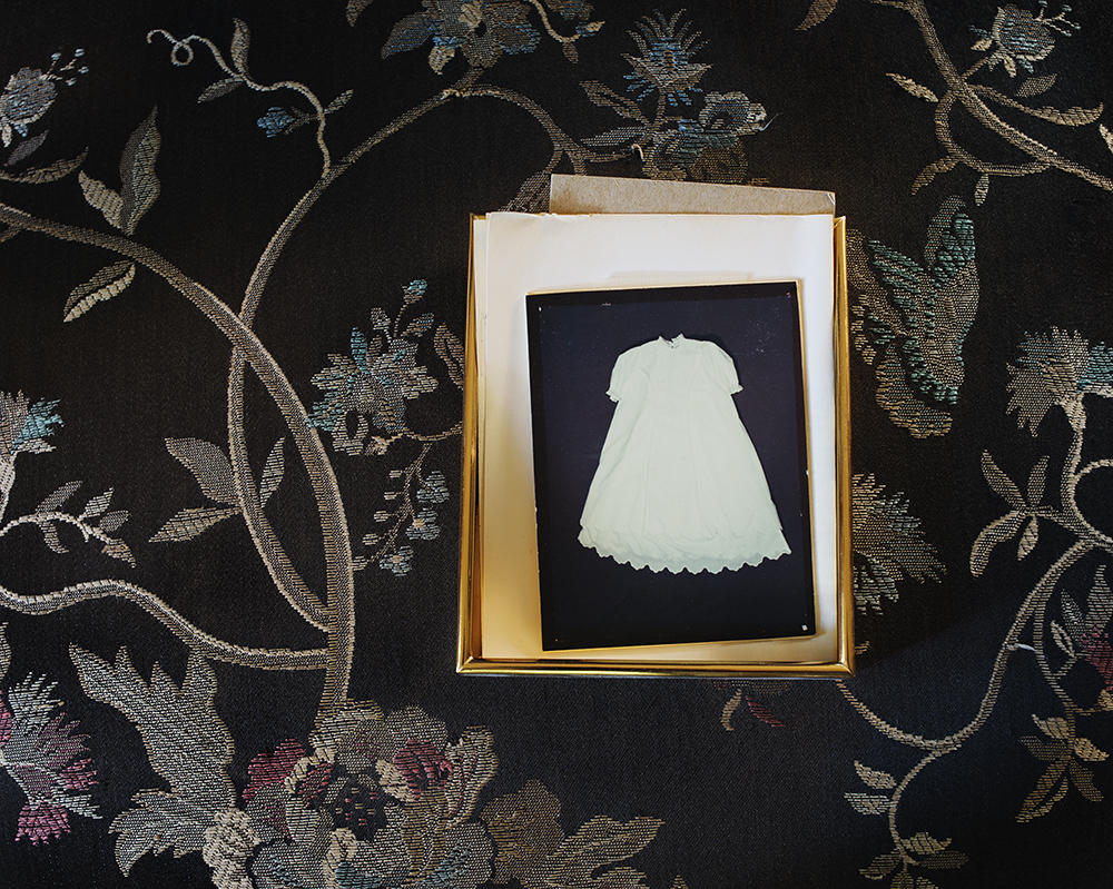
"Christening Dress"
- What are some tips/advice you would give to someone just starting out in photography?
ML: One of the reasons that the portfolio reviews and photography festivals that I’ve attended have been such positive forces in my life is the community of creative people around me that they have helped develop and foster. I think that nurturing one’s artistic community is crucial - supporting and encouraging each other as well as exchanging thoughts and ideas that inspire us and help us grow.
I also find it helpful to remember to simply be true to myself. Everything is a process. Life is a process; we’re always learning. Being open minded and curious to learn and grow, even when I am uncertain and wish everything was crystallized in my mind, is incredibly important to me. Otherwise, life would feel stagnant and pale instead of vibrant and lush.
"The Suitcase"
Artist Spotlight: Tytia Habing
"Wild Onions"
Lets start this off right: her name is pronounced Tie-shuh, and she has definitely been making her name known in the photography world. Originally from the Watson, Illinois area, Tytia grew up on a small working farm and then spent the majority of her adult life in the Cayman Islands. She holds degrees in horticulture and landscape architecture and is a self-taught photographer. Tytia’s black and white photographs are full of mystery and child like wonder that keeps the viewer coming back for more. She has been published in Shots Magazine, Fraction Magazine, Lenscratch, and National Geographic (just to name a few!). Her most recent and exciting news is her work is shortlisted for the Black and White Photographer of the Year 2015 sponsored by Leica.

"Anna"
- While your degrees are not in the photography field, it still feels like they play a part in your photography. Can you tell us a little about how they influence you as an artist?
TH: I feel like it’s all very intertwined: my upbringing, my degrees, my photography. I’m not sure how or what I would shoot without the background I have. I love the outdoors, plants, animals, the earth,….pretty much anything nature related. My upbringing on a farm and being surrounded by fields of corn, soybeans and wheat and living on the edge of a large woods, I was always immersed in nature. That led me to seeking out degrees in both horticulture and landscape architecture, which I both dearly love, but neither of those degrees clicked with me the way photography did. As soon as I started photography, I knew, I just knew it’s what I wanted to do for the rest of my life if possible. If you have a look at my portfolio, my images are mostly nature related. Even when I do portraits, I try to incorporate nature into them somehow. Both degrees gave me a deep knowledge of how man relates to nature and the many hurdles we need to overcome concerning that relationship. We try and fight nature, to conquer it. That isn’t our path. We’re on the wrong path. One day we will all come to our senses whether it’s from our own accord or we’re forced into it. I truly believe we take care of what we love, and if we can all love nature again, all of nature, even the unlovable parts of it, we’ll get on the right path. If my photography can help even the tiniest bit to make even one person appreciate nature more, I’ve succeeded. One of my favorite quotes is “Our greatest responsibility is to be good ancestors.” Jonas Salk
"Saved"
- How did you become involved in photography?
TH: It was a happy accident really. I never had any interest in photography previously even though my older brother graduated with a photography degree. I was in my last year at university working towards my landscape architecture degree and I had some electives I needed to fill. I happened to find an intro to photography class that fit into my schedule and it was in a building very near the architecture buildings so it was convenient. I thought it would be a fun, easy class to round out my schedule. Little did I know I would almost immediately become obsessed with it. I spent ever spare minute in the darkroom and my other classes kind of fell by the wayside. My intro to photography class suddenly had first billing! My last semester I took the follow up class as well, and that ended my official training in photography. Everything else has been self taught.

"Rhubarb"
- Your photographs of your son and his friends capture the excitement and discovery we all had as children. When you are photographing them how much of it is instinctual versus planned? Do you set up the scene or do you always have camera handy & ready?
TH: I always have the camera ready. Planning a scene with my son doesn’t work and trust me, I’ve tried. I finally realized my folly and gave that up long ago. Plus, the things he does on his own are so much more interesting than anything I could come up with. That’s not to say I don’t facilitate the photographs. I’ll take him for a walk or we’ll go down to the river, because I know he’ll always do something interesting. I plan a lot of the trips in the late afternoon so I have good light. From time to time, he’ll do something that I’ll miss and I’ll ask him to do it again. He doesn’t do it for my photo though. He does it because it’s fun. I’ll also gently suggest he play where there is beautiful light. Sometimes he’ll oblige, sometimes he won’t, but I don’t push it. When it comes to playing, he does what he wants to in the end, and that’s how it should be.
"Go"
- What motivates and inspires you to create art?
TH: Three simple things: family, nature and hope. I hope I can make some sort of difference in the world through my photography. Grand aspirations, I know, but why not dream big right?

"Wishing Weeds"
- What do you think makes a memorable photograph?
TH: I can only speak for myself, but what makes a photograph memorable to me is if it makes me feel something. It could be happy, sad, perplexed, whatever, but if I feel something, I’ll more than likely remember it.

"Eye Spy"
- You recently attended Filter Photo Fest in Chicago; can you share a few experiences you had while you were there?
TH: Filter was my very first photo fest and I thoroughly enjoyed it. I can’t recommend it enough. It was totally out of my comfort zone since I’m a major homebody, but it was great. I was finally able to meet many photographers I’ve known only through social media and admired from afar. It was very cool to put a real face to a profile picture! I took two amazing workshops, one by Aline Smithson and the second by Elizabeth Avedon. I learned more in those two days than I’ve learned in the entire last year! Great classes and great instructors. I also did the portfolio reviews, which was fairly scary, but nothing horrible happened like my mind had imagined would. All the reviewers were very kind and helpful. I do have to add that everyone absolutely loved my black and white prints and wanted to know who printed them…..I have the BEST printer!
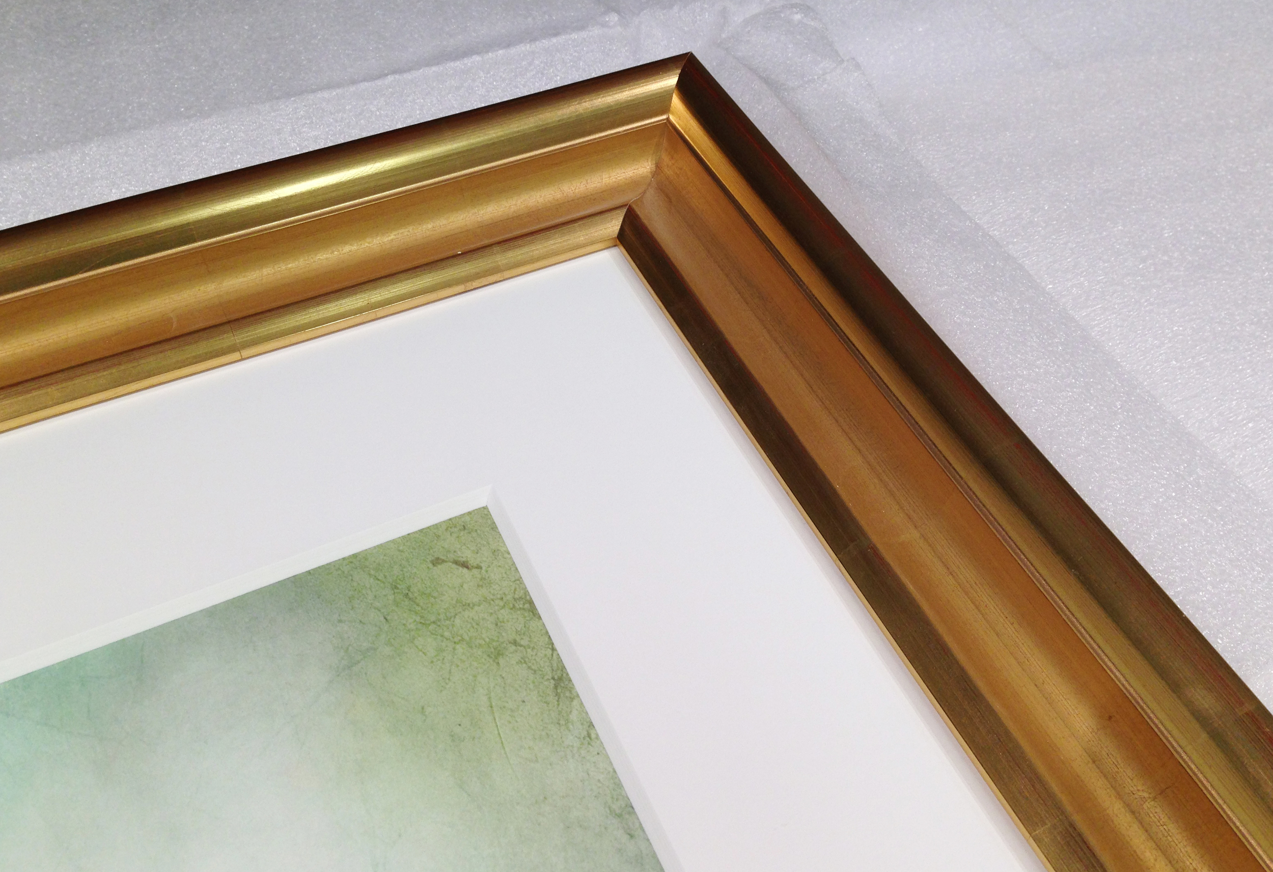
The bling bling frame
We recently framed a piece for a client in a beautiful water gilded frame and wanted to share the intricate process the frame makers go through to create such stunning frames. https://www.youtube.com/watch?v=67LM4Iovll4
The term gilding covers a number of decorative techniques for applying fine gold leaf or powder to solid surfaces such as wood, stone, or metal to give a thin coating of gold.
Here is the frame we used:


Staff Intro- Elizabeth Ellenwood, animal, cheese and film lover
Elizabeth Ellenwood is our fun loving darkroom printer and resident animal lover. She received her Bachelors of Fine Arts in Photography from the New Hampshire Institute of Art in 2010. Following graduation she assisted Boston architectural photographer Peter Vanderwarker for a number of years. In 2012, she started working with us at Panopticon and became full time as of 2015.
Wet plate portrait by Mercedes Jelinek
Darkroom printing and development is her passion here at Panopticon. Elizabeth known lovingly as Liz is obsessed with all things film. She is an accomplished alternative process printer having studied and assisted at Penland School of Crafts. Over the years she has learned the alternative processes of Wet Plate Collodian Printing, Tin Types, Cyanotypes, Albumen Printing and Emulsion Lifts. Also, she has taken classes with Carl Weese at the Center for Alternative Photography where she added Platinum Printing to her repertoire. Recently, she had a one person exhibition of her work at Danforth Art titled Elizabeth Ellenwood: Of Light and Line. Which received a wonderful review by Mark Feeney in the Boston Globe!

Some fun facts about Liz. She loves cheese...I mean like really loves cheese. She is frequently known to throw a cheese party or two and loves to say "Queso for my Face-o". When not in the office you can find her chilling with her dog Ophelia and her drummer dude Josh who plays in the Boston-based band Girls, Guns and Glory. She loves to travel and has visited Germany, Ireland, Italy (2x) and Switzerland in the last two years. Her next excursion is to Hawaii next year!

Check out Liz's process video:
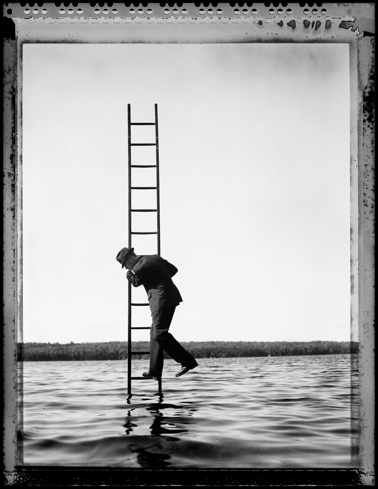
Artist Spotlight: Stephen Sheffield
"Descent (ladder series #35)"
Stephen Sheffield, a native of the Boston area, is an alumnus of Cornell University, where he obtained a BFA in painting and photography. He received his MFA in photography from the California College of the Arts, in Oakland/San Francisco. He specializes in photography, mixed media and photo-montage and has exhibited nationally for over 20 years. Stephen creates large-scale commissions for private collectors, institutions, restaurants and hotels, as well as images and photographic illustrations for magazines and advertising agencies across the US. In addition to being a full-time artist, Stephen runs the black and white photography major at the New England School of Photography in Boston and is adjunct faculty at the New Hampshire Institute of Art MFA Program. Stephen Sheffield is represented by Panopticon Gallery in Boston, MA.
- Your work has a sense of storytelling and a slight twinge of humor to it. Walk us through your process – do you sketch out the scene ahead of time or is more a spur of the moment?
SS: Ideas pop into my head almost at random. I then make sketches and do research as far as location and angle, props and “feeling”. Once things are set up and planned I get to work. Of course that is when things go wrong and I have to wing it. There have been very few shots I have taken that have ended up looking exactly as I imagined them. I think much of the humor comes from the “winging it” aspect of the actual shoot.

"Small Business"
- How has social media played a role in your photography?

SS: I use social media less for personal and more as a way to lead people to my work and to keep my work on their minds. It is also in a small way becoming a reminder to continue to make new work. You cannot show the same work forever.
Mixed media installation at Union Beer Company in Red Hook, NY
- You recently moved from Kenmore Sq area to the suburbs of the south shore. Has this changed or impacted your art making?
SS: The move has made a major impact on my work flow mainly, not the work itself. Good and a little more difficult. Good for space and my kids and my wife. It was tough moving my studio out of the Fort Point Channel after 20 plus years, but now the studio has been replaced by a carriage house and a darkroom in the basement. No more rent payments and no more commuting, but it is tough to find a good cocktail and quick access to galleries and museums. Making the work itself has the potential to be easier as I move forward. Time will tell.

"Smoke 1"
- What artists influence you and how do they influence your thinking, creating and career path? Because you are a mixed media artist do you look at more painters & sculptors than photographers?
SS: I am still mainly influenced by the masters. Minor White, Edward Weston, Imogene Cunningham, Ralph Eugene Meatyard, Duane Michaels, I could keep going. As far as career path? There is no path anymore. These days it is every artist for themselves and ever-changing. I’m old and I need to stay quick on my feet. For my mixed media I am also still influenced by the masters, mainly non-photographic, but the Starn Twins and Gilbert and George are big ones. The biggest go-to influence who has never let me down has got to be Robert Rauchenberg.

"Lust"
- What are some tips/advice you would give to someone just starting out in photography?
SS: It is super tough out there these days, and and like I said before, there is no clear path for success. My advice is to try to be good at all of it! The technical, the creative, the marketing, the social, the hustle. Go to everything, (openings, museums, lectures) meet everyone and talk to anyone. Always be making art, but don’t show everyone everything. Edit! Edit what you show and edit what you say. Also, never forget to be a good and generous person. That last bit will get you through more doors than interesting or clever art.

"Eddie 2"

Staff Intro - Bruce R. Wahl, Company Bad-A$$
Introducing..... BRUUUUUUCE!!
The newest member of the Panopticon crew, Bruce R. Wahl joined us just last year as a part time-er. He is currently finishing his Bachelor of Fine Art in Photography at Massachusetts College of Art and Design and is a freelance photographer working for clients throughout the Boston area. He brings years of photographic experience as well as some pretty sweet facial hair to the Panopticon team.
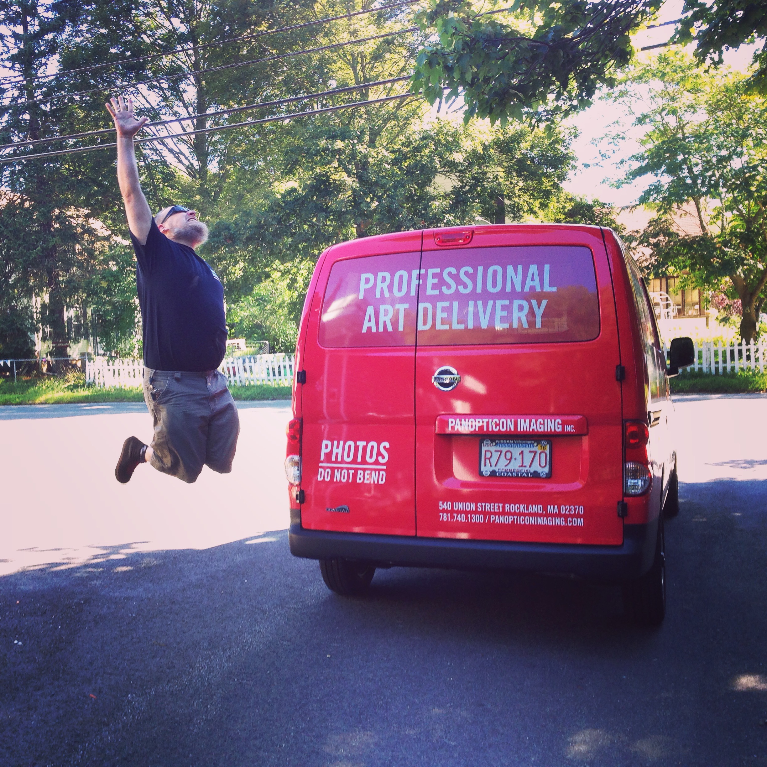
You can usually find Bruce at the matting table or jumping into the Panoptivan for a delivery, where ever he is you can be sure there's a story he will have to share.
When he is not at the office or at school, you can find him nerding out over old school motorcycles & film cameras, editing his own work, chillin with his cat Mr. Whiskey, and perhaps indulging in a glass of whiskey (yes there is a coincidence with the cat name) or a brew-ski. Needless to say Bruce fits right in here!


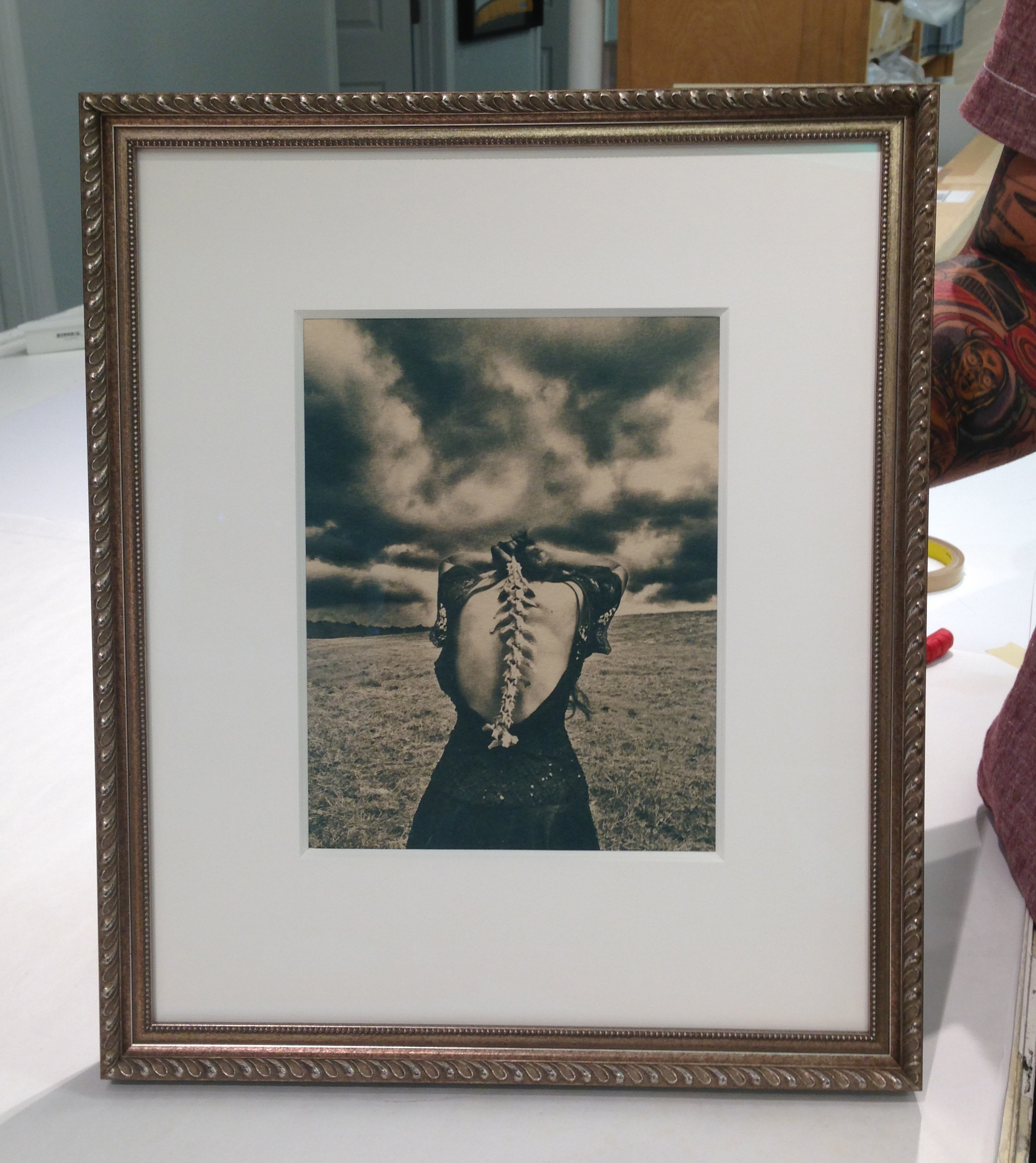
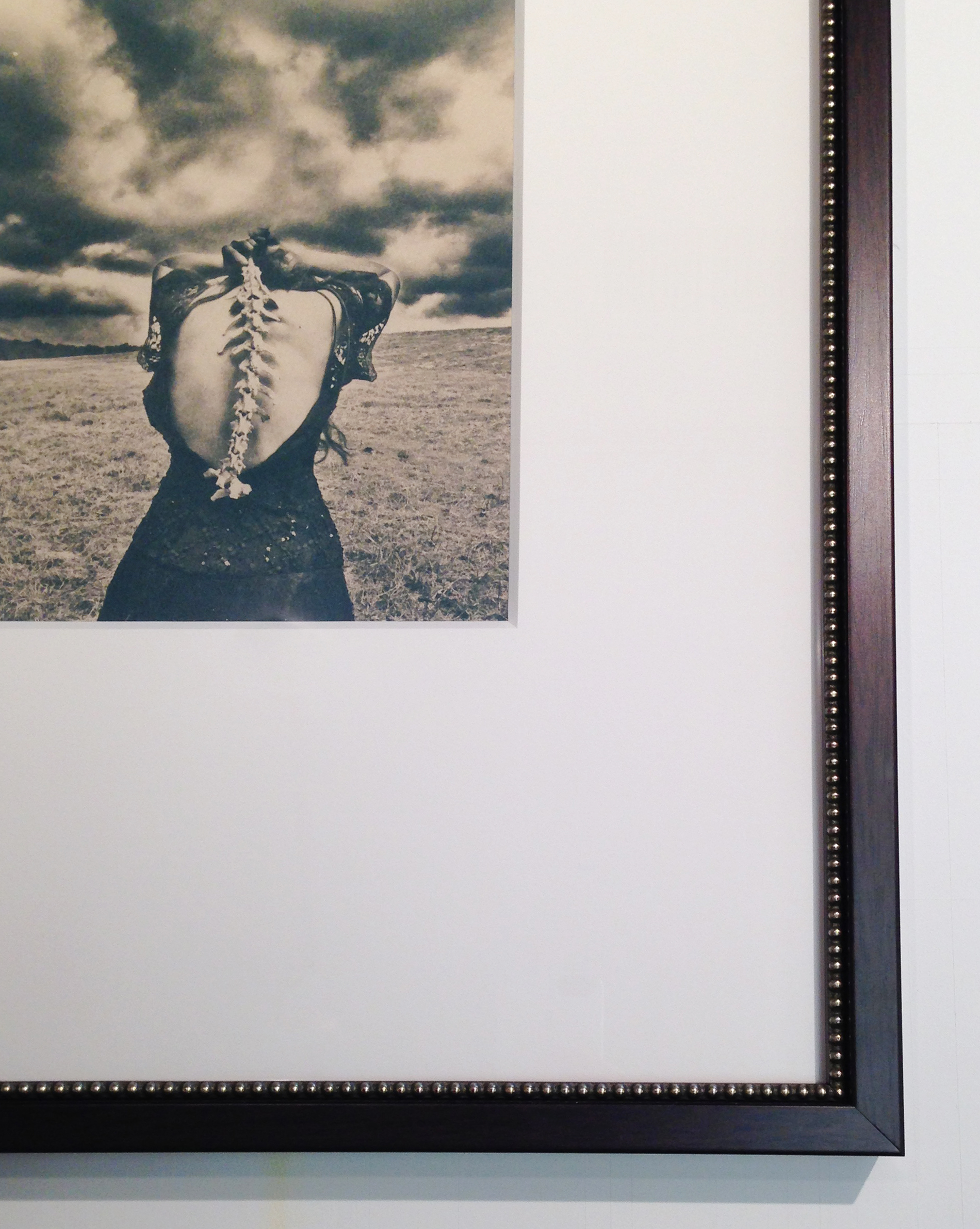
Jaime Johnson - Same print, Different presentations
"Spine" Courtesy of Jaime Johnson, Tea-toned cyanotype on Japanese rice paper
Don't Take Pictures Magazine is a biannual print, online & tablet-ready magazine run by Kat Kiernan who is receiving this years Rising Star Award at the Focus Awards hosted by The Griffin Museum of Photography.
The online magazine also sells an exclusive limited edition images by an artist featured in the magazine. Working with the artist, they select an image, which is then hand-printed by the artist, signed, numbered in an edition no higher than five, and priced below $200. Because they believe in helping emerging artists build their careers, the full amount of the sale goes to the artist!
First, let us say that this is a FANTASTIC print program that not only helps the artist but opens the door to smaller or new collectors. Liz & Shannon from the office recently purchased the same beautiful print by Jamie Johnson through the program. Since presentation is a big part of what we do here at Panopticon, we wanted to show the way that each print was framed to suit the collector's taste.
Shannon's Frame:
- 8ply mat board
- slight bottom weight
- decorative brushed silver & gold wood frame

Liz's Frame:
- 4 ply mat board
- heavy bottom weight
- dark natural wood frame with a silver beaded fillet


About the artist:
Jaime Johnson grew up in Mississippi where the sounds of wild animals outside her window became her daily melody. Jaime received her BFA from the University of Mississippi in Imaging Arts and her MFA in Photography from Louisiana Tech University. Johnson was awarded Honorable Mention for her experimental short, Flutter in the 11th Annual Oxford Film Festival in 2011. Jaime was named a finalist for the 2015 Clarence John Laughlin Award and her work has been shown nationally in venues such as the Center for Fine Art Photography, The SOHO Photo Gallery in New York, The New Orleans Photo Alliance, and the Ogden Museum of Southern Art . Her work has been published in Shots Magazine, Don't Take Pictures, Light Leaked, and Seites, and her series Untamed recently won the Grand Prize in Character: Portraits and Stories that Reveal the Human Condition, sponsored by Maine Media Workshops.
Make sure to check out Jaime Johnson's website and Etsy shop!

Staff Intro - Chris Mulready, The Jack of All Trades
You know that guy you know that can fix everything and make it seem effortless? Put a Graphic T on him and that's Chris! A photography graduate of the Center for Digital Arts and a Mathematics degree from the University of Massachusetts Lowell, Chris has been a part of the Panopticon team since 2011. His expertise & skill set stretch from the darkroom & film processor, to the digital world, to the framing table and hits everything in between. Chris started his photography career at Ritz Camera then continued on to EP Levine and assisting as a second shooter for weddings. As a full timer here, his days are filled with a little bit of everything: meeting with clients, digital printing, scanning, custom framing, and maintenance of all the machines. Needless to say we like to keep him busy!

Fun Facts:
- Chris's favorite M&Ms are crispy so if you need to bribe him bring a few packages of those.
- He is an avid Foo Fighter fan.
- He is a happy new owner of a 2014 Triumph Bonneville Motorcycle so you can catch him cruising around town.

Photographing and Matching a Painting
At Panopticon we work directly with many mixed media artists, painters, and watercolorists. Depending upon your medium we have many ways of capturing your artwork for reproduction.
We recently received and image from the Hingham Historical Society for photographing. This image is an original oil painting titled "Marsh Homestead". The original date of production and artist are unknown.

Chris, one of our Digital Techs, went to work meticulously adjusting lighting to create the ideal conditions for capturing the image. Then begins the process of color matching. We will create as many test strips to ensure the color is exact.

We work our way from the test strips adjusting the color and contrast to the final file. From the finished digital file the client now has a high quality digital representation of their work as well as the option to make an edition of archival pigment prints. At Panopticon we try to give each piece of artwork the same amount of time and attention that the artist put into the original.
Sum sum summertime- that's a wrap!
Whoa! Summer is always an exuberant time to go down the Cape, have some BBQ and for us down at Panopticon Imaging, make work! Our artists have been busy, so we have been having a great season of working with them on finalizing images, prints and exhibitions! We were so excited to work on so many of these projects we lost track of the time, but don't worry- there were a few outing with the Panopti-crew where we were able to steal some sun and fun. We ushered in the season with quite a bang at the Magenta Foundation's Flash Forward Festival! We have been working with the Festival and it's artists for the last three years, and it is always fantastic and quite a different array of work every time.
This year we helped with the printing and installation of the 7 shipping containers that were on the Rose Kennedy Greenway for all of May! In coordination with the Fence, this outdoor exhibition was so much fun, and such a great experience working with the international artists that made up the roster. Each shipping container held a solo exhibition from artists like Angélica Dass and Gregor Schmatz.

Angélica Dass's solo exhibition in the shipping container.

Along with the Fence, we had the great pleasure of working with Boston Globe Legend Bill Brett on his Flash Forward solo exhibition. We take great pride in managing and implementing all production for these kinds of exhibitions- from the proofing with the artists, printing, framing and even delivery to the exhibition venue. This was the fist of the two large-scale exhibitions we helped produce at the beginning of this summer, the second being a brand new relationship we started with artist Emil Cohen!
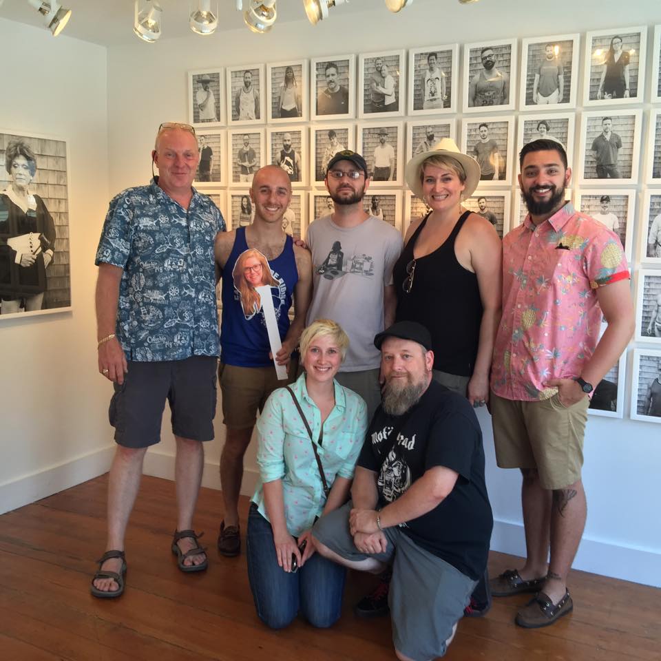
The crew with Emil Cohen at the William Scott Gallery
Emil Cohen came to us for assistance in producing his solo exhibition, "Portraits in Provincetown" at the William Scott Gallery that was held in July. The exhibition would be of 76 portraits he made of the good people of Provincetown, both large and small scale to be displayed. The portraits are beautiful as well as playful and sometimes mischievous- just as you might expect from P-Town. Working from London now, Emil needed to produce the exhibition remotely, and we were happy to take on the task. When the exhibition was finally ready for air-time, we took that opportunity to join him in P-Town for a little out-of-office research and development. We hope if you were there this summer, you were able to see Emil's work, or him photographing for the project!
Our whole summer did not just consist of large-scale exhibitions, though. We work on any photographic endeavor, and were happy to work on both printing and framing projects for a multitude of new clients. Artists such as Lazaro Montano stopped by to have one of his great Color Block pieces printed and framed; as did Toni Pepe, who had some of her new work in this summer's Community of Artists exhibition at the Danforth Museum of Art. It was also great to do some expert framing for the end-of-summer exhibition Landscape as Fetish at Gallery Kayafas, introducing us to the work of Angela Mittiga and Mark Dorf.

Finished framed work by Lazaro Montano
It has been a delightful season, and we hope that the fall brings even more exciting projects as we get to see what everyone has been working on all summer! And don't worry, we haven't slowed down one bit. We are currently preparing artist Betsy Schneider for her exhibition at Harvard's Carpenter Center, and looking forward to the great work that will be in the Griffin Museum of Photography's annual Atelier exhibition in September! Stay tuned for more, and have a great rest of August!
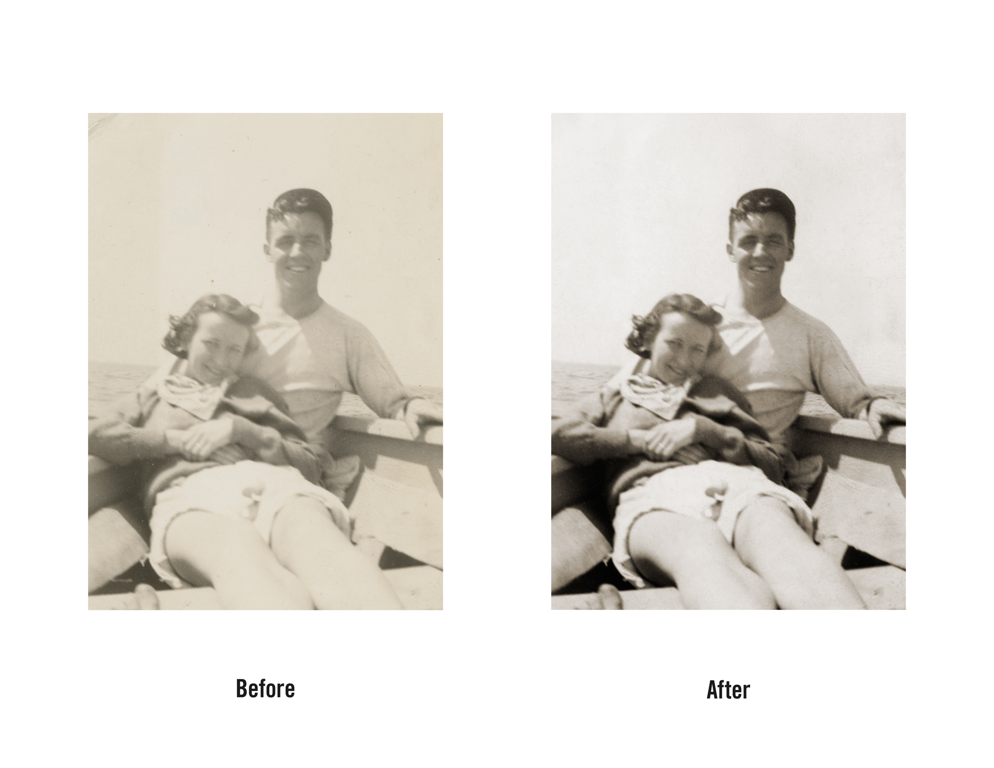
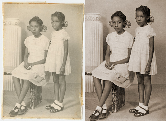
Family Restorations
We loved these latest restorations we received in house. The client had family members visiting and they brought these long lost images. They were very happy to have these images brought back to life. Here are the before & afters:


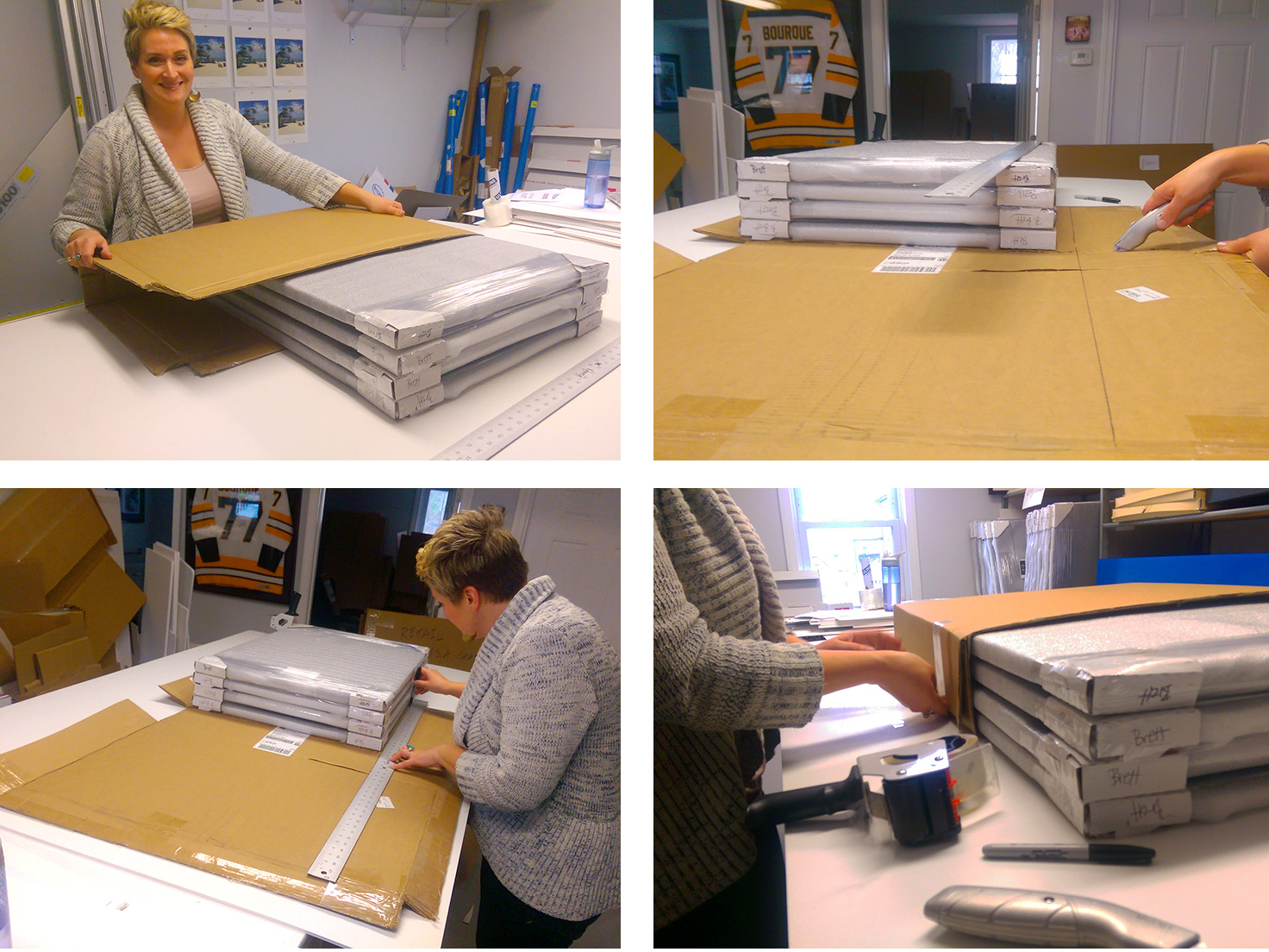
Staff Intro - Shannon McDonald, Office Manager and then some
A south shore native, Shannon McDonald joined our team in 2013 as the office manager. Whether you call the office or swing by for a visit, she is there with her positive energy and willingness to help with whatever project you have. With a Bachelors of Fine Arts degree in Photography & Electronic Imaging from the University of Massachusetts at Dartmouth, Shannon's skills go way beyond an office manager. She has to perfect amount of organization and creativity to add to Panopticon Imaging.
Shannon take packaging very seriously!
When she is not at the office Shannon can be found working on her own artwork at her studio in the E. T. Wright Buidling Artist Studios. Her mixed media pieces have been exhibited in galleries such as the Zeitgeist Gallery, Trescott Street Gallery, Panopticon Gallery, and the Nave Gallery. Shannon is a gallery artist for the South Shore Art Center as well as a curated member of the Southern New England Artist Community.
Need your work shipped? Shannon's got your back!
She has now expanded her artwork to a home decor line that captures her bright personality and love of design. Make sure to check out her Etsy site, it feels good to support local artists!